 broad range works with Narrow low-key range .
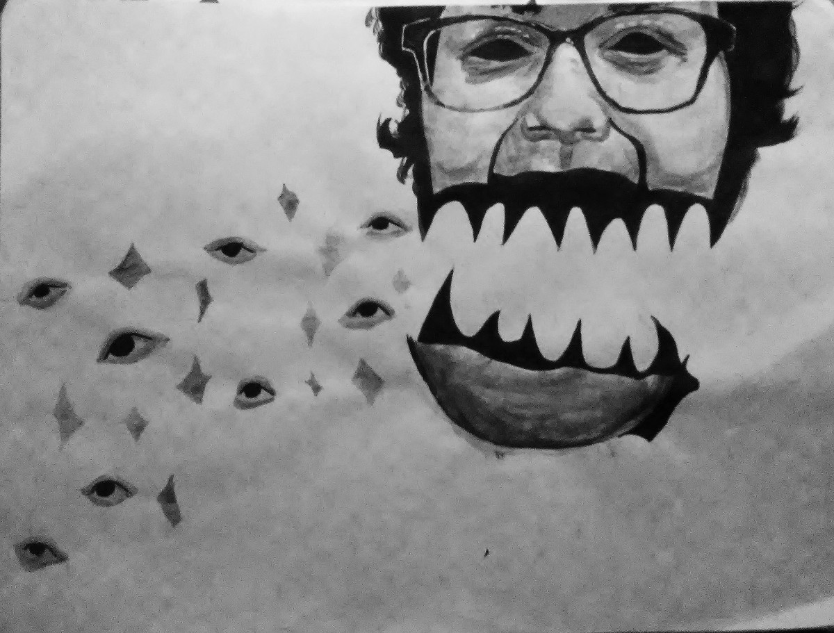
With both pictures i wanted them to be taken lightly, they don’t reflect or mean anything.
time 8-9 hours

Ways of Seeing – FYLC Fall 2018
First Year Learning Community
broad range works with Narrow low-key range .
With both pictures i wanted them to be taken lightly, they don’t reflect or mean anything.
time 8-9 hours
Broad range design, followed by Narrow (low key).
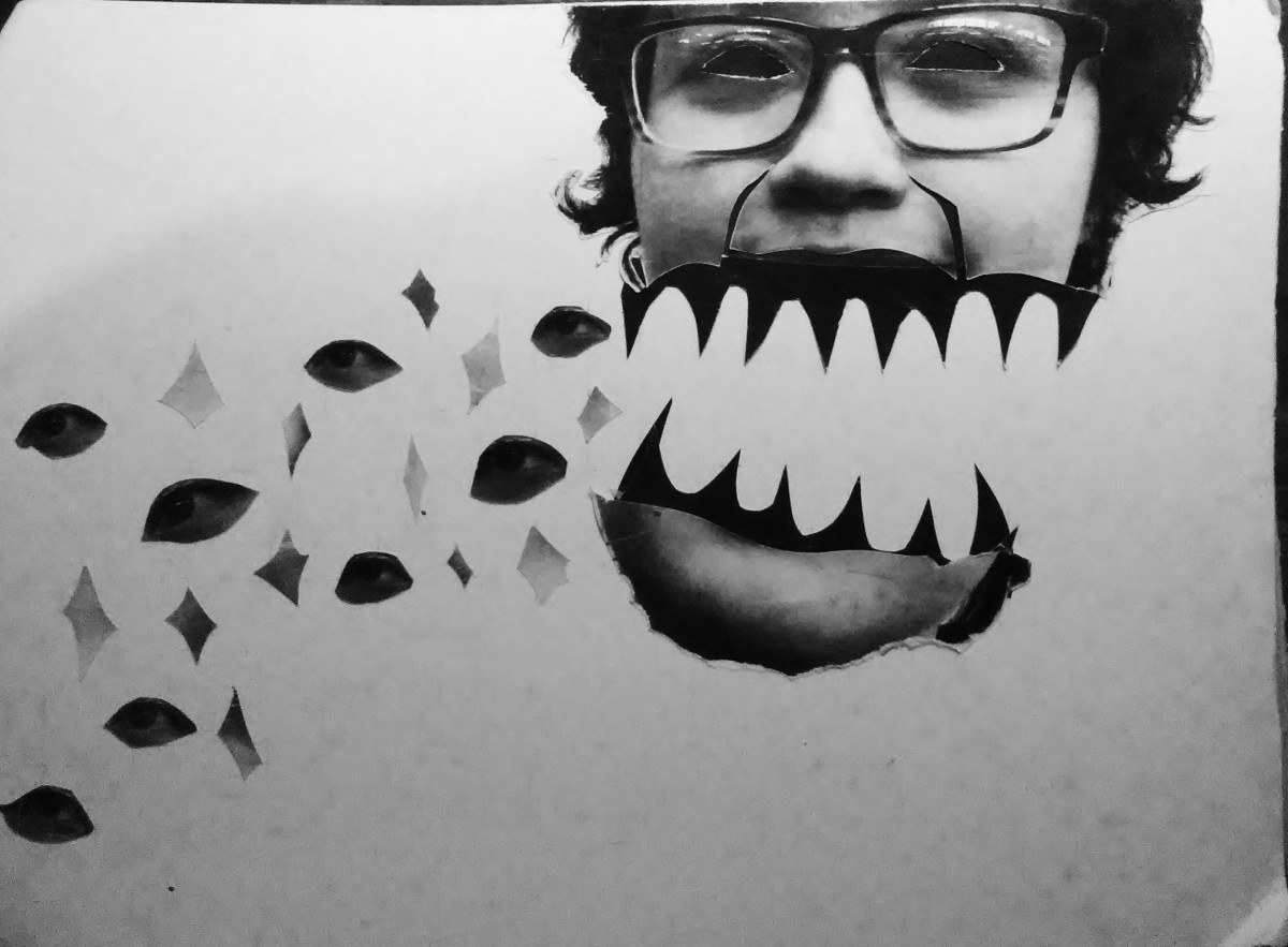
This first image was meant to be campy and more artistic, while the second piece is more grounded in reality.
hours spent, roughly 8
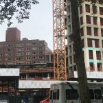
The building in the foreground, made possibly in the 1920’s, is forced to assimilate to modern day, plastered with signs and made into a retail store, while a building currently in construction, sits in the background, waiting to be completed. The juxtaposition is time, old against new
This building was constructed during the architectural period known as Art Deco or simply Deco, and is described as “influenced by the bold geometric forms of Cubism; the bright colors of Fauvism and of the Ballets Russes.” ( this is from wikipedia, so i need to change the source). This older building, and the period in which the building was constructed, was known for it’s exterior design, and every building made during that time period are easily visible, yet here we see it’s design partially blocked by signs, hiding the other decorative sculpture like carving behind it, leaving only one visible. To add onto this, just below our Art Deco building, we can see that the first floor was renovated and transformed from a time capsule into an Ann Taylor. (old building with ann taylor and the signs, why not do the whole building? are different floors owned by different people?)(elaborate n stuff) ( and add a quotation, maybe from that ny guy) It appears as though, that instead of modernizing the second floor, they did what they thought would be just as good, and plastered signs outside. But all this does is make its presence more known, it stands out even more( add on ) ( only talk about the tiny building here, compare everything there then move onto the other building) ( maybe you could even compare the art deco to Ann Taylor? for a different section. since it is the bottom half that got updated.) (so it would be building to signs. then building to Ann Taylor. then whole building to new building)
construction: which brings me to my next point, the new (yet unfinished) building in the background, looming over our older building. As i had said earlier, what reason was it that they renovated the first floor, but kept the original design on the upper level, and why not just demolish the entire things, and start over? what did this art deco building have that the newly made building didnt have, or the building that was there prior. It seems as though our shorter building, against it’s signs and first level, in addition to the new building under construction, has been left behind. Left to remain as old as it is, forced to assimilate into modern times by adding in signs, but these attempts are in vain. ( quote in here)( because its still old and i ran out of ideas ) (maybe talk about the skyscraper race, when they really wanted tall buildings, that was when the empire state building was made, and thats when art deco was around in the US, now that skyscrapers are more common the building in the background is taller just cuz)(also separate some points, like the height)
conclusion: (basically the intro, wrap it up)( i have no more ideas)
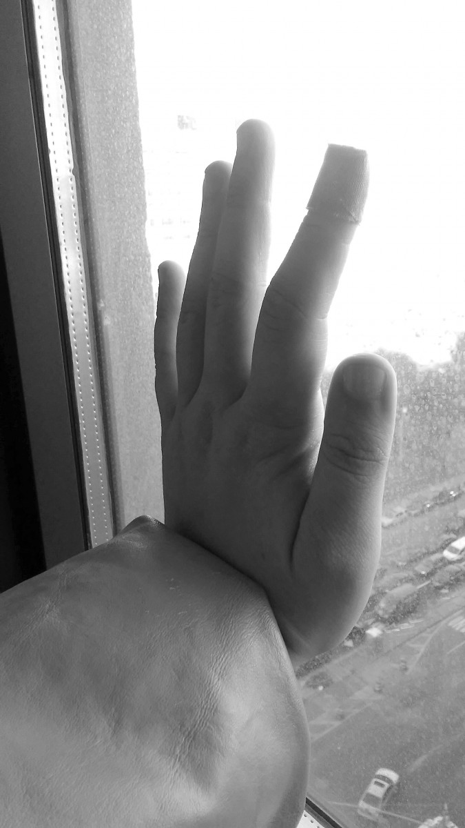
High Key image is meant to be more pale, with more lighter tones and almost has pure white in the image. This composition makes the photo look almost colder, maybe even with more added sunlight, and very little black. photo was taken underneath a bright light.
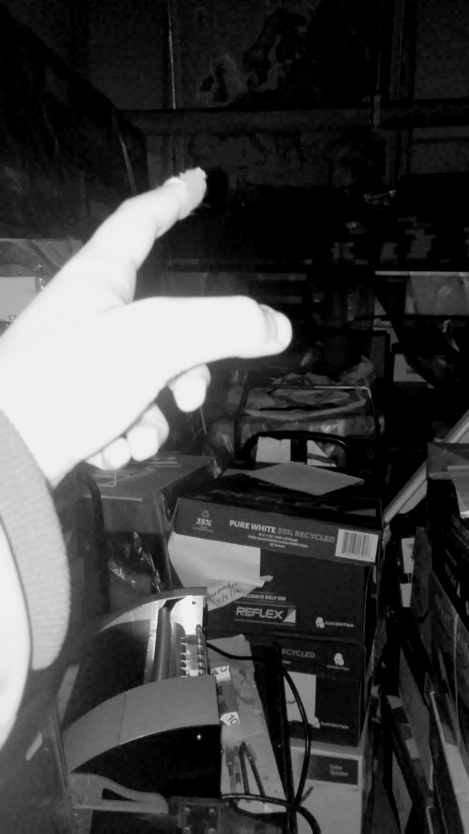
Low Key image has a bright hand in the frame, but very little white in any other part of the photo. All potential brightness is directed towards the hand. The rest of the photo is darker with tones of gray. The way this photo was lit, it gives off the impression that this photo was taken at night with a flash illuminating it.
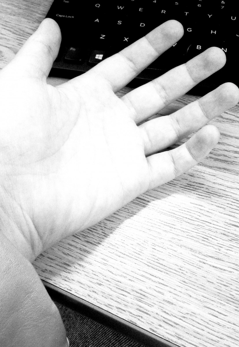
Broad Range this last photo has tones of gray, black and white mixed throughput to create a full gray scale. The palm, while not shown, is facing towards the outside, towards the light, meanwhile the back of the hand is receiving little light. This image, in my opinion, feels more natural, having the most ranges in tone, while the others feel more forced. I would say this is because having a range like this is more natural.
use our senses: what are all the different sensory experiences you have there on site? be detailed! Definitely *sight, maybe also *touch, *sound or its absence, or a soundtrack you layered on to the juxtaposition, *smell, *taste?
[think about time of day, time of year, climate, weather, etc]
Use your photograph as well as the experience of being on location
well-organized essay: organize your ideas into paragraphs!
900-1200 words: use this as a guide to get a sense of scope, to drive your revision, but not to make your language awkward and repetitive
make a claim: this is your argument. It comes at the beginning of your work (usually end of first paragraph) and you express it as a thesis statement. Then you bring your ideas back to this point throughout.
juxtapose/compare the elements: the bulk of the writing, very detailed, think about organizing your comparison into a point-by-point or block format or some combination of the two.
use 2 quotations: use these to support your claim, or to push against to make your claim. Your ideas are primary, theirs are secondary, so not in the introduction. Better to include these as you’re making your argument/doing the comparison, though there is a way to bring one (maybe both) quotations into your conclusion–this is much trickier.
You can refer to the ideas from these quotations throughout your project.
OUTLINE:
Write a rough draft of your outline of Project #3. Be as specific as possible.
Section 1: Introduction with claim
Section 2: Describe the sensory experience at the location [this could be divided into each point in your comparison]
OR describe where the location is, or where it is in relation to City Tech OR the story it tells you, OR why it’s important
Judge for yourself: how important is it to include things like 1-how to get there; 2-story it tells you; 3-why it is important to you; 4-sensory experience
Section3:(point 1) time frame of the two elements of the juxtaposition
Another possibility:
Introduction
similarities
differences
(point 1, point 2, point3, in different sections)
more about juxtaposition
conclusion
OR
Introduction
More about juxtaposition/claim (here or after more comparison) Q might go here
point 1
(element 1)
(element 2)
Q might go here
point 2
(element 1)
(element 2)
Q might go here
point 3
(element 1)
(element 2)
point 4
(element 1)
(element 2)
Draft to submit for comments (to guide future revision): 10/31
I was eager to discover the other Las Vegas, the real Las Vegas
While this quote isn’t about New York, it certainly relates to it. Vegas has the same style of flash as some parts of New York, such as Times square, and Rockefeller center, and being someones whose been to Vegas, it does feel like that there are parts about it that we as tourists should know about, things that’ll make your experience better than any gimmicky hotel ever could. When traveling anywhere there are sites you’ll see, and sites you should see. Some of my favorite places to visit in New York are many locations even other New Yorker’s don’t know about.
You start building your private New York the first time you lay eyes on it.
Every one has that one place in the city they always go to, whether they’re bored, or trying to show out-of-town relatives a good time. My personal favorite places are east 86 st. from 5 av to Lexington (also a block or so away from the MET) and the North woods (I only go at night, and i even spent my new years there, my sister and i played winter Olympics on the frozen lake). Your own personal New York could also just be your neighborhood, i was born here and still live in the same place, so these familiar locations shaped me growing up.
This paragraph stood out to me because this is my neighborhood, On 5th av is central park, but from Park av to Madison is where the railroad starts, its where this railroad starts is where this dramatic shift in income changes. But no matter where apartments or houses near parks will always cost more, and it’s almost double for getting a view of it, and while the railroad may not have any correlation to the buildings there, when ever i passed it, even as a child the change was obvious.
These three quotes all represent my New York, and how I’ve always seen it, from being flashy and maybe easy to see to my favorite locations and even the huge income gap that is clearly visible from outside my window. These quotes add to my personal New York.
To start class, let’s write about our Project #3 subjects:
Why have you chosen this subject in particular—what about it is striking to you? What story does it tell you? What would you want to know more about (although conducting this research is not part of this project!).
Jennifer Egan writes about a writing and research project in “Reading Lucy.” We can use her essay to consider how outside information can inform our writing. We can also think about how it represents a different kind of overlap and juxtaposition.
Where does Egan use outside information?
What kind of outside information does she use?
How does she incorporate it?
What is its effect?
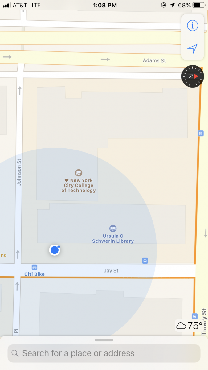
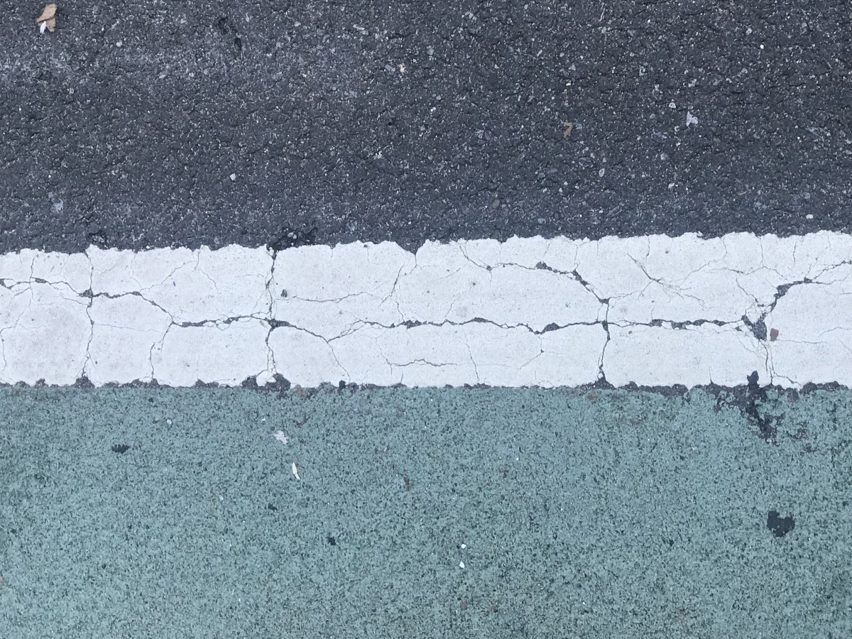
The first picture is located right in front of the school. Where the city bike rack is located. When I walked outside there wasn’t a lot of people walking around and there weren’t a lot of people on bikes. The reason I chose this is because of the contrast of people walking and riding bikes were the same, so this line represents the separation of transportation. There were people walking, driving and riding bikes, so that’s what I think the three colors represent.
I say that the paragraph describes the position of the picture because as soon as you walk outside of the building, there is a bike rack that holds blue city bikes literally a foot away from the sidewalk. Then there are plants behind those racks.
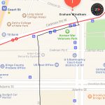
To take that picture I left the school on jay st and turn to my right and walk to Johnson st, I walk pass the big intersection( Adams st) I took a while because there were a lot of car, most of them are going on the Brooklyn bridge and i past the post office and go to cadman plz w after Adams street, Johnson st become more relax there isn’t a lot of car and it feel like a big park, there environment is calm and there are birds flying, I enter the Korean War veterans park, from the park I took the picture, the park wasn’t to big, it is just some benches , trees and birds.
The OpenLab is an open-source, digital platform designed to support teaching and learning at City Tech (New York City College of Technology), and to promote student and faculty engagement in the intellectual and social life of the college community.

