Color Harmony: Phase 4

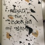
Throughout this project i enjoyed making the cover the most. I wanted to keep my book plain and simple with the colors black and white. I was inspired by my phase 2 painting,  splatter paint art.  When making it, splatting the painting the paper was the best. I tried using the colors that was given and noticed i used too much tan. I learn about monocromatics, complementary and analogous. I learned a lot about colors, before these lessons i would think a color is just color but theres more to colors than i thought.

Phase 1

Phase 2

Phase 3

Project#6 ColorHarmony: Phase 4

Project#6 Color Harmony taught me many things about the different types of color scheme and some of the methods used to achieve a certain color scheme. I learned about the Monochromatic, Angelou’s, and complementary and non-complementary or split complement color relationships.  I also learned how to Create a proportional Color inventory’s` by referencing a piece of graphic design, advertising, animation or film still, comic, graphic novel, or artwork. I took all this useful information and tried to incorporate it into my book cover as much as I could. I enjoyed working on this project a lot. I learned many useful things that will definitely use in my future.

Phase 1

Phase 2

Phase 3

Duration: 3 hours

Project#6 ColorHarmony: Phase 3

I based my book cover on the proportional color inventory I created based on the artwork inspired by the anime called Tokyo Ghoul. I originally chose the artwork as a reference for my proportional color inventory because the poster had a dark vibe or theme to it and I felt it that was because if the color used for it. And so I  chose these colors to and added them to my book civer give off the same dark vibe and I think it was a success.

Duration:2 hours

Color Harmony: Phase 3


This is my book cover.  The book name is I Heard the Book Call My Name. The original book title was called I Heard the Owl Call My Name. I written out the name instead of painting because the original book had a handwriting style. I used a bristol paper and taped and glued the cover to the book. I used the photo from phase 2 as the idea of splatting paint as my book cover. I chose this type because my pages consist of paint and its paint messy and also colors are black and white so the painting i chose was perfect and matches what was inside the book.

Duration: 45 mins

Color Harmony: Phase 4

So far, I’ve enjoy working and thinking about a design for my cover book and learning the combination and categories of coloring. I think what i did best was the cover book and it took a lot of time consuming and effort. One thing I could’ve done best is to add a little bit more on some of the empty space and try to blend in the image and the background. It’s been a pleasure working and learning graphics desgins, I’d enjoyed this class and learned a lot, I’m glad to have you as a student Pro. Specvack and hopefully I will see you around next semester any time soon. Farewell.

Phase 1 

Phase 2

Phase 3


Color Harmony: Phase 4

I learned how to use colors from another picture as a reference and the term proportional color inventory. I would have tried a third time on making the yellow look more creamy beige but at night it looked beige to me, the paint was beige too but it dried really yellow. If I had a bit more time I would have let the paint dry every night and see if I get it right the next day. Next time I might want to plan out the time it takes to paint/mix and dry so that I can see the true color once it dries before the assignment is due. Overall it was fun to paint. There’s a nice contrast because yellow and purple are complementary. I’d say the only thing I got accurate was purple and black but the beige is definitely not accurate.

Phase 1: Discover

Phase 2: Define

Phase 3: Develop

Color Harmony: Phase 3

This is my cover book for my glossary collection. The title of this book cover is called Cold Fate because the theme color of the book with the glossary cover is based on something sadistic way and it just describes the experience of someone or your lifetime. This cover book was made with white sticker tags, painted with black, blue and yellow gouache paint. One part I like about this project is the back of the cover book and there’s an angel character painted yellow, yellow represents light, hope, this psychologically fits certainly well with this angel. I also put two quotes on both the inside the front and back side and these quote are kind of like facts about our life time, experience we had all face and our coincidence.

Duration: 2-3 hours.

Phase 4: Deliver

This is project was nice change. This what I enjoy. Making projects by hand than digital. If the hold semester was like this I enjoy it more. But I have to try something new for one. And thats what this courses was trying to teach me. To get me out of my comfort zone. Trying to challenge me and make me a better artist. Art would boring if t to easy. So I appreciate this class for that.

Phase 1 

Phase 2

Phase 3


Phase 3: Develop

This is my Glossument Cover. I’m very proud of how this turn out. It reminds me of a old cook book. The blue is desaturated while the orange and purple are bright and makes the stripes pop out. I was going for a mid-evil feel with the letters in the middle and the birds at the top. I first started pastels but the pastels kept peeling off so I decided to paint the book. Best decision I made.

This took about 2 hours.

Color Harmony: Phase 2

So, this artwork was taken from a mobile game I play, then photoshop it for some essential editing and Ai (illustrator) to place every color proportion in the image which is on the bottom of the image. I decided to choose this image is for being an analogous, I think it would be interesting to see all the color on the proportion bar blend in together that will converted into a monochromatic transition, for some parts. This charcter was design and own by Blustone, VisualShowers.

Duration: 10-15 minutes.