
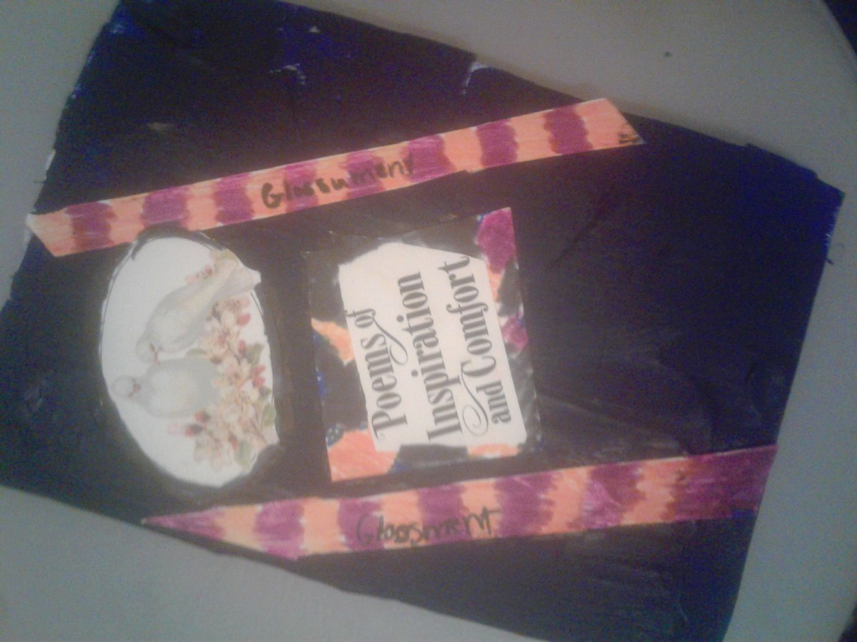
This is my Glossument Cover. I’m very proud of how this turn out. It reminds me of a old cook book. The blue is desaturated while the orange and purple are bright and makes the stripes pop out. I was going for a mid-evil feel with the letters in the middle and the birds at the top. I first started pastels but the pastels kept peeling off so I decided to paint the book. Best decision I made.
This took about 2 hours.

