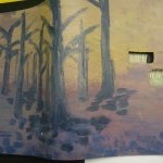
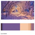
[Work in progress] Although my cover looks very muted compared to when it was wet paint, the dominant color is supposed to be the purple on the bottom. While the subdominant is the different tints,tones and shades of cream. I will be adding the cream color in the top right corner as sunlight to match the cream in my proportional inventory. The accent color is supposed to be the black tree branches which I will later cover with purple leaves so it really does look like the purple is dominant instead of the trees standing out so much. (After I waited for it to dry I noticed how off it looks so I will go back to correct the colors by tomorrow.)
About a hour


