
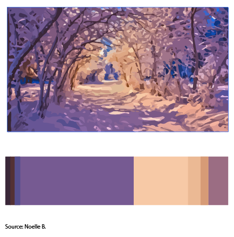
Image 2 by Noelle B
Its a picture of winter sunset. In this activity I learned the terms Dominant color(Purple tint), sub dominant cream, the accent color will be muted yellow. Color references could be utilized in future work to create a sense of harmony in the image so that it is visually pleasing. It helps balance out from an image being high in contrast or too low in contrast keeping the image interesting to look at. I’ll use this for my cover because the title contains the word joyous which I associate them with warm colors in the trees.
30 minutes

