Color Harmony: Phase 4

I learned how to use colors from another picture as a reference and the term proportional color inventory. I would have tried a third time on making the yellow look more creamy beige but at night it looked beige to me, the paint was beige too but it dried really yellow. If I had a bit more time I would have let the paint dry every night and see if I get it right the next day. Next time I might want to plan out the time it takes to paint/mix and dry so that I can see the true color once it dries before the assignment is due. Overall it was fun to paint. There’s a nice contrast because yellow and purple are complementary. I’d say the only thing I got accurate was purple and black but the beige is definitely not accurate.

Phase 1: Discover

Phase 2: Define

Phase 3: Develop

Color Harmony: Phase 3

[Work in progress] Although my cover looks very muted compared to when it was wet paint, the dominant color is supposed to be the purple on the bottom. While the subdominant is the different tints,tones and shades of cream. I will be adding the cream color in the top right corner as sunlight to match the cream in my proportional inventory. The accent color is supposed to be the black tree branches which I will later cover with purple leaves so it really does look like the purple is dominant instead of the trees standing out so much. (After I waited for it to dry I noticed how off it looks so I will go back to correct the colors by tomorrow.)

About a hour

Color Harmony: Phase 2


Image 2 by Noelle B

Its a picture of winter sunset. In this activity I learned the terms Dominant color(Purple tint), sub dominant cream, the accent color will be muted yellow. Color references could be utilized in future work to create a sense of harmony in the image so that it is visually pleasing. It helps balance out from an image being high in contrast or too low in contrast keeping the image interesting to look at. I’ll use this for my cover because the title contains the word joyous which I associate them with warm colors in the trees.

30 minutes


Color Harmony: Phase 1

Image 1 by Katy Hawk

Image 2 by Cassandra Penner

Image 3 by Noelle B.

The monochromatic one is supposed to be one color with different shades/tints. This first image is dominantly blue and contains all its shades varying from light blue/blue/navy blue. The analogous color are colors next to each other on the color wheel so in this image it would be purple/violet/red. The complementary color is colors across the color wheel so in this third image that would be violet and orange/yellow.

30 minutes


Color Interaction Parings: Phase 4

I learned how to see different values and hue changes. I could have done in terms of communication. It was a struggle to find a color that describes a partner that you haven’t really talked to. If I took more initiative to find out more I think the logo could have been created to better reflect the other person’s personality. I will apply to get better communication in my next project through actually taking the initiative to ask more questions. I applied to change the colors from both being muted to bright contrasting colors. At first, it was muted dark green and gray with a green in the middle. We changed it to a bright yellow/red and green in the middle because of green contrasts red. In the critique, I printed it out too small. I reflected the fish and then I changed the colors to create a higher value change, also a very subtle color change because there wasn’t any before. I’m not entirely sure how to make the hue change more vivid.

Phase 1: Discover

Phase 2: Develop

Phase 3: Define

Color Interaction Parings: Phase 3

Step 1 – Color Research Process.

Outgoing/Curious/Relax/Sports/ Hiphop

Step 2 – Color Mockups 

I picked the red color for my partner Olando because to me it resembles energy for sports. In the video it talks about being in a red room makes you talk more so I think red can also represent outgoing. Our shared color is green because our favorite colors are mint/lime and dark green. The green shows relaxation as well.

Step 3 –  Icon Research Process

Olando's icon
Evelyn’s thumbnails

I chose a fox to represent Olando because when I think of curious and active I think of fox’s being a hunter of some sort always moving. Besides that, a fox is generally quick when they move and that reminds me of Olando’s love for sports, the energy you can get from hip-hop, and being outgoing.

Step 4: ICON MOCKUP

This took 2 hours

Catalog Entry

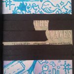
The glossument book named “The Waves – A Work of Art… Altogether Joyous and Lovely” consists of illustrations based on vocabulary words. This project is inspired by “A Humument” made by Tom Phillip. Digital artists are is used to being able to undo things simply with a command, Air E.N has reflected that this book is different due to the fact that there is no such thing as a button that will undo a mistake. Digital art is able to be kept forever since it is in the computer unless someone purposely deletes it; however, the book is fragile and can be broken since it wears off as time passes or can be destroyed in the wrong environment.

This project was a departure from the artist’s previous work which focused more on representing digital illustration based on a pre-existing concept and design rather than illustrating them through pictures and words simultaneously. The artist has previously explored character design, fashion, and color which was on digital media. Having a physical book to work with helped the artist see mistakes and the option to keep them or correct them which alters what the artist finds acceptable in terms of aesthetics.

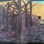
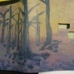
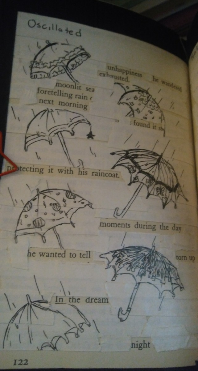
The motivation behind these pages is exploring traditional media once more and learning the aspects on how to use the materials before the artist converted to all digital. These mundane objects on all the pages, as well as the rest of the pages in the book, convey a feeling to the viewer and artist of simplicity. This could occur during work when office supplies may have been the only thing available to create art with or it could also bring them back to their childhood. There is a recurring uniformity in the way all the pages look similar, which is blackout poetry accompanied by an illustration.

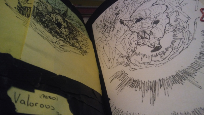
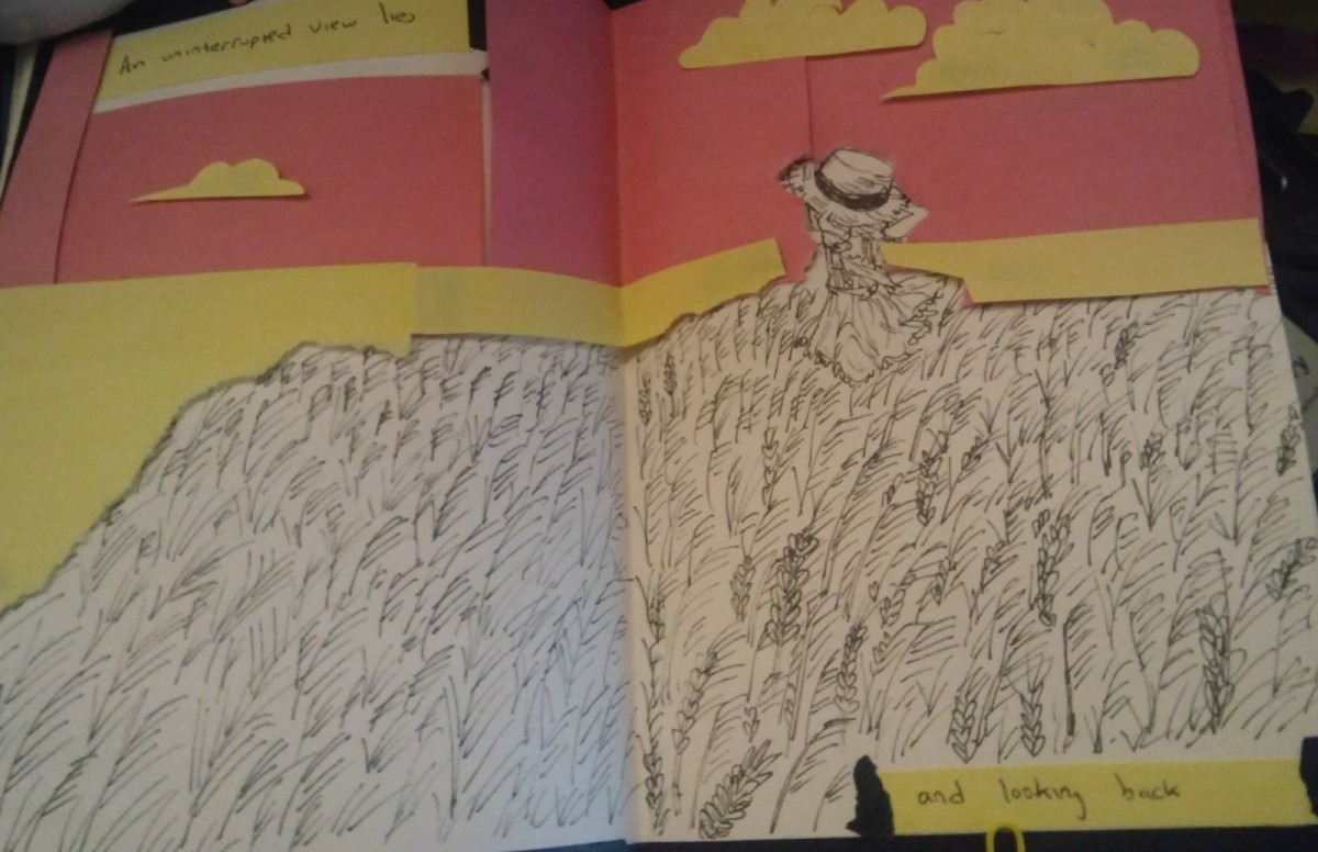
The process was taping the page with masking tape first, then choosing a vocabulary word that would fit the poem on the page, and lastly, the artist illustrated accordingly. The book ended up becoming somewhat of a picture book with a poem as the images and colors take up the majority of the page. Some of the illustrations reflects the artist’s interest such as the word Valorous representing an interest in game design and concept design. On the last page Omnipotent, it reflects on the artist’s personality of easygoing or silly. And lastly, the book itself is a collection to demonstrate the artist’s skill, style and aesthetic of everything being clean, simple and fleeting.

Blackout poetry is already a technique used as highlighted by Austin Kelon in his video “Steal Like An Artist”. What the artist took away from this video is that William Burroughs got the cut-out technique to rearrange words into a new poem idea from Brion Gysin who did the same thing out of newspapers. The central idea being that there are many artists that get inspired and nothing is truly original. This was motivation for the artist to start something imperfect and to try new things. The artist took the idea of blackout poetry and the reassembling of words to utilized black masking tape in order to black out the unnecessary words on the book. Instead of a sharpie or marker the artist chose black masking tape because it is removable. Then the illustration portion was inspired by the video “Altered Book Pages- December 11, 2013” : which is a video of a person painting a page white before adding illustration. In the glossument that the artist has made, this has a similar effect to whiting out two pages to make a spread using printer paper. 


Didactic panels below:

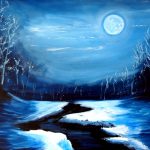
Propinquity, Oscillated, Serene, Valorous

Didatic 4: Glossument Valorous

The pages 17/18 in the book provides an illustration based on the poem underneath the post-its. The materials used including post-its was inking pens, white paper, and black masking tape. The artist’s concept to represent this word is through two people standing behind an explosion and a dragon to show bravery.

Didatic 3: Glossument Serene

The first spread of the book proves an illustration based on the poem created on the page prior. The materials used were post its, black masking tape, white paper and inking pens. The artist represents this word through a girl who’s not looking back and standing in a field of wheat gazing at the sunset at peace. The first page of the spread says “An uninterrupted view lies” making the first page consist of the sky and wheat.

Didatic 2: Glossument Oscillated

Page 19 /122 of the book provides an illustration that is based on the story created from blackout poetry. The materials used were inking pens, white/black masking tape, and paperclips. The artist represents this word with umbrellas is based on the concept that when it rains, umbrellas can be seen swaying back and forth as people walk through the city.