Field Trip

0604, SNOW STORM, 2018

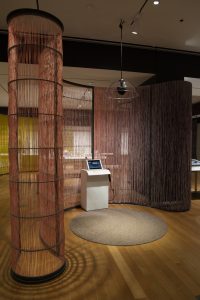
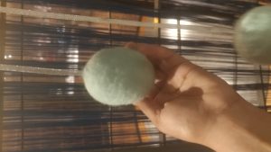
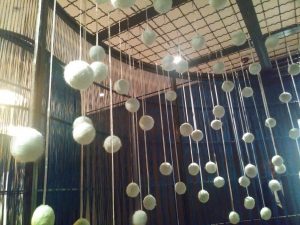
The work I found most compelling was Snow Storm. The reason why I found it most compelling was due to how they were hanging and their color. When I heard the audio I knew the snowballs would be tied up with string to be hanging down from however the size and color was something I imagine differently. Turns out it use a light teal color for the snowballs, that could also be affected by the scent that the snowballs have.

Materials for it: Wool, chimes, ribbon, scent;

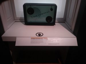
0408, Cotodama Lyric Speaker, 2016

The speaker was also an interesting one because it had to do with sound. The screen will show geometric shapes and lyrics of the song being played base on its songs characteristic, whether there’d be a hard or soft sound the lyrics and shapes would go along with it. This was interesting because it would connect with the current project that will be worked on in class.

Materials: galvanized steel, acrylic plate; Courtesy of COTODAMA and Songs, “Number One”; Performed by Portugal. The Man; “Don’t Love Me”; Performed by Janine; “Sticky”; Performed by Ravyn Lenae

Field Trip: Cooper Hewitt Design Musuem

https://soundcloud.com/cooperhewitt/0201a

I really loved this work, it was called “Portal Soundscapes”. It caught my eye when I was walking towards it because I didn’t really see that it was a speaker, it just looked like a ceiling lamp or something. I really enjoyed this particular piece because I don’t know how but because the speaker was emitting sounds above me I felt like I was really hearing these sounds in person. What I mean by that is each sound was a different place and different sounds so I felt like I was right there witnessing all these sounds, I think if I would’ve closed my eyes I could imagine being in the scenarios they put down and watching all this noise and sounds happening.  This piece was made by Shared_Studios, an organization that creates two-way audio/video connections between dozens of cities around the globe. Made in 2018.

https://soundcloud.com/cooperhewitt/1201a

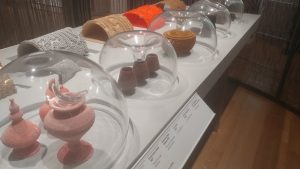
I think a lot of people missed this one, it was one of the works that had to do with smell. There were five glass domes that had those little cups that had a particular scent to them. These glass domes had a tiny indented opening that would allow you to sniff, I think a lot of people didn’t really like the smelling pieces, even though there were a lot of them. This piece was made by Ronald Rael and Virginia San Fratello in Oakland, California. Made from 2015–17. Everything was 3D-printed.


Class notes from 9/26

Reflecting on “Our Senses”:

1-In a focused free-write that your classmates will read and respond to, write about your experience of visiting the Cooper Hewitt Museum for our field trip. Your response could

  • focus on one aspect of the exhibit
  • focus on the experience of visiting a museum
  • focus on the experience of learning outside of the classroom
  • compare your experience to another experience at a museum
  • compare your experience to learning in the classroom
  • something else.

2-Comment on the response passed to you. Do this by

  • adding to what the author wrote, or
  • contrasting what the author wrote, or
  • a little bit of both
  • or, ask questions for clarification, for provoking thought, for getting the work back on track.

3-Comment: did the comment add to your understanding, thoughts, the conversation? Was it helpful?

4-Comment as for Comment 2

5-Comment: what in the initial freewrite worked well, and would have made for a better start to the conversation?

  • getting specific would be helpful (eg, what senses were engaged)
  • more detail
  • more connections to outside
  • more comparison across works in the exhibit or across exhibits
  • more versatile: more instruction, ask writers to do more in their posts
  • ask questions

6-Comment: what in the comments worked well, and what would have made for a better continuation to the conversation?

  • ask more questions
  • variety in questions, responses–don’t repeat what someone else has done
  • more controversy! drama! push more!
  • come back to and look forward to all of our materials and experiences


Field trip to Cooper Hewitt Design Museum

The New exhibit at the Cooper Hewitt-The senses, features many works incorporating our five senses into design elements of everyday objects, such as clocks for the visually impaired, and food bowls for those with Alzheimer’s.

While trying to fully admire each work and making sure to keep a slow pace, i came upon one work entitled “Taste of Music (1002)“designed by Bruno Mesz, made in 2011. The work featured a set of black speakers, each tucked into a corner of the window sill it rested on, with a description before it, reading “Four buttons play short musical compositions inspired by the sense of taste”. After i pressed the first small white button labeled sour, what came was a series of notes that i thought maybe could represent sour to the artist. This work compelled me because of how subjective it was. In other pieces i saw, they mostly relied on touch, sight, or audio, but what this piece does is different, it tries to take something we taste and translate that into audio, which in my mind, doesn’t work. When you’re first introduced to it, you are immediately given a name to the sound, in a way its almost saying “this is sour, and that’s a fact” or “this is what sweet sounds like” and the audience is expected to go “that’s right!” but that isn’t how it works. It would have been better to have the viewer decide for themselves what sound goes to what taste, or even make it a surprise. But yes, i did enjoy this particular work, to create something we taste into a piece of audio is hard, and i’m sure to some the artist really captured the taste.

Another work i noticed at the gallery was a large textured canvas, maybe 4ft by 2 ft “Organoid Organic Rose Blossoms Wallcovering, 2016″, by Martin Jehart, made up of flower petals, and Alpine hay mixed with herbs (not specified which herbs). From afar it just looks like a textile pattern, but when getting up close, you can smell the aroma of said flowers and herbs and alpine. I thought this piece was, to put it simply, really pretty. I thought the idea of introducing a natural aroma into a room, which source was more organic than a tin can spraying chemicals was very eco-friendly. However i noticed some of class mates weren’t really observing this piece as much as i was,  not that that’s a bad thing.  Maybe to them, it was plain. Or it wasn’t really breaking new ground, which might be true. But i found the use of flowers and other natural smells, especially in a large frame, was very welcoming and beautiful.
Field Trip Cooper Hewitt Museum

According to some research I did, An overhead speaker plays sounds collected from cities and locations around the world. The piece was created by Shared_Studios, an organization that creates two-way audio/video connections between dozens of cities around the globe. This caught my eye because the phone like gadget was like a way to hear different sounds from different places. I also felt as if some people might have skimmed through this but it was very interesting.

According to some research I did these, Two circular pods are attached to the table. Touch the pods with both hands to feel music as vibration. Vibeat was designed by Liron Gino, a graduate of Jerusalem’s Bezalel Academy of Arts and Design, Israel. This particular design caught my eye because it was very interesting to me. The setup was kind of weird because I first I thought it was a portable charger but it turns out its some kind of gadgets that vibrates sounds when they are touched.

Field Trip

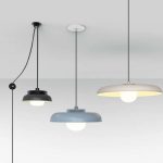
I found this compelling because the lights changes from a bright blue to a warm yellow. The light colors changed when standing under it. The light’s colors can affect our mood and feelings. A bright blue would mean we are awaken and warm yellow would mean we are tired. The materials used to create this was light emitting diodes, aluminum, and glass.

Rich Brilliant Willing (New York, New York, USA, founded 2007)


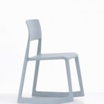
The chairs are designed for use in schools. Apparently these chairs are to help students sit with their spines straight. This is compelling because its similar to a rocking chair and its pretty comfortable for my back and does not make any noise. Too bad we don’t use these in school. The chairs are made from Polypropylene and polyethylene. (Plastic)

Designed by Edward Barber and Jay Osgerby, Barber & Osgerby.


Field Trip to the Cooper Hewitt Design Museum

The first design that I think I found it compelling was the Tactile Orchestra 2017-2018 designed by Roos Meerman because it was a wall made out of black fur and as you are feeling it and moving your hands around it make this sound of a playing string instrument and depending the motion of your arms it plays it how smooth or fast you’re moving. Roos Meerman is the designer for the tactile orchestra and was founded in 2014. This art work was made from man made black fur and a sensor behind it that plays string instruments orchestra.

Another design that I think it was compelling as well and I don’t think many people had the chance to see it or understand what is was meant for is the ostrich pillow, 2012 deigned by studio Banana because first of all, it’s a pillow for people who often sleep on desks (which I might be interested of getting one for myself) and second it has this funny cubic shape form. It’s an unusual pillow that I don’t get to see it every day and the way it is properly use is you literally have to wear the pillow on your head and face. There are four hole in this pillow, the bottom is to insert your head into the pillow, the front has a big hole that exposes the mouth and nose for breathing comfort and both left and right are for your hand where your head will be resting on. It’s a very cool accessory for everyone to have and I think it will be a good use for college student who likes sleeping on tables.  Ostrichpillow was design by Studio Banana and founded in 2007.

Field trip

These two images were for your sense of smell. For the first one ,you would be able to smell for example, cotton candy, coffee, and chocolate. I really like this one because the smell was accurate and it brings back memories. The second one was these cotton blue balls dangling up from these silver fabric and that when you touch it, it’s soft and it has a bell inside when you shake it. Also when you smell it ,it has this nice pleasant smell almost like the smell of fresh laundry.

Field Trip Cooper Hewitt Design

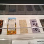
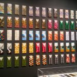
The one work I found compelling is “1001, COMPARTÉS CHOCOLATIER” because the chocolate was so beautifully packaged and had colors one wouldn’t normally see when purchasing a bar of chocolate. Description: A wall of chocolate all packaged differently every 4 to 3 chocolate bars. They are very colorful with green, blue, and mostly red patterns. Some of them have images such as a grizzly bear riding a wave or two legs with red heels. On the bottom of the case, there is chocolate with nuts, white and brown chocolate with a diamond design, pastel purple chocolate with a black splatter, and two more at the end which I’m not exactly sure what they are. Source: (Jonathan Grahm, Courtesy of Jonathan Grahm)

The medium used for this was handmade chocolate bars and packaging

The work I think classmates may have missed is “1203, ORGANOID ORGANIC ROSE BLOSSOMS WALLCOVERING, 2016” Because it looks like a regular wall but it is actually petals, herbs, and flowers pasted on the wall with slight texture. The scent is faint but it smells like rose tea. Description: A wall divided in three that reach almost the ceiling in pure red that you need to go closer to notice that it is created from multiple petals. It feels rough almost like dried paint but mostly is quite smoothed out like a normal wall with patterns on it. It almost looks like wallpaper if it wasn’t for it being divided. Also, it was at the farther end of the room where there were rocking chairs which almost seemed like just an info center about layouts and blueprints. Source: (Martin Jehart, Organoid Technologies Gmbh)

The medium used for this was “Alpine hay, rose petals and buds, self-adhesive foil backing” (Description)


Field Trip to the Cooper Hewitt Design Museum

Homework:

After visiting “The Senses” at the Cooper Hewitt Design Museum, we all will have encountered works in the exhibit. But we will have experienced them differently! Let’s crowdsource a tour of the exhibit, focusing on what stood out most and what might have been overlooked.

Post the following:

  1. the name and a  detailed description of the one work you found most compelling and why
  2. the name and a detailed description of one work you noticed that your classmates might have missed
  3. photos of each of the two works
  4. name of designer/company for each
  5. date for each
  6. medium (materials used to create the work) for each
  7. choose the category Field Trip and the tag “Our Senses” so we can showcase our tour (and to get credit for your work).

Don’t forget to comment on at least 1 other student’s post. These comments are your chance to add to the tour your impressions and observations of the works your classmates chose to write about.