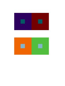
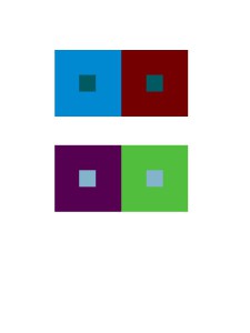
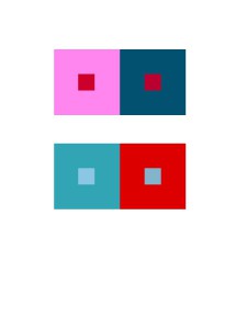
Color Interaction Pairings: Phase 2

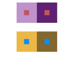
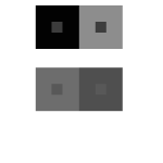
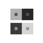
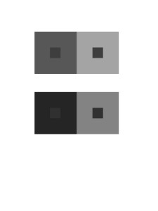
Group 1: Shifting Value
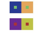
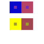
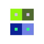
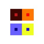
Group 2: Shifting Value in Color
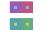
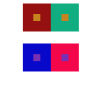
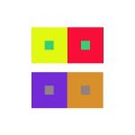
Group 3: Shifting Hue, Not Value
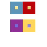
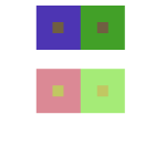
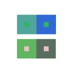
Group 4: Shifting Hue and Value
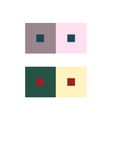
Extra Credit: Making Two Different Colors Look Alike

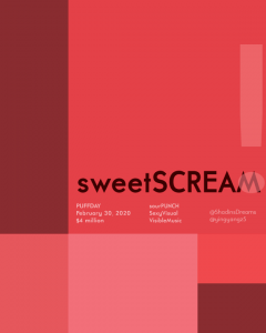
According to this project, I learned different compositions will give us different visual effect. Warm back layer gives an effect of pumping out the composition that over it. Cool back layer opposites that, it gives an effect of inward zooming, like a 3D tunnel. Also when you put the same color on both cool and warm back layers, you will see two colors that exactly same will became two different colors, which called simultaneous contrast, an interesting effect tricks your eyes. I think the most painful part is when you are up on group 4 and extra credit part, because you have already stared on compositions with simultaneous contrast for long time, so the illusion may caused headache and eyes damage. It decreased my concentrations a lot, therefore this part is the best part to challenge yourself as a designer.

I spend around 5-10 minutes on each pairs
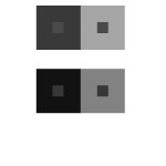
Color Interaction Parings: Phase 2

For this project, I had confidence on how to use hue and values to create this type of illusion. Each pair of small and big square/frame contains the difference in value or hue that made tricks on our sights. From our learning from the last project, I learned that our eyes does not capture a light spectrum that is emitted from the color that is actually there. With the help from value in Photoshop, I was able to create this interesting art. It took me about about ten minutes plus five minutes, because I wanted to check in with my professor if I was on a right track. With the knowledge of Photoshop from my Raster and Vector class, it made me easier to work on it and was able to help others with this project.

Color Interaction Parings: Phase 2

achromatic gray studies with shifting values.
color studies with shifting hue and value.
color study interactions with shifting value (in color)
color studies with shifting hue, but not value.
color studies with shifting hue, but not value. 

I learned how to manipulate a color using its surrounding. There are many ways to achieve different effects. Such examples are shown above, you can have a change in hue, value, or both. Color is associated with psychology just as much as it is to art. Our eyes see and brains perceive so I’ve learned how to really observe and see color. I am able to see the effect but also notice it is the same color at the same time. The time taken to complete this was about an hour.

Simultaneous Contrast

First Image
Second Image

In the first picture, the red dots are being contrast. on the right, the red looks saturated because of the surrounding grays. On the left the dots look really bright and pure. However both red are exactly the same. In the second image the triangles are fading away on the right side while you can clearly see it on the right side. The green triangles are being simultaneous Contrasted.

Simultaneous Contrast

color-wheel-interpretation simultaneous-contrast-2-small-web1

https://kayreincolor.files.wordpress.com/2012/10/color-wheel-interpretation.jpg

https://nelldart.files.wordpress.com/2012/03/simultaneous-contrast-2-small-web1.gif

Same color has different appearance of value on the top of different backgrounds. They gave us a illusion of when it on the top of a bright layer, it looks it has a lower value. But when it on the top of a darker layer, it looks it has a higher value. This phenomenon is called simultaneous contrast. Two images above are the examples of it. Do you see the difference between the colors?

Simultaneous Contrast

Simultaneous Contrast 1 Simultaneous Contrast 2

(Click here for link to the first image. Click here for link to the second image.)

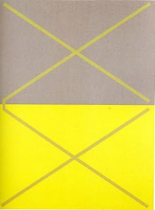
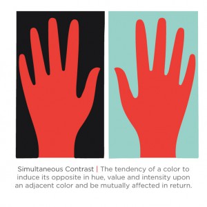
From what I’ve observed, these two images show interesting simultaneous contrast. In the first image, the lines are the same color but with the surrounding gray and yellow makes the lines appear as the colors are switched. The lines in the yellow box are gray while the lines in the gray box are yellow. In the second image, the surrounding colors are like in the first image( in a that they are different colors from one another). But the red hand in the black box appears to be lighter while the red hand in the blue box looks darker.


Simultaneous Contrast

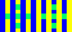
Stripes

This website is called, Color Cube. It shows the example of simultaneous contrast where it has a variety of affects on our sights. When different backgrounds or patterns are framed by the identical colors, it appears to shift. The example follows this instructions, “The diagrams below feature two sets of identical green squares within a striping pattern. Do the colors on each side of the stripes appear different? In each case, the squares on the left side appear darker and the right side appears lighter. View the images from the side of your monitor to exaggerate this effect.”

Link: Here

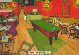
Van Gogh: Night Café in Arles

Next website is called, Color Vision & Art. This website explains many famous paintings that shows examples of simultaneous contrast. “Two colors, side by side, interact with one another and change our perception accordingly.” This quote also explains very well about our perception of our sights. As we read further down, it explains each art that is posted online. Different art has different type of contrasts that the artist shows the viewer, which it explains how, “Simultaneous contrast is most intense when the two colors are complementary colors.”

Link: Here

Color Interaction Parings: Phase 2

Group 1 – Achromatic gray studies

Group 1 Chromatic Grays

What I learned on this group is, it was easy to see a difference because I was only working with grays. There wasn’t a lot of options to choose.

Took about 10 minutes.


Group 2 – Shifting value (with color)

This group was a little tricky to create because of the value options. But with many tries, this is what I came up with.

Took about 25 minutes, because I had to experiment a lot to get what i was looking for.

Group 3 – Shifting hue, but not value

This group was easy to create, I first chose a color and the chose another another hue by sliding the hue bar up and down util I see a difference in the middle square.

Took about 10 minutes

Group 4 – Shifting hue and value

This group was also easy to create, I first chose a color and the chose another hue by sliding the hue bar up and down and then I changed the value until I see a difference in the middle square.

Took about 10 minutes.

Group 5 – Extra Credit

Group 5 - Extra CreditThis group was very difficult because I had to keep changing the colors so that I could make the middle squares look alike.

This took about 30 minutes

All took about an hour and half to create.