Color Harmony: Phase 4

This project was the final one for this course and shortest one that I had to complete. Overall for this project I learned about color harmony which was making colors together. I had to create a split-complementary palette and an analogous palette which were two types of color relationships. Then my class went on a trip to the Cooper Hewitt Museum where we had to find references for our book covers that we had to make for our humument books. The hardest part of this project was finding the right poster to use for the Color Proportion Inventory, which was another assignment we had to complete. The poster had to have a dominant color, sub-dominant color, accent, and a tint or shade. The poster also had to relate to the theme of our humuments. There was a lot of experimentation done with color and I had fun seeing different types of combinations.


Color Harmony: Phase 3

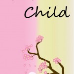
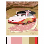
After going on our Cooper Hewitt museum trip, I chose this digital painting( Kabuki Theater Poster) by Ellen Mon Lee because I love the color palette, the Japanese influence and being underneath a cherry blossom is soothing. I thought this would be a good inspiration behind Glass Child because the theme of this book is tranquil and slice of life. The total time to complete this process was 6 hours.(Source)


Glossary Journey

Aft

Anomalies

Contemporary

Deterrent

Hokum

Memorabilia

Misanthrope

Ordain

Perilous

Prodigious

Sensationalist

Superfluous

Theologians

Vice

Zany

While working on this glossary throughout the course I noticed there was a lot of words I felt I knew the definition to. In reality if I was to be tested on those words I would’ve probably failed. Some of these words that are listed I had that feeling of maybe knowing  what it meant. The other words I just didn’t know What they meant or it was my first time encountering the word. Before I posted my word on to the glossary, I would look through the dashboard to see if it was already claimed by another student. Some of these words that I’ve encountered had multiple definitions so I gave all the definitions but stated which definition was related towards the text that I found the word in. For every word, I gave my understanding not only in the word but also in the author’s text. With this glossary, it made me really think about the words I don’t know instead of just giving up on them because I did not know their meaning. I believe the words I searched for not only helped expand my vocabulary but also helped out my fellow peers. Every time I would see my word on the glossary I would have another word I could learn its definition. This glossary project made the learning of words feel like a community. Each week there was a new word to be learned, not only from me providing a word but the other students providing their words as well.

Zany

noun

  • a subordinate clown or acrobat in old comedies who mimics ludicrously the tricks of the principal

  • :  a slavish follower

  •  :  one who acts the buffoon to amuse others :  nut, kook

Source:http://www.merriam-webster.com/dictionary/zany

I came across this word in the reading excerpt, “A Picture Of Language: The Fading Art Of Diagramming Sentences” by Juanna Summers. This word can be found in the sentence “If you weren’t taught to diagram a sentence, this might sound a little zany”. The sentence before says ” But sentence diagramming brings geometry into grammar”. I believe this word is being used in descriptive terms of foolish or crazy like a nut or kook. The author is saying that the idea of diagram sentence might sound crazy because it’s in a different format that not everyone is use to learning about sentences.

Memorabilia

noun

  • objects or materials that are collected because they are related to a particular event, person, etc.

Source:http://www.merriam-webster.com/dictionary/memorabilia

I came across this word from a link we was going over in class (click here for link). This word can be found in the sentence “Of all the civil rights memorabilia I’ve collected over the years, the Emmett Till material upset my kids the most”. My first impression of this word was that it had something to do with memories. Technically this word is related to memories but more towards a particular range of memories. From learning what memorabilia meant, this sentence is saying the Emmett Till memorabilia was upsetting to the author’s kids since the kids were around Emmett Till age. The case of Emmett Till was a tragedy about a fourteen year old boy who was lynched because he whistled at a white girl.

Deterrent

adjective

  • serving to deter.
  • Deter(noun):  to prevent (something) from happening

Sources:http://www.merriam-webster.com/dictionary/Deterrent

http://www.merriam-webster.com/dictionary/deter

I came across this word in the reading excerpt, “A Picture Of Language: The Fading Art Of Diagramming Sentences” by Juanna Summers. This word can be found in the sentence “In 1985, the National Council of Teachers of English declared that “repetitive grammar drills and exercises” — like diagramming sentences — are “a deterrent to the improvement of students’ speaking and writing”. From learning what deterrent meant, this sentence is saying that repetitive grammar drills and exercises are preventing the improvement of students speaking and writing skills. It seems as though there’s no expansion of learning happening if students are being taught the same over and over again.


Contemporary

adjective

  • : happening or beginning now or in recent times

  • : existing or happening in the same time period : from the same time period

Source:http://www.merriam-webster.com/dictionary/contemporary

I came across this word in an article my fellow peer posted in response to the article about Emmett Till (click here for the link). It can be found in the sentence “Chris Metress, the editor of “The Lynching of Emmett Till,” a book that includes contemporary news accounts of the killing and trial”. I thought this word meant in a short amount of time. Contemporary to me felt like a word I would know since I’ve heard it a lot of times but I was wrong. From learning what contemporary means, it now makes sense that the book The Lynching of Emmett Till is talking about today’s news about the tragedy that happened in the past.

Color Harmony: Phase 2

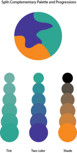
Split-complementary palette
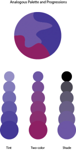
Analogous palette
Analogous palette

In this phase I learned about more behind color by learning about color harmony. When certain colors are together it feels as though it’s very pleasing. Colors can be harmonious in terms of shading, tints, compliments, tone and gradient. For the split-complementary palette, I had to choose one main color then choose two colors that is on either side of its complement. I chose orange as the main color while blue-green and blue-violet are the other two colors. For the analogous palette, I had to chose colors that were adjacent to each other on the color wheel. In this case I picked red-violet, blue-violet and violet. It took me 2 hours to complete this phase.


Exhibit Catalogue (Final)

The artist Brandy Ortiz was born on 1997 in New York, NY. She currently lives and studies in the city she was born in. She was inspired by the works of Tom Phillips in his A Humument book to create compositions that combined linguistic language and art into three pages of her vision. Tom Phillip was an English artist who purchased a cheap book to use as the basis of an art project known as A Humument. Behind his artwork,  he paints, collages or draws over the pages, leaving some of the text peeking through in serpentine bubble shapes, creating a found text with its own story, different from the original. Ortiz made compositions with themes that juxtapose from the original theme from the novel Brimestone by Douglas Preston and Lincoln Child. While Brimestone theme was thriller, the artist decided that her artwork known as Glass Child would have a softer tone. Within her creation of Glass Child contains Ocean Breeze, Picture Perfect Family, and Love Exists, which are different representations of the gentle theme behind Glass Child  .

Ortiz used Pigma Micron Pens(0.2, 0.5 and Brush), Faber-Castell Brush Pen, pencils(HB-6B) and a pair of scissors as her materials for her artwork. For her first design, Ocean Breeze, she shows a silhouette of a boy relaxing in a beach setting with the sun rising. She first made outlines of the boy and the waves by using the micron pens. Afterwards she used the Faber-Castell Brush Pen to ink the ocean and the sun. The top half of the page is left blank creates positive space while the inked image within the bottom area creates negative space. These spaces create a figure and ground relationship due to the equal amount of negative and positive space. The revealed message that the artist created says “Cool dawn air. Hear the surf thundering. Smell the salt air of the invisible ocean beyond”.  The boy in the image feels the cold breeze from the sea as the sun is rising. He hears the rippling waves thrash against the sandy land only to be pulled back into the ocean once again. The thrashing of the waves creates the smell of the salty air. He is taking in the different sensations that are happening around him.

For her second design, Picture Perfect Family, she first creates an outline of a frame within the margin area of the page with the micron pens. Next she uses the Faber-Castell Brush Pen to black out the rest of the page leaving out the frame and the revealed text. The revealed message that the artist created says “Family and friends perfectly never changed. Countless dinner parties, weekend parties, living room”. The message conveys a family that enjoys getting together for parties in their living room. A frame is a boundary made from either a rectangle, square or circle that is placed on the edges of the paper or the margins drawn within. The concept behind the frame was to transform the text to make it look like a family portrait since the idea behind the message was family gathering.

For her third design, Love exists, she used scissors to cut out pieces of the page to reveal words from other pages. Instead of blacking out the page to show her message, Ortiz creates a message from cutting out certain words from various pages to show all on one page. The revealed message that the artist created says “Love was fantastic to obtain in the vast world”.  The artist made a heart in the lower left corner of the page while everything was shaded by pencil to show low key, in which the values of the image is predominantly dark. The heart shows that love will always be there even when surrounded by this darkness. The idea behind the message was that love is a great feeling to have in the world we live in.

With her vision behind Glass Child, Ortiz wanted to show her ideas of different messages through the language and the art she depicted. The title of the artist’s humument is a piece of alternated text much like the pages inside. Glass Child was made by picking out letters from both of the author’s names behind Brimestone. The work of alternated texts along with visual images creates a new story from a preexisting one. It creates more room for stories that have yet to be told as the original source is left as inspirations behind those stories. Whether it be about relaxing, family gathering or love; each page correlates back to the original theme of Glass Child.
Color Interaction Parings: Phase 4

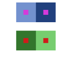
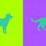
For this project, I learned about simultaneous contrast. Simultaneous contrast is when you have to colors next to each other one of the colors change due to the contrast between the colors. In class we had to go through four studies (shifting value, shifting value with color, shifting hue but not value and shifting hue and value) of changing colors with simultaneous contrast. This was really fun to me because of the way the the middle color that was being surrounded looked like a completely different color. It was like an optical illusion and my eyes felt like they were zooming in on the color which was pretty cool. After getting through this phase the next step was to partner up with someone and create simultaneous contrast with colors that best represents our personalities. As a bonus, we also had to create logos for each other that represents our personalities but at the same time both logos had to be similar in a way. Not only was it fun getting to know my partner but the research in finding colors that represents different traits was fun as well. The challenging part for me was coming up with cohesive logos. I believe it was hard because there was a lot of different traits deal with so it’s was hard finding that one thing that represents everything. For the next project, if it deals with logos what I’ll probably do is do more research on how to create logos so I can have an easier time with that part.