Juxtaposition


To take that picture I left the school on jay st and turn to my right and walk to Johnson st, I walk pass the big intersection( Adams st) I took a while because there were a lot of car, most of them are going on the Brooklyn bridge and i past the post office and go to cadman plz w after Adams street, Johnson st become more relax there isn’t a lot of car and it feel like a big park, there environment is calm and there are birds flying, I enter the Korean War veterans park, from the park I took the picture, the park wasn’t to big, it is just some benches , trees and birds.


Project 3 : Juxtapositions

If you keep walking straight past the family court and the Starbucks, you’ll find the subway station. I took this photo at the ACF station. I noticed on my way there people were buying food at the Nathan food stand and cars were trying to come out of the parking lot. It was noisy because it was a street full of people and the area near the train station was closer to a shopping area so naturally, it’s a busy street. I chose this photo because the back clearly shows a more “modern” or clean building in the middle of much older buildings that have stains on them. It is also the tallest building compared to the small pizzeria shop. The glass reflects much more light compared to the foreground of this image which already gives the building a much more dull look.

“Thousands of people pass that storefront every day, each one haunting the streets of his or her own New York, not one of them seeing the same thing.” The Way We Live Now: 11-11-01; Lost and Found

“One day the city we built will be gone, and when it goes, we go. When the buildings fall, we topple, too.” The Way We Live Now: 11-11-01; Lost and Found

Project #3: Juxtaposition

To get to this building i exited through Namm Hall and made a sharp right turn down jay street, kept walking straight, past the train station and stopped at the end of Jay street. From across the street i could see this building.

Considering how busy Jay street is, it was loud, kind of hot and smelled strange. But i had seen this building earlier and it caught my eye then. This building was erected during The famous Art Deco era in american architecture (during the 1920’s), There signature style is vertical lines, and arching shapes. Examples of other building created then are The Chrysler building, The Empire state building and 30 Rockefeller Plaza.

What made this Building stand out to me was the fact that it was Art Deco, and covered in signs, taking away some of the buildings design, and blocking it. The old 1920’s design with modern day hygiene signs, and above an Ann Taylor, it looks ad if it’s almost forcing it to be more 21st century.

Sound Visualization Mashup: Phase 1

Gggg

Time: 40 min

As I play the song the first sound I hear reminds me of steel drums or steel pans being  played gently, giving off a sort of mellow vibe. It kind of reminds me of the beach during a summer day. Next  you here one single beat , and at the same time a  you can hear what I think Sounds like a high pitched Kazoo echoing in the background and Childish Bambino begins to sing. As Gambino sings, you hear the  Kazoo like sound played a few times  through out the song and and what sounds like Maracas. After 1 minute and 18sec into the song you hear a beat played repeatedly to create a rhythm and all the previous sounds heard at the beginning in being played in the background. All of these sounds are played together as one throughout the whole song.

In my sound representation  drawing, the zig zagged lines with circle or ovals represent the steel drummed like sounds. The zig zag lined kind of follows the rhythm if the steel drums. The sort if squiggly lines that go up than down represents the Kazoo like sound that when played was high pitch but towards the end kind of dropped a little. The circles represent the different beats played throughout the song. And the tiny triangles seen at the top of my sound representation represent the Maracas  played a few times in the song. All of these sound were chosen by the artist to give off the summertime like vibe.

Childish Gambino – Summertime


Elicited

verb

“to call forth or draw out (something, such as information or a response)” Merriam-Webster dictionary

The sentence this word was encountered was “How better photos can help you document, and shape, your neighborhood” by Patrick Sisson

The sentence this word was used in is “Part of the beauty of this book is that it was written at a time when smartphone photography is getting better and more common and relevant. It really works well with the book’s focus on crowdsourced and elicited photography. ”

The author used this word to talk about how he takes photos or what he looks for in a photo. In the section before he’s describing how he chooses the images he takes and reveals that he normally takes photos from Paris. Because Paris has a lot of history and old buildings and also because it’s popular for one thing one can argue that maybe people don’t notice the changes happening in Paris which then brings photography to reveal things that aren’t normally seen. This can give us information, or a better look at what Paris is like through daily life and neighborhood is like.

Definition

Sound Visualizations: Phase 2

The crosses represent the piano followed by more notes and the strings represent the violin in the song that gets louder eventually overwhelming the piano. I worked about 40 minutes with the scan.

10/10 Project #3: Juxtaposition

The first and second image was taken in the Korean War Veterans Park (address: 277 Cadman Plz , Brooklyn, NY 11201) and it’s a 5 minutes walk from City Tech to this park. To get to this destination from City Tech is first it’s recommend exiting from the Pearl Building, next make a left until reaching Johnson St then make a right to Cadman Plz W and the park is on your right. This is a memorial park for the veterans that fought during the Korean War and pretty much there’s trees covering from the sun, pigeons everywhere on the grass land and people sitting on the benches. It’s pretty empty because since it’s a ceremony for the veterans, it deserves to have some space and respect. In the first image, it is a pole that has a sign on the bottom saying “To Honor All Who Served Korean War 1950-1953.” The second image is similar to the previous image and it’s a sign that pretty much says the same quote with more details which is actually right in front of each other from a close distance.  I decided to choose these two images and identify them as a juxtaposition because both images are signs that relate to the atmosphere of the park and share the same perspective.

Project 2: Avatar

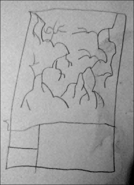
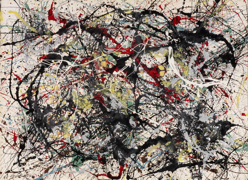
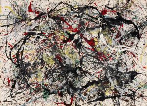
Hello, my name is Veronica.  My major is Communication Designs, and I am specifically in this major for photography. The reason why I chose this painting by a famous New York City artist Jackson Pollock because I love the idea behind it. It’s chaotic with no thoughts or idea. It’s almost like the artist didn’t plan it, it just happen. He wasn’t thinking or contemplating. He allowed his hand to guide him and which that, this master piece as been made. I like how this art shows there’s no rule or order. That the artist didn’t have focus on a subject or object and just simple copy it.

It came from his imagination where something was going to be different. This shows my personality where I am a rebel. I don’t go by society expectations. This kind of imperfection that wasn’t meant to be perfect, but came out to be in a sort of way. My ideas and how I think is kind of what the painting shows what goes inside my head. These lines with no direction or pattern, almost unpredictable. That you never know what to expect, but you know it’s going to be huge. It’s like this explosion of ideas, like when people have a light bulb that lights up.

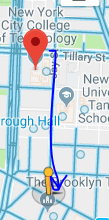
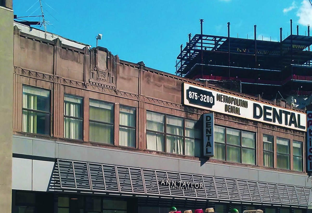
For photography, I take pictures of architecture and other objects where it will be just some random thing I have encounter. the relationship between the this painting and the pictures I take is that there’s isn’t a rule to follow and gender. I like the idea of a gender less artwork.  In 10 years since it’s more time to think about my future, I’m going to have my own place with a lot of photography equipment. I either will be a traveling photographer because I always wanted to see the world, and why not combine the two things I love and have it as my job, or a freelance photographer where it’s anything I want to take pictures of while telling a story.

As for the painting itself, I chose this particular one because not just of the amazing colors scheme that has been used, but also for the movement of the lines. It doesn’t follow a path, each line is on their own, but also the shapes that is form that is organic and natural than geometric and sharp. It’s almost like with each new line form, they all were made with different emotions which i believe represents me because my emotions ranges and changes by a second so I thought how the movement of it shows that.. Meanwhile, others with a different perspective or point of view may misinterpret that painting as me into artwork, particularly painting by itself, or that the colors are dark, so I am a sad, depressed, or angry person which is all false since the artist himself was an angry man who smoked.

Artistically the artwork speaks me because my favorite is splatter paintings, but I do like paintings in general compare to   any other artwork that I have encounter throughout my life. As for my bio itself, I just gave the simple information on what major  I am in and that’s it, since I know if I keep going on about myself, it will be to long and lose interest so I keep it blank since I also like  to be a mystery to people. There is not much to say now about my avatar and how it relates to me as a designer. However, I do have to say that the artist and me share some similarity, but are mostly opposite from each other. If I had to recreate his work into my own master piece, I will focus on  my mood and what I feel to help direct my hand since the paining will be based off of each feeling as if they are their own person.