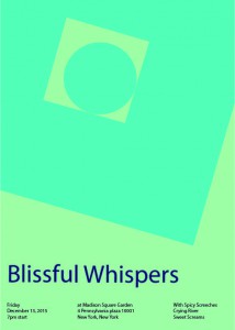
for this I worked with Jason and we had to make a band poster with cool colors so thats why we used these colors in the poster. we had a lot of different names but be stuck with blissful whispers.
Tag: Saturation Studies: Phase 3
Saturation Studies: Phase 3
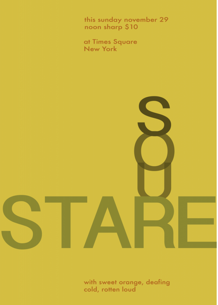
This part of this project was fun, I like creating stuff right on the computer, Hence Graphic Designer. It was fun to create this poster because I learned what the old times Band posters looked like. Creating this poster was harder than I thought because I am new to illustrator so it was very frustration. We came up with the name Sour Stare because our colors where warm colors, therefore, we also use different saturations and values of the color orange.


