Project #3 juxtaposition

The first picture is located right in front of the school. Where the city bike rack is located. When I walked outside there wasn’t a lot of people walking around and there weren’t a lot of people on bikes. The reason I chose this is because of the contrast of people walking and riding bikes were the same, so this line represents the separation of transportation. There were people walking, driving and riding bikes, so that’s what I think the three colors represent.

I say that the paragraph describes the position of the picture because as soon as you walk outside of the building, there is a bike rack that holds blue city bikes literally a foot away from the sidewalk. Then there are plants behind those racks.

Juxtaposition

I took a picture of an enter and exit sign. I walked about two blocks and I saw a parking lot that included two different things within the same space. One sign says renter and be the other sign says exit. I find that to be juxtaposition because you could do two things exactly opposite things within one space.

Project 3: Juxtaposition

To go to that building, i left from the exit near the pearl building on the second floor of the school. When i got out i made a right, walked to the end of the block of adams street. Then walk across the big crosswalk with a crossing guard there to tillary street. After crossing, cross the street to your right after crossing turn left and there should be a court. Walk down the street of the court and you’ll be between the korean war park and brooklyn memorial park. Then across the street of the other side of the park you’ll see a big building that is under construction.

I chose this building because its under construction currently. I wanna know what kind of building it is and once was. What did it look like before the construction. How long has this building been there. Next to it is also a really tall building that is built.

Juxtaposition


To take that picture I left the school on jay st and turn to my right and walk to Johnson st, I walk pass the big intersection( Adams st) I took a while because there were a lot of car, most of them are going on the Brooklyn bridge and i past the post office and go to cadman plz w after Adams street, Johnson st become more relax there isn’t a lot of car and it feel like a big park, there environment is calm and there are birds flying, I enter the Korean War veterans park, from the park I took the picture, the park wasn’t to big, it is just some benches , trees and birds.


Project 3 : Juxtapositions

If you keep walking straight past the family court and the Starbucks, you’ll find the subway station. I took this photo at the ACF station. I noticed on my way there people were buying food at the Nathan food stand and cars were trying to come out of the parking lot. It was noisy because it was a street full of people and the area near the train station was closer to a shopping area so naturally, it’s a busy street. I chose this photo because the back clearly shows a more “modern” or clean building in the middle of much older buildings that have stains on them. It is also the tallest building compared to the small pizzeria shop. The glass reflects much more light compared to the foreground of this image which already gives the building a much more dull look.

“Thousands of people pass that storefront every day, each one haunting the streets of his or her own New York, not one of them seeing the same thing.” The Way We Live Now: 11-11-01; Lost and Found

“One day the city we built will be gone, and when it goes, we go. When the buildings fall, we topple, too.” The Way We Live Now: 11-11-01; Lost and Found

Project #3: Juxtaposition

To get to this building i exited through Namm Hall and made a sharp right turn down jay street, kept walking straight, past the train station and stopped at the end of Jay street. From across the street i could see this building.

Considering how busy Jay street is, it was loud, kind of hot and smelled strange. But i had seen this building earlier and it caught my eye then. This building was erected during The famous Art Deco era in american architecture (during the 1920’s), There signature style is vertical lines, and arching shapes. Examples of other building created then are The Chrysler building, The Empire state building and 30 Rockefeller Plaza.

What made this Building stand out to me was the fact that it was Art Deco, and covered in signs, taking away some of the buildings design, and blocking it. The old 1920’s design with modern day hygiene signs, and above an Ann Taylor, it looks ad if it’s almost forcing it to be more 21st century.

Draft: Bio & Avatar

Brianna M

My name is Brianna Maldonado, currently enrolled in City Tech and majored in the study of Communication Design. I’ve always loved the way things have been designed for the public, like when you see movie posters or advertisements in the subway and I got really into it when I entered high school. Even though it is something I would love to do in my future, my passions and things I enjoy the most are reading, writing, and watching movies. Ever since I was little I would always be reading and once I learned how to write stories or even argumentative essays I would enjoy actually doing it. Watching films has always been something that really made me happy because each one has its own stories and ways of expressing it. I always had this personal philosophy that you should always do what makes you the happiest, even if it’s not something you would want to do as a career, you can have it as a hobby. My hobby of watching films all the time introduced me to looking at advertisements and the movie posters and I was so curious on how they did those to capture the audience’s attention or just random people passing by. That’s also how my personality is too, I like to keep myself open-minded to different interests because I don’t think I can only enjoy doing one thing and sticking to one thing. That’s how my aesthetic is, and always trying to see the brighter side to things, always trying to be optimistic because I don’t wanna waste my time being negative. So, always trying to see the best in a situation and making others laugh or smile because I think you should treat people the way you want to be treated. So even though I might have my rough days because of my load work for school my goals for college is to really push myself to keep my grades up and to not underestimate myself to get a Bachelor’s degree.

My avatar is a cartoon version of myself which is to represent how I look, and also the tiny cartoon version of myself is also a little humorous because people realize how much it does look like me. I didn’t want to put anything specific about my major or my passions represented in my avatar because I don’t think that truly represents me. My personality and aesthetic is something I say truly represents me. I wouldn’t want to change it now that I’ve explained what my passions are and what I enjoy to do. My avatar has orange-reddish hair in a little afro, green glasses, some hoop earrings, and a yellow shirt with some blue little pants. So, basically, this avatar looks exactly like me because I have my hair like that all the time. My glasses are green, and I’m always usually wearing earrings because I love accessories.

Overall my bio and avatar really satisfy me because I think it represents me and what I want to specifically show to my peers.

Avatar and Bio

  I’m Sam, and all i pretty much do is draw. As of late I’ve mostly been doing Fine arts, and some creative work on the side. My passions is art, whether it be 2-d work, sculptural or film, it’s all i want to do, and i can’t think of doing anything else. Recently my inspiration has shifted form people and anatomy to nature and texture. My main goal is to build up a better portfolio so that i can apply to art school, either LCAD or RISD. Further than that , my absolute dream would be to work for an animation company (Laika) and help create stop-motion films.

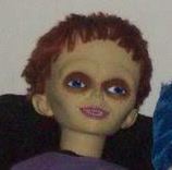
The avatar i chose is of yellow-ish gaunt doll, vaguely alien looking, with short red hair, straight bangs, dark sunken in blue eyes and wears a purple shirt, with a tiny smile, out-turned ears and is facing something unseen off to the upper right of the image. The doll is seated in a black bean-bag chair with a tye-dye blue pillow to their right. The image itself is low in saturation making the colors look muddy and gray-ish.  I had chosen this image because of a joke i made with a friend, saying that i look a little like a puppet if i made certain face. I saw this image and it immediately  reminded me of myself, not because i look sickly, but by the vibe it gave off, the doll looked like it was relaxing and that’s always what i’m trying, and failing, to do.

This image can definitely be misleading, seeing it with out knowing me at all, could give someone the impression that i’m a horror fan, and while that’s a little true, it doesn’t guide my aesthetic that much. I even heard one of my classmates ask if its Chucky, it’s not Chucky, but i have no idea where this image originates from. It could also be interpreted as someone who likes to scare people, some could think i set my icon up as something  “weird” to weird others out, when in actuality i don’t find this icon weird, or creepy or anything else, at all. I think it looks a little bit like me and that’s it, i even have two other puppet related images saved that also share a small resemblance to me. I want this image representing me because while i do connect with it, it also represents my aesthetic, and the type of art and feeling within my art that i try to create. But to add on to something i mentioned earlier, yes i’m trying to relax, i may not look like i am, or sometimes i struggle and maybe it’s obvious, but deep down, i’m okay, i’m an optimist.

My bio, or profile, i feel could be used to connect me with others who also share similar interests with me. I know what it’s suppose to be used for, but in reality i doubt it’ll work like that. And knowing how i’m like, i don’t think many people will take their time to read something that’s 4 paragraphs long. I think that an outsider reading my bio might consider me to be and artist, maybe even a dedicated one.  I’ve established my style, aesthetic, and i’m studying fine arts, i think with this profile i’d like to meet someone who also plans on applying to some of the same colleges i do, because all i do now is think about applying.

Culminate

Culminate (verb)

1. To reach it’s the highest altitude – Mariam Webster dictionary

2. To rise to or form a summit

3.to reach the highest or a climactic or decisive point

This word was found in an essay called “The Tool”.

The sentence which shows how the  word was used says, “Have you ever thought, not only about the airplane but about whatever man builds, that all of man’s industrial efforts, all his computations, and calculations, all the nights spent over working draughts and blueprints, invariably culminate in the production of a thing whose sole and guiding principle is the ultimate principle of simplicity?”

When I think of the word Culminate, I think of the word climax. To culminate is to reach the highest point.


Class notes from 9/26

Reflecting on “Our Senses”:

1-In a focused free-write that your classmates will read and respond to, write about your experience of visiting the Cooper Hewitt Museum for our field trip. Your response could

  • focus on one aspect of the exhibit
  • focus on the experience of visiting a museum
  • focus on the experience of learning outside of the classroom
  • compare your experience to another experience at a museum
  • compare your experience to learning in the classroom
  • something else.

2-Comment on the response passed to you. Do this by

  • adding to what the author wrote, or
  • contrasting what the author wrote, or
  • a little bit of both
  • or, ask questions for clarification, for provoking thought, for getting the work back on track.

3-Comment: did the comment add to your understanding, thoughts, the conversation? Was it helpful?

4-Comment as for Comment 2

5-Comment: what in the initial freewrite worked well, and would have made for a better start to the conversation?

  • getting specific would be helpful (eg, what senses were engaged)
  • more detail
  • more connections to outside
  • more comparison across works in the exhibit or across exhibits
  • more versatile: more instruction, ask writers to do more in their posts
  • ask questions

6-Comment: what in the comments worked well, and what would have made for a better continuation to the conversation?

  • ask more questions
  • variety in questions, responses–don’t repeat what someone else has done
  • more controversy! drama! push more!
  • come back to and look forward to all of our materials and experiences