Catalog Entry

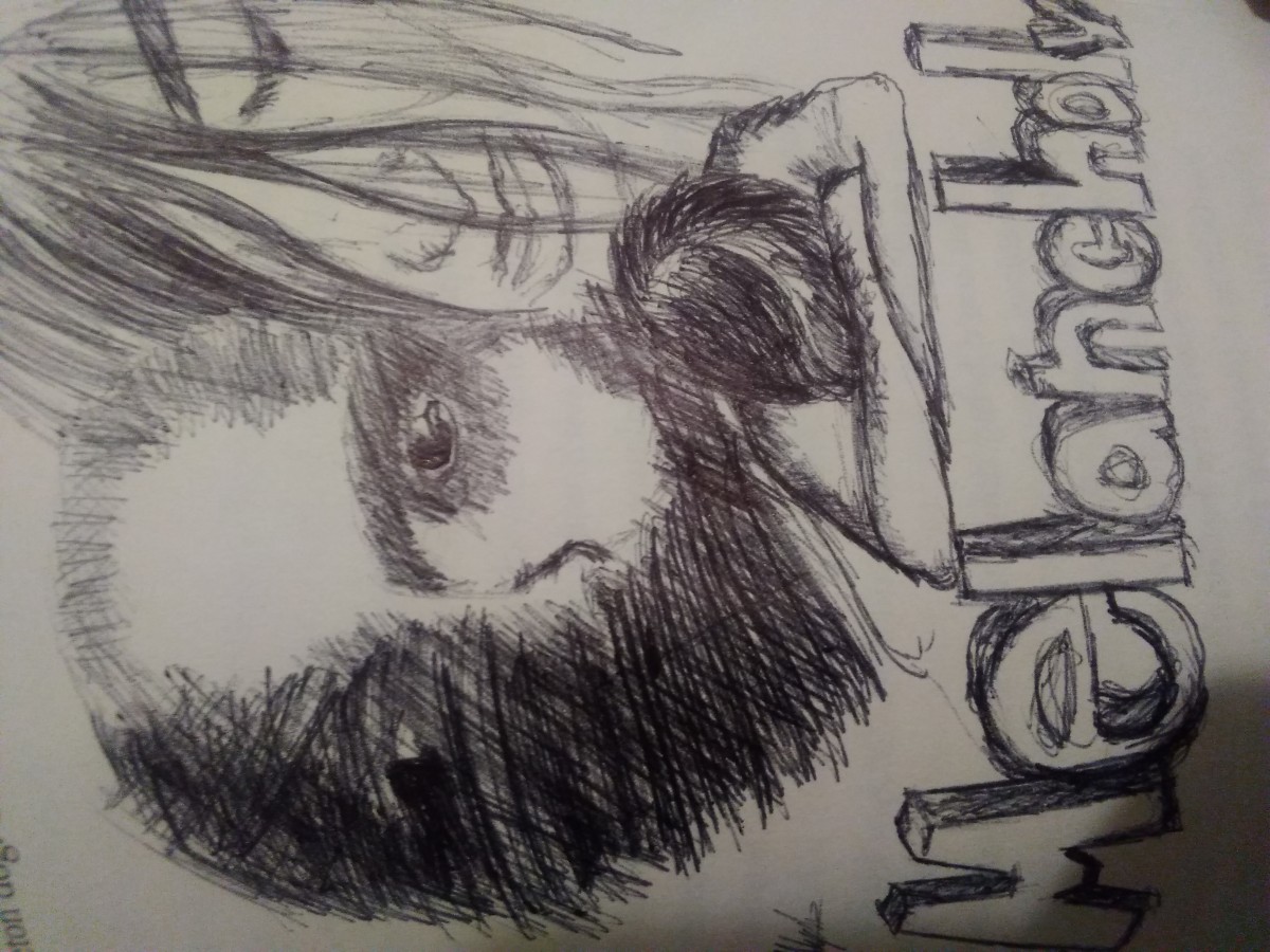
The glossument book ” The Mark”, contains illustrations that represent the word chosen from Eng1101 glossary list or our glossument. The words chosen all fit the theme of the book. The book has a dark theme, it contains a little horror, a little of a somber tone or mood. The author chose a dark theme for his book because he enjoys the dark and horror genre. The artist mainly uses black and white in his illustration because he believes there are really great and strong colors that give off a kind of dark feel or vibe, although there are some images containing a little color besides the colors black and white. The artist created these images mainly using a brush pen to help color or cover the page at a faster rate and inking pens to outline and circle words, he uses pens as well to create detail illustration or add any detailed aspect in his work, he also uses pencil for one of his pieces in the book to add a little shading. The author gets inspiration from other book altering artworks and artworks that convey a dark theme.
This project was inspired by the book ” A Humument” created by the artist Tom Phillips. The idea was to find a  book and alter every page by painting, collage and cut-up techniques to create an entirely new version. Tom did this to book called A Human Document by W.H. Mallock, he transformed it into A Humument. The author took the method altering books and an applied it to a book of his own, which he found lying around in his house.

The book he altered was called ” The Mark of Athena”, written by Rick Riordan. The author took this book and transformed it into “The Mark. The author got his inspiration from other illustrations or blackout art that was created by other artists, some who specialize in altering books or creating book art. He also looked at artwork that conveyed a dark or horror theme. He used some of the other artwork as a reference for the artwork of his own which his altered book. The motivation the author had working on this project was basically trying to discover the ways he could express or represent a word through the process of imagery, the way things are drawn, and through emotion. He also enjoyed looking at other work that related this project and tried to basically incorporate a piece of the work seen during his research, into his own.
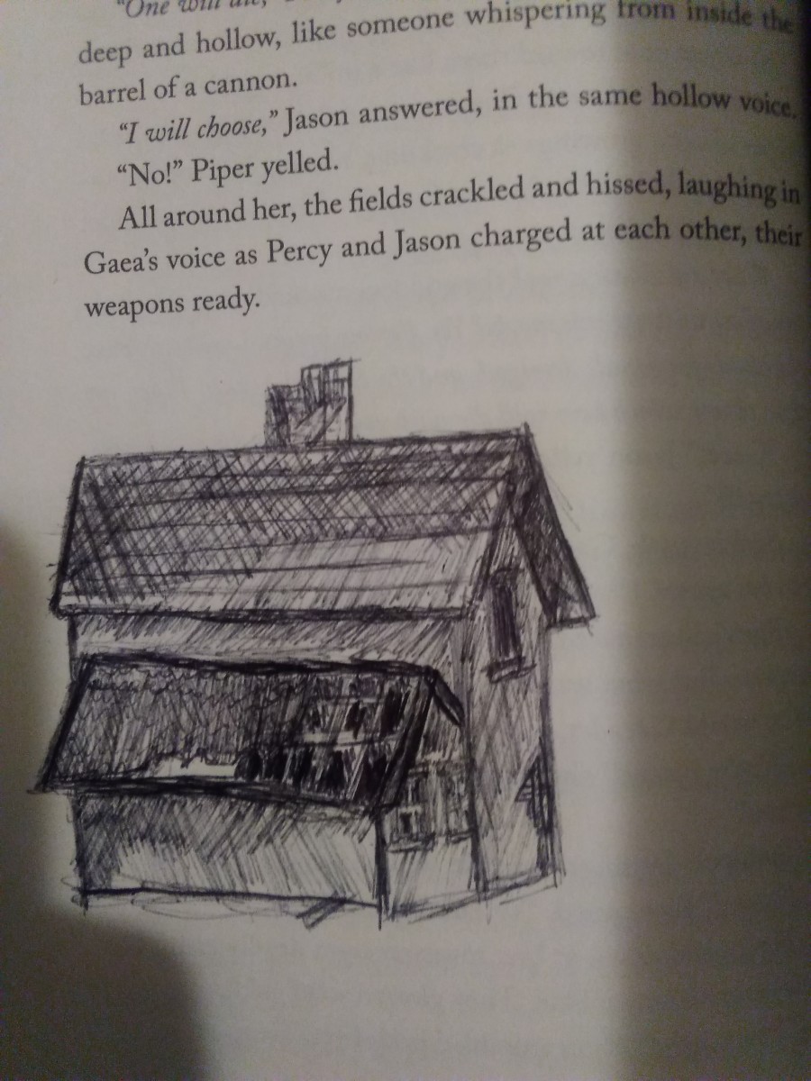
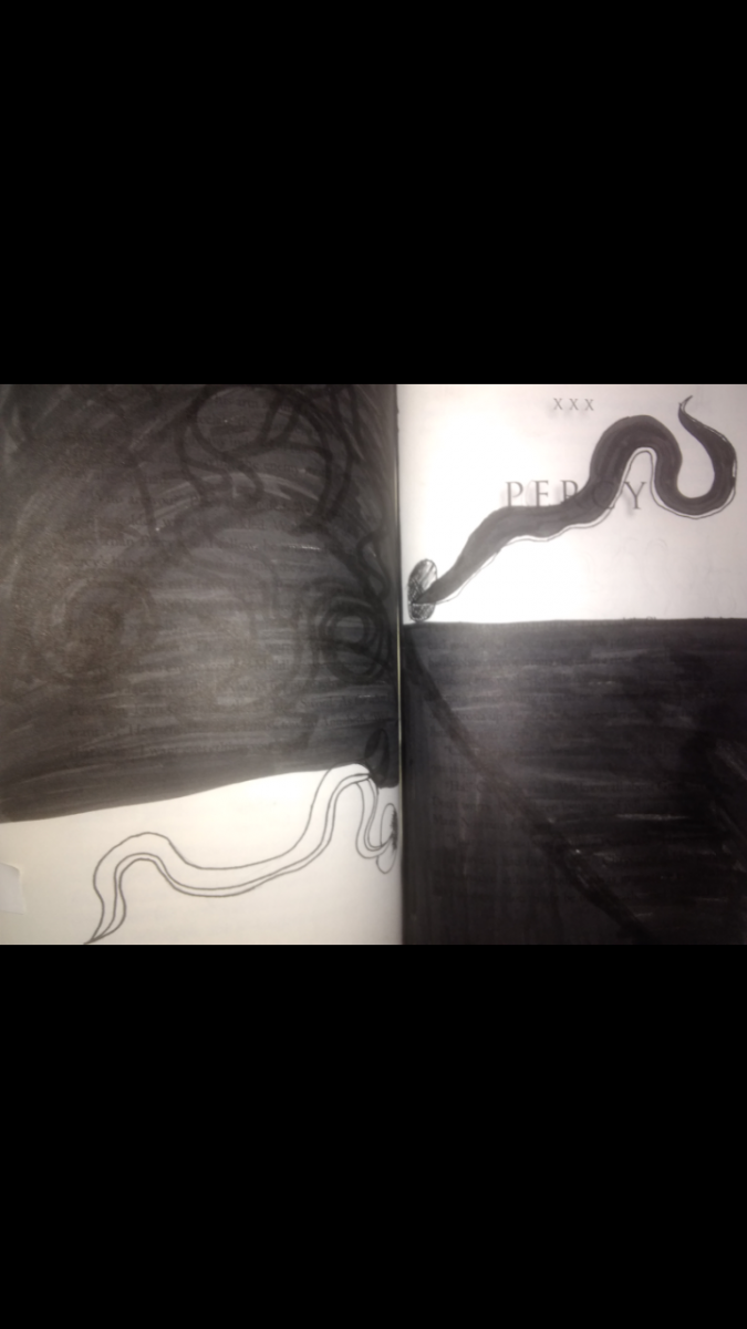
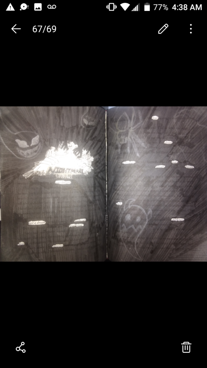
There were not many steps in the process of creating or altering a page in the book. The author wanted to keep his work simple, but he also wanted to add some detail. After the author chooses a word to incorporate in his book, the first step the author does to visually represent that word, is to create an illustration, an illustration when seen to, the viewer would have an idea what word it is trying represent. After taking his time to finish creating the illustration, the author begins to black out the page. The author does this to block out the words which would distract the viewers from the focal point of the page. The author may circle words he wants to incorporate into a poem or words that relate to the word being represented in some way, beforehand so that when he is blacking out the page, he knows to go around them. Blacking out a page took a lot of time, even with the black brush Pen. The author says that to him this was the most annoying part, but also the most necessary.

Didactic panels:

Dilapidated
Nematodes
Nightmare
Melancholy

Didactic 4 : Dilapidated

Dilapidated

The word the illustration above visually represents is dilapidated. Dilapidated is a building or house that is in ruin or despair. The image represents this word through an illustration of an old shabby house. This illustration was created using a black pen.

Didactic 3: Nematodes

Nematode

The illustration visually represents the word nematode. Nematodes are visually represented through the illustrations of worms,  drawn in black and white. The materials used t create this illustration were inking pens and a brush pen.

Didactic 2: Nightmare

Nightmare

The image above provides the authors visual representation of the word nightmare.  The material used to create this image were inking pens and a brush pen. The word nightmare is visually represented through a lot of dark shadowy figures, drawing closer to the frightened man hiding him himself under sheets.

Didactic 1: Malancholy

Melancholy

the image contains an illustration that represents the word Melancholy The image contains illustrations of people, all with expressions of sadness and despair. The image gives a feeling of sadness, depression, sorrow, and misery. The materials used to create this image was a black pen.

Saturation Studies: Phase 4

This Project thought me a lot about warm and cool colors and how to represent them. It also thought me a lot about the different ways to combine colors to achieve each level of saturation and value. I also learned a lot about visual weight, balance, and symmetry. This was a very interesting project, one that I will look back on when creating future work.

Phase:1

Phase:2

Phase:3


Saturation Studies: Phase 3

  1. Garence.jspevackposter1

The color temperature or color scheme that was given to my group was Warm. we made a list of words used to describe our color temperature.  The words chosen would be used to create our band name. The words that we chose were Spicy and Hiss. Combined they become ” Spicy Hiss”. I decided to make this poster simple and bold. I chose the color Orange which is a warm color, for the background to give a warm feel. The word spicy should bold and hot, so I chose Hot pink,  a very warm color,  for the word Spicy. When thinking of the word hiss I think of a very settle color, I also want this color to fit in with the poster. I chose a muted Orange color for the word hiss. Together the colors of the poster really give it a warm feel and you can really hear the subtle hiss and taste the flaming hot explosions in your mouth.

Time: 2 hours 45 min


Saturation See: Phase 2

Time: 4 hrs

This phase of the project took longer than expected. Mixing various of color to get a different saturation of itself was very interesting and fun. I learned how how you can create your desaturated brown colors using the colors that compliment each other, such as Reference and green or yellow and violet. I also learned how you can desaturat the Colorw by adding white , this also changes the value from dark to light.


Saturation studies: phase 1

Time: 2 hrs

The first image is your standare color wheel that I made. The second image is color wheel based off of the color wheel in the  first image, except this one has a sky theme. There  are different  skys with the color they are representing based on the color wheel of the first image.