Comprehend: According to the story, the author is consider disability because for the fact that she is blind, the museum will provide assisstance for her and she mentions that in every museum entrance have automatic door opener, she claims that for most of the other patients think it to be a pure acessibility accommodation, pointing out that the museum’s assisstance is fairly convenient for everyone, even those who are not disability.
Comprehend: According to the story, the author points out that she has some light perception vison even though she is blind, she can mentally imagine what she is observing meaning that she can identify when she approaches to a light view.
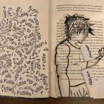
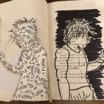
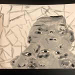
The theme of this design will be focusing on the word “futile” and futile means something pointless, useless or incapable of doing something. So, I decided to design an character that might resemble to the topic with some significants element in the art piece. This art piece was made from printed paper cuttin in piece with the word “futile” on it and my drawing itself. After drawing the character, I took a chunck of pages, highlighted and cut it with the knifing tools. One side is covered with the chunky pieces with the word on it and the chunck pages were use to see what it through the open cut space.
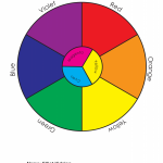
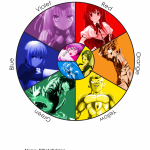
My idea to relate my topic with colors is using with something called anime and I want to test something that I can use the available color to describe each character feature and/ or personality. It was very challenging thing because it’s very difficult for me to remember and decide what character I should choose and the only that I watched before so I can’t just choose a random character without knowing who they are . Overall, it came out great and I did quite enjoy thinking back.
So far, it wasn’t not my best thing when it comes to painting and it can be a mess and take alot of time to get it done. At first, I wasn’t very interested of doing Cubist-style with our portraits, but I guess testing it out wouldn’t hurt so bad. After the process of design the cubic style with our portraits, I didn’t really like or enjoy the result becasue to be honest, I was pretty disturbed of what I’ve created. Then, I had to take another bristol paper for the painting but before I did, I first sketch one of the collage that we design and after the process, the painting comes next. It was very difficult for me to paint and blending the values because sometimes mixing balck and white can give you different values of gray and it was complicated to get the right value, as well as for the small area of the figure. But I managed to pull it off at the end. Then, working on the digital collage was very similar and convenient because in photoshop, you can just take piece from your portrait and place them together and it’s a great thing that the value color is already on our portrait to use. In my personal opinion, it was disturbing to watch my design (I was more frighten at the digital collage) but I did learn something as always and I have to admit, as much as I dislike my work, I pretty much enjoyed it in the end and it’s not a satisfying thing for me but at least I had something fun to do.
The left side is the broad collage image and the right is the painting version of the broad collage. For the Broad collage, this drawing was painted with gouache paint and it gives it a smooth feel and texture on the image.
Narrow-Range Collage
Narrow-Range Digital Collage
The left side the original narrow collage image and the right side is the digital version of the narrow collage. For redesigning the narrow collage, it requires photoshop support in order to completly give the right measuring for every small pieces of element on the figure and gives a neater finish.
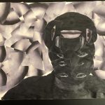
The left side image is represented as a broad image because the focus point of this image is me covered with noses on my face and it has this light grayish value which gives it a high key.
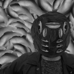
The right side image is considered as a narrow image because the figure and the background itself has this low key value and it blending well with the low volume of light.
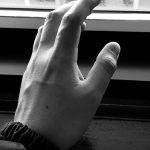
The High Key figure was taken in class by the window while the sun still shined. It’s a mixture between high and low value light because the reflection of the sun, it gives a depth of volume for every little perspective of the hand. For instance, the top left of the hand is partly covered with high value from the reflection of the sun and we see the shadow on the bottom right hand that is covered on low value. With these element combine, it give the portrait a realistic view for every shape and angles.
The Broad figure was as well taken in class by the tables and the lights of the building hit it all to my hand with barely any shadows. Its quite clear that this portrait hand is covered mostly with high light value as well as the background and you see little dark value on the bottom right side of the hand.
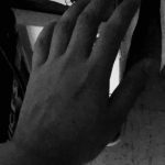
In a dark room, it is considered as Low Key for the large amount of dark value on the image. There’s barely any light value reflecting at the hand and the only thing that covers it is the total dark value that creates a depth perspective of the shadow.