Compensate

Verb

Definition: “To be equivalent to or to make an appropriate and usually counterbalancing payment to.” (Merriam-Webster definition).

Website: https://www.merriam-webster.com/dictionary/compensate

Founded: “A Natural Fix for A.D.H.D.” by Richard A. Friedman

Comprehend: It’s more like to repay something appropriately and maintain the situation equally.

Didactic #3

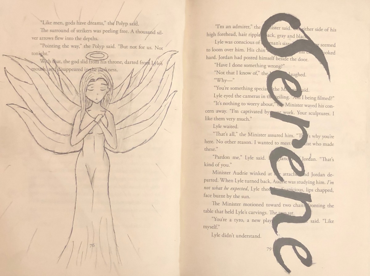
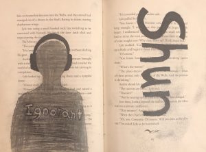
For this dicactic, the word that I will be using and describing both the definition itself and the drawing is “shun” and it defines to persistently avoid, ignore, or reject through antipathy or caution. (Dictionary.com) On the left page, the first think I thought of being avoidable or ignoring is someone with a pair of big headphones, therefore I decided to use a page with long text that will surround the person in headphones. According to my design, there’s a person wearing dark headphone and that person is shaded with a gray color. Now, I was thinking that maybe I could compare the psychology of the color value and the image itself. First, the headphones are shaded with black and opposes the outside which is white with text. The person is shade with a dark grayish color that represents that the headphones is consuming him/her, avoiding to make any contact to the outside, typically ignoring and inside the person , there used to be texts but since it is shaded with a grayish color, we can’t see what it says or barely see it what it was written. There’s the word “ignorant” inside of that person that it is kind of a light gray and the reason I decided to make it lighter is because first that word is a synonyms for “shun” and second that person is aware of that word and describes who he/she admits that he/ she is a ignorant, then that person goes on listening to there music and ignoring at the same time. This project was uses with pencil for the gray shading of the person and black marker.

Didactic #2

The word I use for this artwrok is Serene and it defines peaceful, calm, untroubled, etc. (Dictionary.com). I decided to use a angel as an example for serene because angels are represent to be an signal of peace. So, I decided to draw an anime character with a halo on top of her head that will represent herself an angel on the left page and design the word serene with a eligent font on the right page. This artwork was design with penicl, black marker and a razor point.

Color Interaction Parings: Phase 4

Creating an illusion with color was quite no a bad idea, I did enjoy learning the values of color, its illusion and discussing about the psychology between each color and what does it affect of people. I think one thing I could’ve done a bit better was for project #3 and maybe I could’ve add a little more details for the design while I was working in adobe illustrator. So far, I think I’ve learned a lot that i didn’t that coloring can also create a illusion in our perspective and I did mostly enjoy working with my partner (Rose) and discussing between our thoughts of character design.


Phase 1

Phase 2

Phase 3

Color Interaction Parings: Phase 3


This project will be focusing on animal theme that compares between our persona’s description or our ways of describing our characters. Rose and I decided to choose an animal theme that we have to think of an animal that could describe each other in general or basically about our own main character design. Before we started that, we had to choose as well the color that describes us first and then we come up with an idead of what we can place in our boxes. Rosa chosed an phoenix for the describtion of my fictional character and I chosed a chameleon for her fictional character as well.

Duration: 5-10 minutes.

Color Interaction Parings: Phase 2

These four images were recolored in photoshop and the objective was to create a illusion that the middle box inside the two giant boxes are the same exact color value, the outer boxes having a differennt color, value but in our perspective we thinking that one mid box seems to lighter and the other darkern but it’s just an illusion the fact that the mid boxes are still the same exact color and value.


Duration: 1 1/2 hour in total.

Color Interaction Parings: Phase 1

Based on the article presented, it states that color is for sure relative and distinct for the human eye .  According to Josef Albers in The Magic and  Logic of Color;

“Just as the knowledge of acoustics does not make one musical — neither on the productive nor on the appreciative side — so no color system by itself can develop one’s sensitivity for color.”

Josef Albers mentions that the color system can’t develop itself unless it spreads out its diversity, one way I can describe, and by exploring much more you’ll be able to gain the informations before knowledge itself. Comparing to music that Josef mention in his article says that knowledge is not what make that person musical, it’s talent itself, in my own opinion and that fate within you can help you reach through higher boundaries that knowledge can’t independently reach.

Saturation Studies Phase 4: Deliver

The objective of this project is based on color and combination itself. There is a lot of colors that are mixed between two and depending the value of the color. The most challenging one so far due to this project was phase #3, which is in a group of 3-4, we have a word and we need to describe it with two words of sense. Once we chose our two sense, we would individually work in adobe illustrator (Ai) and redesign with a poster provided for us. I’ve enjoy and learned a lot about coloring, combination and the meaning itself. I am looking forward for the next project.

Phase 1

Phase 2 

Phase 3 

Saturation Studies Phase 3: Develop

The two words that describes warm is “Spicy/ Hiss”. I think it might sound catchy and have a strange taste besides the theme color I chosed in this poster. The word “Spicy” has this 3D feature and I think it has a strong sense of describing warm and the word “Hiss” is placed at the background of the poster, repeating itself vertically with less opacity on the texture. When I think about the word “Hiss”, I would imagine it less visible and directly spread out.

Saturation Studies: Phase 2

These are guide colors that explains the mixture between two color and relationships.  There are three sets and each set has two rows, the  top is the original color and the bottom is for light colors that white color is added as well. This project is used with a Bristol paper and gouache paint. It took some time to get the function of mixing for a color and to be considerate of the proportion of paint used. To be honest, it was quite stressful but I did quite enjoy mixting and discovering colors.

Duration : 1-2 days (first day- 3-4 hours).