Project#6 ColorHarmony: Phase 4

Project#6 Color Harmony taught me many things about the different types of color scheme and some of the methods used to achieve a certain color scheme. I learned about the Monochromatic, Angelou’s, and complementary and non-complementary or split complement color relationships.  I also learned how to Create a proportional Color inventory’s` by referencing a piece of graphic design, advertising, animation or film still, comic, graphic novel, or artwork. I took all this useful information and tried to incorporate it into my book cover as much as I could. I enjoyed working on this project a lot. I learned many useful things that will definitely use in my future.

Phase 1

Phase 2

Phase 3

Duration: 3 hours

Project#6 ColorHarmony: Phase 3

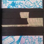
I based my book cover on the proportional color inventory I created based on the artwork inspired by the anime called Tokyo Ghoul. I originally chose the artwork as a reference for my proportional color inventory because the poster had a dark vibe or theme to it and I felt it that was because if the color used for it. And so I  chose these colors to and added them to my book civer give off the same dark vibe and I think it was a success.

Duration:2 hours

Color Harmony: Phase 3


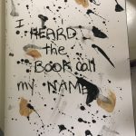
This is my book cover.  The book name is I Heard the Book Call My Name. The original book title was called I Heard the Owl Call My Name. I written out the name instead of painting because the original book had a handwriting style. I used a bristol paper and taped and glued the cover to the book. I used the photo from phase 2 as the idea of splatting paint as my book cover. I chose this type because my pages consist of paint and its paint messy and also colors are black and white so the painting i chose was perfect and matches what was inside the book.

Duration: 45 mins

Color Harmony: Phase 4

So far, I’ve enjoy working and thinking about a design for my cover book and learning the combination and categories of coloring. I think what i did best was the cover book and it took a lot of time consuming and effort. One thing I could’ve done best is to add a little bit more on some of the empty space and try to blend in the image and the background. It’s been a pleasure working and learning graphics desgins, I’d enjoyed this class and learned a lot, I’m glad to have you as a student Pro. Specvack and hopefully I will see you around next semester any time soon. Farewell.

Phase 1 

Phase 2

Phase 3


Color Harmony: Phase 4

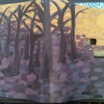
I learned how to use colors from another picture as a reference and the term proportional color inventory. I would have tried a third time on making the yellow look more creamy beige but at night it looked beige to me, the paint was beige too but it dried really yellow. If I had a bit more time I would have let the paint dry every night and see if I get it right the next day. Next time I might want to plan out the time it takes to paint/mix and dry so that I can see the true color once it dries before the assignment is due. Overall it was fun to paint. There’s a nice contrast because yellow and purple are complementary. I’d say the only thing I got accurate was purple and black but the beige is definitely not accurate.

Phase 1: Discover

Phase 2: Define

Phase 3: Develop

Final Glossary write-up

WORD LIST

Fictitious, Diatribe, encompasses, Carousing, Affluent, Disparate, Inadvertent, Sociology, Omnipotent, Cartographer, Flabbergasted, Juxtaposition, Bind, Prolific, Perennial,

During the whole semester we had a  glossument project in which we had to find or cite approximately one word per week based on class readings or outside sources. So basically the main concept is this Was basically defining these words and define them. We also had to site the sources on where we found the definitions and provide the titles of the readings. Added to that, we had to comprehend these words by exposing what they meant in our own words. That was a pretty good task be cause that gave us a better understanding of the words meaning. In my case, half of My words we’re  found in class reading or in relation to the class. The other half of my words were found on outside sources such as advertisements, subway stations,, sport center reports, YouTube videos, and even my peers from my class and other classes. that I just to happen to have access to on an consistent basis. All in all this project really helped me understand how words can have different meanings and how it can affect our everyday lives. Based on this project I was able to read more articles with a more open-minded understanding. For example, i even started using new words in many of my conversations and text messages with friends and family and in some cases even some of my professors. My personal favorite words includes fictitious, flabbergasted, and affluent. This project for sure has helped improved my vocabulary and it had also helped me articulate my words in a fashion in where i feel as if i can be understood by my peers better.



Bind

Word: Bind (Verb)

Definitionto make secure by tying

Source: https://www.merriam-webster.com/dictionary/bind

Encounter: I encountered this word in my typography class and my Graphic principles class.

Comprehension: I now understand how this word is used in society, It’s like putting two things physically together. For example, you can bind a whole bunch of paper to turn it into a book.

Juxtaposition

Word: Juxtaposition (Noun)

Definition: the act or an instance of placing two or more things side by side often to compare or contrast or to create an interesting effect

Source: https://www.merriam-webster.com/dictionary/juxtaposition

Encounter: I encountered that word through my class semester-long projects and we had countless reading based on juxtapositions.

Comprehension: Juxtapositions can be used anywhere in modern civilization. For example, Sand and ocean, tall and short, fast slow.

Color Harmony: Phase 3

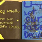
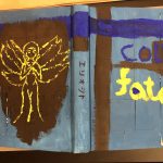
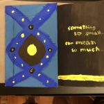
This is my cover book for my glossary collection. The title of this book cover is called Cold Fate because the theme color of the book with the glossary cover is based on something sadistic way and it just describes the experience of someone or your lifetime. This cover book was made with white sticker tags, painted with black, blue and yellow gouache paint. One part I like about this project is the back of the cover book and there’s an angel character painted yellow, yellow represents light, hope, this psychologically fits certainly well with this angel. I also put two quotes on both the inside the front and back side and these quote are kind of like facts about our life time, experience we had all face and our coincidence.

Duration: 2-3 hours.

Prolific

Word: Prolific (Adjective)

Definition: producing young or fruit especially freely.

Source: https://www.merriam-webster.com/dictionary/prolific

Encounter: I encountered this word at a concert me and one of my friends went to, the singer happened to

Comprehension: I know could say that I understand fully how this word is used in society. For example, its like I have a plant and I water it every day if it grows then that means its prolific in terms of growth and productivity.