Value-Added Portraits: Phase 3

This is my broad ranged digital collage. I spent about an hour on this. Doing this digitally was faster than I expected but I simplified a lot due to the fear of running out of materials physically. Other than that I believe getting the shape of it and location was what took a little longer.

Reminders for ENG 1101

A few reminders:

  • Please go to the City Tech Library, 4th Floor of the Library Building at 1pm for class on Monday, 11/12, for our library session on finding sources for our Glossument project.
  • Please review the Project #4 assignment
  • Your homework is to contribute at least 2 entries to our shared Annotated Bibliography, by 11/12. Please follow the instructions in the document and see my sample entries as models.
  • Continue your work on Project #3, and look for comments from me to help guide you through your next steps.


Value-Added Portraits: Phase 1

Highkey
Broad range

In these 3 photos, the first one is a lowkey value which is the darkest photo out of all of them. The shadows and little highlight of my hand makes you really have to look at the image to see the shape of my hand. Which the little highlight helps with. The second photo is a highkey value which is shown through how mostly white and highlighted the photo is. There is barely any shadow showing because of how much light is entering the photo. The last photo is a broad range photo which shows a middle value of a lot of grey but still some shadow and highlights throughout the photo.

Class notes: reflecting on and writing about A Glossument

Techniques:

  • shading
  • cutting
  • blackout poetry
  • illustration
  • white-out
  • use 2 pages
  • in process
  • repetitive vs variety
  • character design
  • use more descriptive words
  • use the project to represent your own interests in art/design/writing
  • painting
  • gluing different words on different pages
  • collage
  • gluing pages together
  • window
  • wouldn’t it be cool to cut out so much of the book that you make a space for something or the word itself

How much does the text matter vs. the visual?

  • poetry?
  • dictionary entry?
  • something else?
  • helps the illustration match with the glossary entry word
  • let’s workshop the poetry/text aspect
  • tell a story
  • represent the defined word in a creative way, playful, engaging
  • also while still being accurate, informative

Theme, technique, argument:

  • uniformity on the page
  • random choices vs. planned choiced
  • display of range
  • find a path in chaos if you choose chaos

What would you want to know more about?

  • know more about word origins, etymology
  • how different colors affect mood: color theory, psychology of color
  • impact of learning new words
  • Tom Phillips, A Humument
  • Altered books
  • other artists and techniques: look at the compiled references
  • poetic/writing techniques such as collage poetry, concrete poetry

search terms

  • words that you put into the search bar
  • Google, Wikipedia

Project#3 Juxtapositions

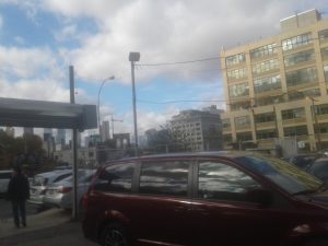
The way I see Juxtaposition is that there is a lot of things going on in a photo. From the very top of the photo, to the very bottom. To the left and right as well. To me the photo shouldn’t be clearly right away. People should have time to look at the photo adjectively and be able to make their own opinions about the photo. They should think about how a photo shows juxtaposition. For an example I will be showing a picture of a place around Fulton street. I took this picture because there are objects in the picture that takes a lot of empty space in the picture. To me the way this photo shows Juxtaposition is the relationship between a dark tone and a light tone and size comparisons. The photo I took a picture of shows multiple cars at the bottom. A large building on the right and a bunch of smaller buildings on the left. The car at the bottom is dark red color and the rest are a grey color. The red pops out because not only is it a different color then the rest of the cars. It’s also the closest to the camera. Making it appear bigger than the other cars by comparison. On the left side of the photo that I notice was that it has more dark and bland colors than the right side. For example, there is a person the is black silhouette of a man on the bottom left and a grey structure above him. The buildings are also fade towards the back and there roughly the same color as all the other buildings. Another thing I notice on the left side was that there were more trees and street lights.


Now on the right side of the picture was that it has a large building that takes up most of the right side. It has much lighter color compared to left side’s darker tone. This building is what really makes this photo stands out the most. All of the other buildings in compassion aren’t as important. There just there to make the larger building more noticeable. Putting more focus on the building. Just like the photo goes from dark to light when going from left to right, the does the same thing going up and down as well. For an example, there are bright and colorful clouds at the top of the photo. And the more you go to the bottom the photo to get darker, shown by the dark red car and the grey buildings. This adds a lot of contrast and depth to the picture. The beautiful sky above and the dark and boring ground below gives you mixes feelings. At first glance you would think that this is just a parking lot. Nothing special about. But you can some interesting things about this picture. Like how previously stated that there is a relationship between dark tone and light tone. Like the sky is blue but the red cars reflect the sky is grey supporting the dark and light comparison.


Even though there are some differences between the left and the right side of the picture, there are some similarities. Like how they both have cars on both sides, a long chain gate that goes across the picture, they both have a bunch of buildings, and how the cars and the buildings line up with each other, for example the red car is the biggest and the most noticeable car compared to the others. The same goes for the building in the back. The other buildings are smaller and more basic looking then the one on the right. This photo gives somewhat of a urban vibe. The rusty guarders and buildings all the way at the back, a bridge. The construction cones, The dying tree in the middle of the picture, moss next to entrance to the left, a dirty puddle next to the car on the left, etc. The second most noticeable thing in this picture is the black silhouette of a man at the bottom left. Why is he there? Nobody knows. It’s so random. It’s like this guy came back here to where he used to live back when he was a kid. Supporting my claim that this gave a urban vibe.


Avatar Bio (Updated Version)

Part 1: Biography

Hello my name Jordan Anderson. I am a freshman at City Tech College. As a person I’m a very straight forward person. Not really the talkative type but Im not afraid to interact with other people. I like being in quiet places so it can help me focus. I also like a wide variety of music. Rock, Hip-Hop, Jazz, Japanese, Some Heavy Metal, etc. My major is Graphic Design. I want to make videogame and do animation. I’ve been playing videogames for most of my life. Seeing how games are now of days like removing content that should be in the game and making you pay for it. That’s method is called Downloadable Content or DLC for short. I want make games how they use to be. Making you earn stuff on your own without paying extra money. Back to 90s and early 2000s.

Part 2: Avatar and image description

For my avatar I choice Sonic the hedgehog. Sonic was a big part of my childhood. Plus I a like speedster. Sega’s mascot Sonic is a very easygoing hyperactivity hedgehog. He is a 15 year old hedgehog that can run at hypersonic speeds and above. He cares dearly about his friends and does whatever he can to not only save his friends but everyone. Just like most speedster, Sonic is cocky and over confident. Beliveing that hes the fastest thing alive. Sonic can also be very impatient at times to the point that he just leaves if someone if taking to long. Sonic is one of the most popular and well-known videogame characters of all time even rivaling the popularity of Mario. Even through I’m not as hyperactivity as Sonic, I am easygoing. Pretty much I don’t have a problem with things that are different. As long as it’s good. When I’m annoyed I can get very impatient where I just don’t want to do anything anymore or just leave. Sonic is a character I hold dearly to my heart as I can related to him. Me and older brother were to play Sonic the hedgehog 2 on the Sega genesis everyday and my little 5 year old mind just enjoyed every minute of it. Even though I did grow up Mario to, I just enjoyed Sonic a lot more.

Final Part: Conclusion

I feel like I have nothing else to add to my profile. This is who I am. I’m a very straight forward person. Not really the talkative type but Im not afraid to interact with other people.

PROJECT #1: My College Experience

Colloge so far is a mixed bag for me. The fact that I have to do most of school work online is very new to me. I need a City Tech ID to even get on the site and sign up. But I do love travel around the campus. Walking to my next class while listening to my music is what I really enjoy doing. I love being more independent here unlike highschool. Luckily all of my classes are in the same building so getting lost isn’t a issue. Now all I got to do is survive the boring classes to get to my major. The back tracking to different parts of the building just to get my self situated is very annoying. I so used to having my work given to me. Nice and simple. Doing this extra stuff I have to get use to. I just hope my freshman year goes smoothly. Now for my Major. I want to make videogame and do animation. I’ve been playing videogames for most of my life. Seeing how games are now of days like removing content that should be in the game and making you pay for it. That’s method is called Downloadable Content or DLC for short. I want make games how they use to be. Making you earn stuff on your own without paying extra money. Back to 90s and early 2000s.

Omnipotent

Word: Omnipotent (adjective)

Definition: Having very great or unlimited authority or power.

Source: https://www.dictionary.com/browse/omnipotent

Encounter: I encountered this word at a subway station poster and i thought that it would be a good word to let others know about.

Comprehension: The meaning o this word can be used to described anyone or anything that is in position of authority or an higher power. It applies both mentally and physically based on the context.