Flabbergasted

Word: Flabbergasted (adjective)

Definition:  affected with sudden and great wonder or surprise

Source: https://www.merriam-webster.com/thesaurus/flabbergasted

Encounter: I encountered this word on a music video I happened to have watched over the weekend.

Comprehension: I comprehend that this word means being surprised in various ways. for example coming home to a surprise birthday party would make someone flabbergasted.

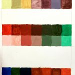
Saturation Studies: Phase 2

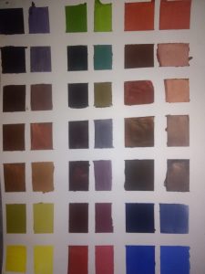
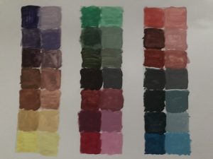
The things i learned in this phase of the project is to how to apply different colors to effect the saturation which means you can have purely saturated, muted, or desaturated colors. That adding white to it will help lighting the color with a different shade. The hours i spent on this project was 6.5 hours mostly because I had to make sure i blended it right to get the right color which was very challenging for me and new.

Saturation Studies: Phase 1

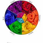
For the color wheel I wanted to do was based off of roses, different colors of roses. The reason why I chose roses because roses are my favorite flower so I wanted to add that on to the concept of the color wheel of my idea. So I search differently beautiful different colors of roses that are real and mostly fake colors. The hours I spent on this was at least 5 at most because applying the pictures and remembering the step by step was slightly complicated, but I got the hang out of it and was able to finish it.

Saturation Studies: Phase 4

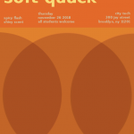
In this project, I learned how to desaturate colors and mute them without using black and how to utilize them in CYMK. I could have done the painting portion better if I was more patient before removing the tape. I also needed to be more careful with the water. When I paint in the future I may set up a table with nothing but the materials to prevent accidents like that. It was suggested that I moved the title (soft quack) higher so that it wouldn’t touch Thursday and I did that. I kept the bottom portion because it was alright, and I changed the bottom text to all the same muted color as the necros guide does. In the critique, until it was projected I didn’t notice that the circles were very transparent so I went back and made it darker.

Phase 1: Discover

Phase 2: Define

Phase 3: Develop

Saturation Studies: Phase 3

Cards: Warm/Swissted Necros/Cross sensory words

The background is supposed to be saturated orange, the yellow is muted and the subtext is desaturated. It took me two hours to get this right because changing the text to being fully saturated didn’t look nice and I wanted to keep the muted yellow look to match the word soft. For the desaturated yellow I had to keep trying again adding about 50/50 magenta yellow but in the end, I used some black to make it stand out from the page without it being brighter than the title for visual hierarchy.

Didatic 1: Glossument Propinquity

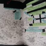
The third spread in the book provides an illustration inspired by Monet Claude to describe the word propinquity (being close to something in time or distance). The materials used was black masking tape, inking pens, printer paper, paper clips, and post-its. The artist intended the concept to be a leap towards freedom through flight.

Class Notes: Project #4 drafting

Reminders:

  • Project #3 is due on 11/26/18 by the start of class
  • We will work on the Glossument in class so be sure to have your book
  • We will work on drafting parts of Project #4, so be sure to have more materials developed in your Glossument as the foundation for your work on Project #4

Writing didactics/labels/wall text for our Glossument projects:

  • Write about the page/spread
  • refer to the artist in 3rd person if at all
  • the genre of this writing is not a reflection piece
  • about a paragraph or two
  • aim for 50 words
  • audience: visitors/viewers
    • some are knowledgeable
    • some are invested
    • some want to learn but don’t know much
  • jargon vs instructive language? aim to reach a wide audience
  • name each piece so it’s easier to refer to it. Could be the word you’re representing, or that word in a phrase, or something else
  • write about:
    • choices you made
    • your method
    • what materials and why
    • what effect you aimed for
    • how you see it represent the word you’re depicting
    • How this page/spread represents your theme, or, How this page/spread fits within your overall Glossument book
  • some resources:
    • https://mgnsw.org.au/sector/resources/online-resources/exhibition/exhibition-labelling/
    • http://eric-leyland.blogspot.com/2011/09/guidelines-for-good-interpretive-text.html
    • https://www.theguardian.com/culture-professionals-network/2015/aug/04/writing-gallery-texts-panels-common-mistakes-interpretation
    • https://evmuseography.wordpress.com/2014/05/28/5-basis-for-museums-didactics/
    • https://en.wikipedia.org/wiki/Museum_label
  • Add your first didactic panel as a post, including a photograph of the page you’re writing about; Comment on at least one classmate’s post by Wednesday Friday, 11/30
    • Use the category ENG 1101 Project #4
    • Use any tags you think are appropriate

Saturation See: Phase 2

Time: 4 hrs

This phase of the project took longer than expected. Mixing various of color to get a different saturation of itself was very interesting and fun. I learned how how you can create your desaturated brown colors using the colors that compliment each other, such as Reference and green or yellow and violet. I also learned how you can desaturat the Colorw by adding white , this also changes the value from dark to light.


Saturation studies: phase 1

Time: 2 hrs

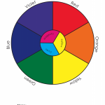
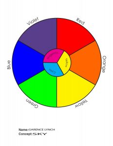
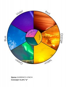
The first image is your standare color wheel that I made. The second image is color wheel based off of the color wheel in the  first image, except this one has a sky theme. There  are different  skys with the color they are representing based on the color wheel of the first image.