
Cards: Warm/Swissted Necros/Cross sensory words
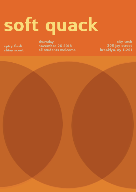
The background is supposed to be saturated orange, the yellow is muted and the subtext is desaturated. It took me two hours to get this right because changing the text to being fully saturated didn’t look nice and I wanted to keep the muted yellow look to match the word soft. For the desaturated yellow I had to keep trying again adding about 50/50 magenta yellow but in the end, I used some black to make it stand out from the page without it being brighter than the title for visual hierarchy.

