Field Trip Cooper Hewitt Design

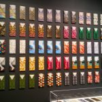
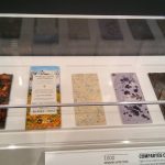
The one work I found compelling is “1001, COMPARTÉS CHOCOLATIER” because the chocolate was so beautifully packaged and had colors one wouldn’t normally see when purchasing a bar of chocolate. Description: A wall of chocolate all packaged differently every 4 to 3 chocolate bars. They are very colorful with green, blue, and mostly red patterns. Some of them have images such as a grizzly bear riding a wave or two legs with red heels. On the bottom of the case, there is chocolate with nuts, white and brown chocolate with a diamond design, pastel purple chocolate with a black splatter, and two more at the end which I’m not exactly sure what they are. Source: (Jonathan Grahm, Courtesy of Jonathan Grahm)

The medium used for this was handmade chocolate bars and packaging

The work I think classmates may have missed is “1203, ORGANOID ORGANIC ROSE BLOSSOMS WALLCOVERING, 2016” Because it looks like a regular wall but it is actually petals, herbs, and flowers pasted on the wall with slight texture. The scent is faint but it smells like rose tea. Description: A wall divided in three that reach almost the ceiling in pure red that you need to go closer to notice that it is created from multiple petals. It feels rough almost like dried paint but mostly is quite smoothed out like a normal wall with patterns on it. It almost looks like wallpaper if it wasn’t for it being divided. Also, it was at the farther end of the room where there were rocking chairs which almost seemed like just an info center about layouts and blueprints. Source: (Martin Jehart, Organoid Technologies Gmbh)

The medium used for this was “Alpine hay, rose petals and buds, self-adhesive foil backing” (Description)



Field Trip to the Cooper Hewitt Design Museum

Homework:

After visiting “The Senses” at the Cooper Hewitt Design Museum, we all will have encountered works in the exhibit. But we will have experienced them differently! Let’s crowdsource a tour of the exhibit, focusing on what stood out most and what might have been overlooked.

Post the following:

  1. the name and a  detailed description of the one work you found most compelling and why
  2. the name and a detailed description of one work you noticed that your classmates might have missed
  3. photos of each of the two works
  4. name of designer/company for each
  5. date for each
  6. medium (materials used to create the work) for each
  7. choose the category Field Trip and the tag “Our Senses” so we can showcase our tour (and to get credit for your work).

Don’t forget to comment on at least 1 other student’s post. These comments are your chance to add to the tour your impressions and observations of the works your classmates chose to write about.

Sound Visualization Mashup: Phase 1

Song: Nothing I’ve ever known (Instrumental Version)

For this project, I chose the song Nothing I’ve ever known by Bryan Adam, the instrumental version. The song has a variety, in which it would start of with the guitar playing giving a lonely feeling slowly building up and by minute 1:05 other instruments join in giving a sense that it’s no longer lonely but hopeful or the feeling of having someone with you. In the Begining, you can say it would have smooth steady lines with curves but as it goes on the line can become into two or more with more curves maybe even sharp turns. This to show the dramatic or dynamics of the song. Then as the song reach the end it can return to one line or shape and fading into the page.

I’m not completely sure if these observations affect my understanding of the music or intention of the Artist. This is due to the song being used in the movie Spirit: Stallion of the Cimarron and was only the instrumental version as the song does have lyrics to it. But while listening to the lyrics the meaning could be that the person has fallen in love and experience that feeling for the first time which becomes something they ‘have never known’ and wanting to be with them, however, the ending causes a confusion for me or a change that the person doesn’t know where this feeling will take them in the end.

Hours: 1 hour and 30 minutes

Urban Artifacts: Phase 4

Ambiguous figure/ground relationship
Stable figure/ground relationship


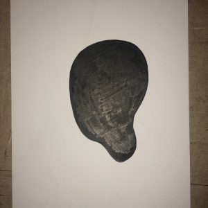
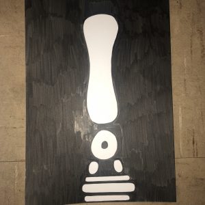
This project has thought me many things. I learned about the difference between geometric and organic shapes. I learned a lot about positive and negative space and how they correlate to stable and ambiguous figure/ground relationships. This project has thought me the importance of positive and negative space and the different aspects they convey. When you have a Stable figure/ground relationship, you are likely trying to draw the audience attention to the figure, with an ambiguous figure/ground relationship, you are making the audience choose there own view on what is the figure, what’s the ground. These are something I will take into account in future projects or art pieces.


Phase 1

Phase2

Phase 3

Monotony

noun

1: tedious sameness
2: sameness of tone or sound
(Merriam-Webster Dictionary)

or

“without variety or change, excessive repetition (or no repetition) can lead to uninteresting compositions.”
– COMD1101 definition

This word came up while learning new words for our project having to do with line & rhythm. This word stood out amongst the other words because I didn’t recognize the word. This word has to do with our project, now knowing the definition, it has to do with rhythm and how in some artwork there is no variety or just nothing going on in the composition. The main definitions aren’t applied to like an art definition however, the one given for our project is. So, many other things can apply to this word because it describes how something can be so boring because there is no change.

Urban Artifacts: Phase 4

This project was very different and interesting from any other art projects I’ve done. The whole process was a little stressful for me because it took such a long time and a lot of steps but it was good to see my final product and my classmates’ final products. I did learn how to visually achieve ambiguous and stable compositions, which I think a lot of other people achieved, I just don’t think I achieved that. However, I was fine with going into class to present my final compositions and getting the constructive criticism that I did. Now that I know what to do for upcoming projects, like posting everything and trying to rework certain things, which I look forward to future projects.

Phase 1

Phase 2

Phase 3

Urban Artifacts: Phase 4

It’s wasn’t the most challenging project that I’ve done nor I didn’t take it very serious, but I did have a bit of fun and I’ve learned a lot besides drawing such as describing the part of a drawing and understand its meaning of a figure. I could’ve done better if I added a little more for my ambiguous sketch by taking that small figure, converted into a larger figure and draw it on the extra space that I had left. If I have done it, then my perspective of my drawing would’ve been better and consider that as a challenge.

Phase 1

Phase 2 

Phase 3 

Urban Artifacts: Phase 3

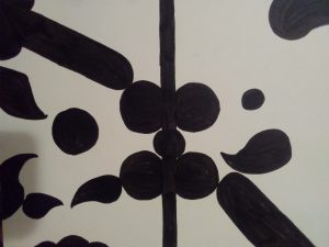
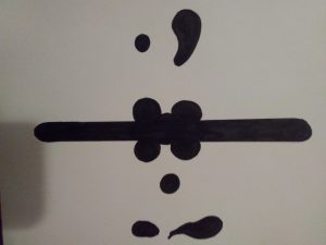
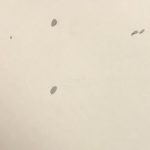
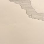
The first image is a stable sketch because the only figure in this image is the dots on the top, bottom, left and two in the right. For some, people think that it’s a Ambiguous image because the dots are moving around at different directions but I say it’s still stable because the dots are just very calm and just staying in one position to another. The second image is a ambiguous sketch  because we see this very large object on the top right corner that doesn’t show where it starts or ends. It just crosses the whole image on a side. Unfortunately, I do not have the original picture that is only draw with black market because I’ve already hand it out the original picture to the professor and that is because I’m only showing the sketch version.

Update (October 11, 2018):

The two images on the top are the complete and ink figures.

Sound Visualizations: Phase 1

22 minutes

The sounds I hear in the beginning are chimes so I drew the firework looking symbols to represent that. Then it slowly eases to more instruments like the circles. The circles represent the main rhythm while the other lines represent the xylophone. The long lines on the side are the computer-generated sound and long part is the violin and electric piano. You also hear a triangle with the violin which is represented by the stars. The vocal is shown through the curvy lines and the triangle is the guitar. And finally, the new instrument at the end is shown through the spiral.

The way I drew it was to be moved slowly from the top left corner down the page and back up. The observation shows how I tend to focus more on the tiny chimes on the side and the slow repeated generated sound and tend to forget the guitar is there. You can also see that the beginning of the song intentionally starts out quiet and gets busy before ending quietly too.


Song

Urban Artifacts: Phase 3

stable stable

For this part of the project I worked about an hour for both to come out how I wanted them to. I picked two different pictures, and they both ended up being stable compositions. However, the reason why I chose those two pictures which were both paintings. One was ribs and the other a human heart, they both showed organic, natural curves and I really wanted to show that. I decided to really make the shapes stand out by having them both contrast each other which is something i recieved positive criticism for.