Color Harmony: Phase 3

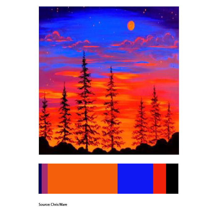
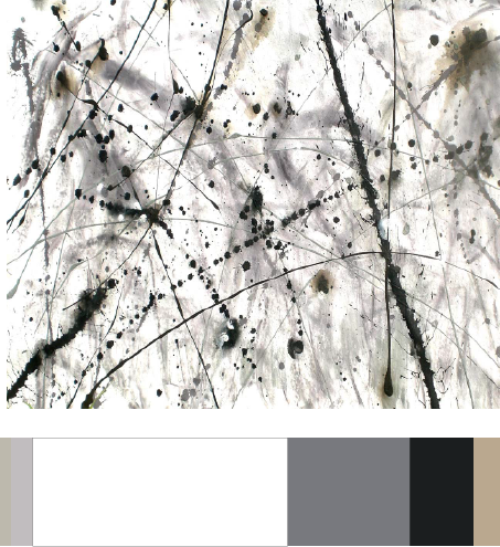
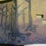
[Work in progress] Although my cover looks very muted compared to when it was wet paint, the dominant color is supposed to be the purple on the bottom. While the subdominant is the different tints,tones and shades of cream. I will be adding the cream color in the top right corner as sunlight to match the cream in my proportional inventory. The accent color is supposed to be the black tree branches which I will later cover with purple leaves so it really does look like the purple is dominant instead of the trees standing out so much. (After I waited for it to dry I noticed how off it looks so I will go back to correct the colors by tomorrow.)

About a hour

Project#6 Color Harmony:Phase 2


Time: 35 mins

The art work I used as a reference when creating my proportional color inventory was an artwork called ” Black Reaper” created by an artist named Elijah Myers. The artwork was based on an anime character from the anime Tokyo Ghoul. This image had a theme similar to mine and it contained colors used to convey a really dark theme. Color reference can be used in your future design work for when you are trying to convey a certain tone or theme. You could look at other references that convey a similar theme/tone to our work and see the types of color used t achieve this. You than apply the same colors to your as well so that you can achieve the tone or theme as well.


Color Harmony: Phase 2

Proportional Color Inventory

What I learn about this Project how different color combinations work together to create a sercent  tone in a picture. The Dominate Color is a Sapphire Blue. The Sub-Dominate Color is Purple and Orange. The Accent Color is Black.

This took about an hour


Color Harmony: Phase 2

This image is an image taken by Victor Gladkov. My theme for my glossument is opposites and fabrication. So for that I chose the colors like brown, white, and different shades of blue. I feel like the color blue has many opposites and I also feel like brown Is an opposite of blue because light brown is a shade of orange. I also learned that colors can harmonize to create compatibility.

I spent about an hour an a half on this phase of the project.

Color Harmony: Phase 2

This image shows different kinds of analogous colors because the blues have different shades and so do the oranges. The colors also dragged me in because these are kind if opposite colors.

Color Harmony: Phase 2


By:  ContempoGallery

I used this painting because it relates to my theme. I found this painting on google when i was looking at splatter artwork. In my book majority of my pages were painted black similar to blackout poetry and has a white paper with the drawings inside. I want to make my book cover with white with a bit of splatter paint on it. I also chose these colors because in my book majority of the color is black and white with some muted colors. I spent around 30 minutes.


Color Harmony:Phase 1

Analogous by Erin Smith Glenn
Monochromatic by Basquiat
Complimentary by Irina Nakhova


The first photo is analogous because it’s showing colors that are very close to each other on the color wheel. The second photo is monochromatic because they are mostly the same color but have different tones. The last photo is complementary because it shows red and green which are complementary colors.


Color Harmony: Phase 2

colorinventory copy


This image is a vintage photograph of my mother, and the type of colors that are in this image really drew me because they also reminded me of one of my favorite movies from Wes Anderson “Fantastic Mr. Fox”. These to me are different tones of orange. The title of the book is “The Book of Me,” so I felt like these were things that had to do with me.

Color Harmony Phase 2

SAMPLE-color inventory

For this part of the project, I used an image created by Taylor Walker that centered around an ocean theme using different tones and shades of blues. Color references can be used in future design works by taking into consideration into the amount of color,  and the different shades and tones of a color that will affect where the focus of the image would be, in the image you see a monochromes of  blues and near the top you see Orange, a complementary color that gains the attention from all of the blues surrounding the rest of the page. This can help me to consider the different ways to use these colors in different ways and most likely make an image less chaotic with different colors.

Worked in 1 hour

Color Harmony: Phase 1

Analogous Colors [Red, Red Orange, Orange, Yellow Orange] – 
Monochromatic [Pink] – Carolina Mizrahi
Complementary [Orange & Blue] – Photographer unkown