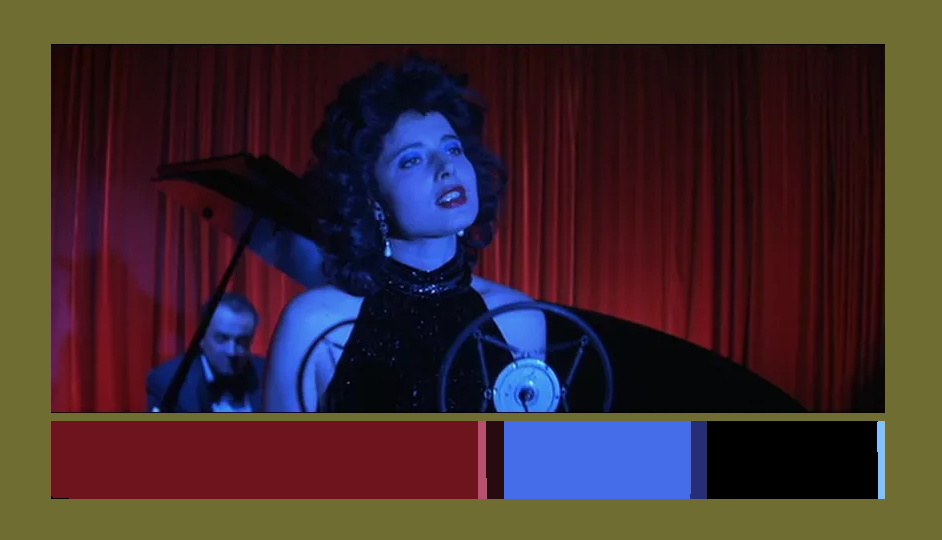
still from the movie Blue Velvet directed by David Lynch. Of Dorothy singing at a club.
Using the same colors from a still in a movie, and using it in a different medium can translate the emotion from the scene into your new image. I might try this again later with another piece.
analogous,monochromatic, complementary: Credit by Blustone
monochromatic, analogous: Credit by Blustone
complementary, near complementary, monochromatic: Credit by Blustone
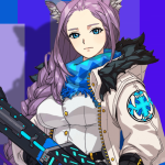
The first image is a analogous for the color blue and purple that they are close nieghbors, monochromatic for the saturation of the purple background and complementary for the bit of yellow zippers and the purple hair with the background. This character is called Patrone and she is a bomber type (ice/ rock), and quite silence.
The second image is a monochromatic for the value of the background and the chrarcter’s clothing and analogous for the light purple hair and the blue on her physical appearance, dress and background. This charcter is Natalia, a noble wolf that weilds a spear, she’s a attacker type (ice/ rock), very brave and serious in battles.
The third image is a complementary for the color red on the character’s appearance and the green backgroud as well, near complementary for green is complementary with red and pink is close with the color red and monochromatic for the saturation of the green background and a bit of the red on the character’s appearance. This character is Joy, she’s a support type (fire/ scissors), hard working medic, very caution, never misses a patient and makes her patients feel nervous thinking she has no experience since she’s young or so as they thought.
These three image are credit and owned by VisualShowers.
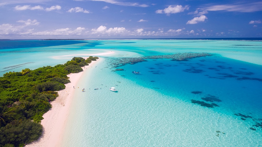
Analogous Blue And green oceans, Picture by Jennifer Levine
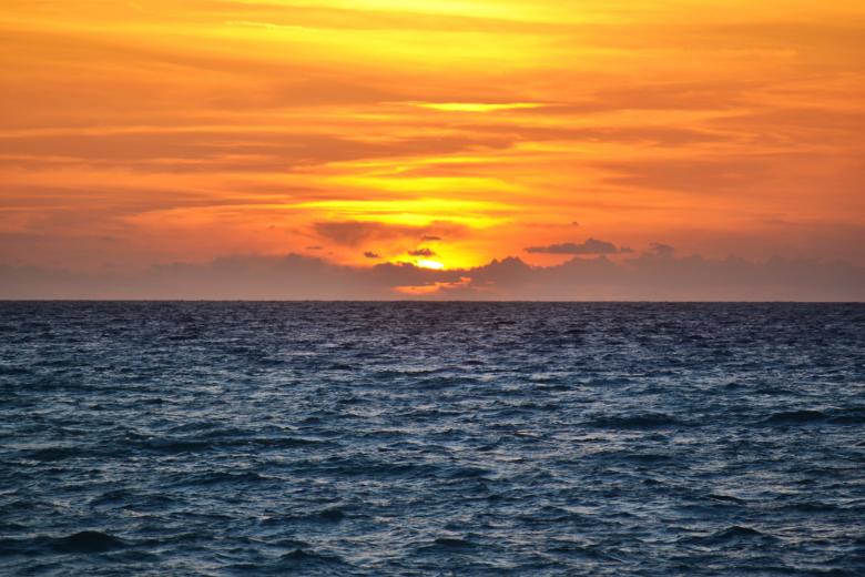
Complementary sky/ocean, Picture by Dave Johnson
The first photo is monochromatic because it’s showing the sky with one color which happens to be blue and it also shows different shades of blue. The second photo isn’t analogous because the photo includes two colors that happen to be near each other on the color spectrum/wheel. The last photo is complementary because it shows two complementary colors which happens to be blue and orange.
The first photo is monochromatic because it’s using only one color, blue and you can also see different shades of blue. The second photo is complementary because blue is complement to orange. The last one is Analogous because there is red, orange and yellow. These three colors are next to each other on the color wheel.
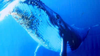
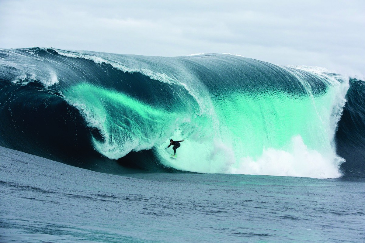
This image represents a monochromatic image because it only contains one color. The image has tinted colors located near the impact zone. The blue transforms into white. The image also shows tone progression from the color blue on the outside of the waves to the darker blue inside the barrel of the wave.
by Carol A. Analogous
This image represents an analogous image because it is an image created using colors that are near each other on the color wheel. An example would be a chart that shows gradients of a color. In the image above you see a gradient of the color red, orange, and yellow.
by Machi Complimentary
A complementary image is an image created using only colors that compliment each other. In the image above, the colors used were green and red. Green and Red are complimentary colors. They are colors that compliment each other.
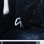
So i found this image based off my book i design. My theme is dark so i wanted to find an image that represents it more. So i discover this artist and her work and i like the dark colors that she included and the idea of her showing what is like to have depression and anxiety. This color reference will be use in my book and any of future ideas i have, i can always come back to this. I spend about 25 minutes on this project alone.
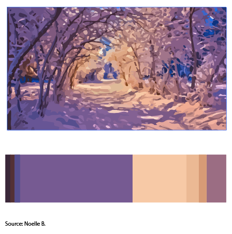
Its a picture of winter sunset. In this activity I learned the terms Dominant color(Purple tint), sub dominant cream, the accent color will be muted yellow. Color references could be utilized in future work to create a sense of harmony in the image so that it is visually pleasing. It helps balance out from an image being high in contrast or too low in contrast keeping the image interesting to look at. I’ll use this for my cover because the title contains the word joyous which I associate them with warm colors in the trees.
So the first image you see is carrots that are peeled and lined up. This is monochromatic because you can see the difference in the shade of orange and this is caused by the shadow of the carrots. Second image you see next is the desert that is purely saturated to show the contrast between the sand and the sharp blue sky. This is complementary because blue is complement to orange. The last image is analogous because the red, orange, and yellow is together just like in the color wheel.