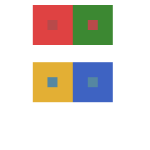
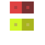
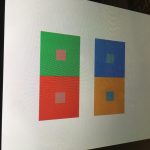
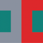
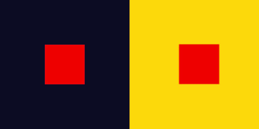
These four images were recolored in photoshop and the objective was to create a illusion that the middle box inside the two giant boxes are the same exact color value, the outer boxes having a differennt color, value but in our perspective we thinking that one mid box seems to lighter and the other darkern but it’s just an illusion the fact that the mid boxes are still the same exact color and value.
Based on the article presented, it states that color is for sure relative and distinct for the human eye . According to Josef Albers in The Magic and Logic of Color;
“Just as the knowledge of acoustics does not make one musical — neither on the productive nor on the appreciative side — so no color system by itself can develop one’s sensitivity for color.”
Josef Albers mentions that the color system can’t develop itself unless it spreads out its diversity, one way I can describe, and by exploring much more you’ll be able to gain the informations before knowledge itself. Comparing to music that Josef mention in his article says that knowledge is not what make that person musical, it’s talent itself, in my own opinion and that fate within you can help you reach through higher boundaries that knowledge can’t independently reach.
This project took me about 6 hours in total. I felt as if I could’ve done more because Phase 2 was kind of hard for me and I tried my best ornament my abilities to complete it.
This part of the phase took me two hours to get done. It was a bit challenging initially because I had to find out how to adjust different colors together. I also had to find how to make different colors compliment each other and to make them into an illusions.
Based on the articles presented, it seems that color, is relative and distinct based on the eye. According to Josef Albers in The Magic and Logic of Color;
So color is open to interpretation, meaning in one way or another we all see color a little differently than what it actually is. Based on what I was able to comprehend about color theory, it appears that having your color makes it able to be interpreted differently. Color also has very distinct appearances and saturations. In short, color is the expression manifested into our own eyes.
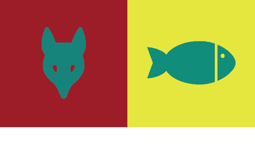
I picked blue for sally because that just so happens to be one of her favorite colors. Also blue happens to be a primary color so i thought that blue for her would be very nice. Also blue is a shared color between us.
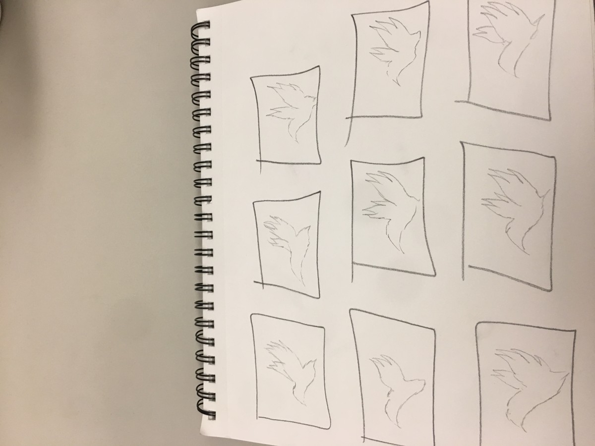
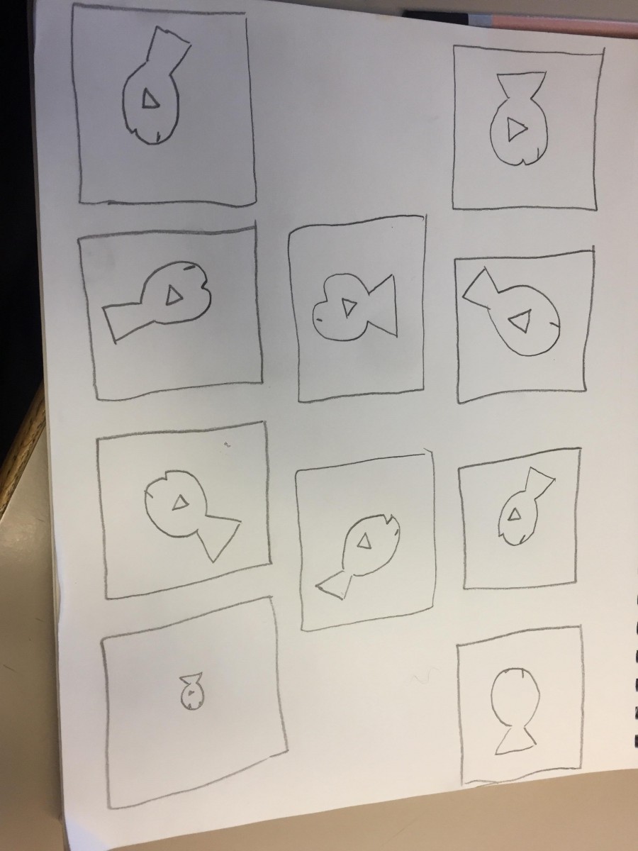
Step 3 – Icon Research Process
I chose to pick a duck for sally because shes free spirited. Shes also very calm in many ways. last but not least she told me that she likes ducks.
This project thought me the importance of the way we see colors within different backgrounds. Color is prolific and exciting. They are viewed in very different aspects of the color wheel. I also learned the importance of how compliment colors can create illusions to the naked eye. I learned the important lesson that Illusions worked best with opposites or complementary colors. The reason our(Olando and Evelyn) shared color(green) appears different is due to the fact that green complements red and yellow is a very different shade from tree. Its also important to recognize that colors appear different based on background color. To be honest I could’ve worked better on phase 2 of the projects where I had to make the same color appear to seem like different saturations on different backgrounds. All in all this project was long but it was something new.
I learned how to see different values and hue changes. I could have done in terms of communication. It was a struggle to find a color that describes a partner that you haven’t really talked to. If I took more initiative to find out more I think the logo could have been created to better reflect the other person’s personality. I will apply to get better communication in my next project through actually taking the initiative to ask more questions. I applied to change the colors from both being muted to bright contrasting colors. At first, it was muted dark green and gray with a green in the middle. We changed it to a bright yellow/red and green in the middle because of green contrasts red. In the critique, I printed it out too small. I reflected the fish and then I changed the colors to create a higher value change, also a very subtle color change because there wasn’t any before. I’m not entirely sure how to make the hue change more vivid.
calm, relax, classical music, video games, friendly
Step 2 – Color Mockups
I picked gray for my partner Evelynn’s color because she likes gray and also she has a sort of neutral personality. The video that I saw on youtube explains gray as a neutral color and gray is also a color that’s desaturated and plus evelynn always wear neutral colors so that’s why I picked gray. The color we both shared was a greenish color that we both find amusing and drawn to. The medium green also gives the concept of calmness and relaxation.
Step 3 – Icon Research Process
Lando’s Thumbnails
I chose a fish for evelynn because she interested in sea mammals. She also fishes as pets and she enjoys the simple things in life. Shes also a very calm person and shes nice.
Step 4: ICON MOCKUP
I learned the important lesson that Illusions worked best with opposites or complementary colors. The reason our shared color(green) appears different is due to the fact that green complements red and yellow is a very different shade from tree. Its also important to recognize that colors appear different based on background color.
This part of the phase took approximately2 hours to complete.