
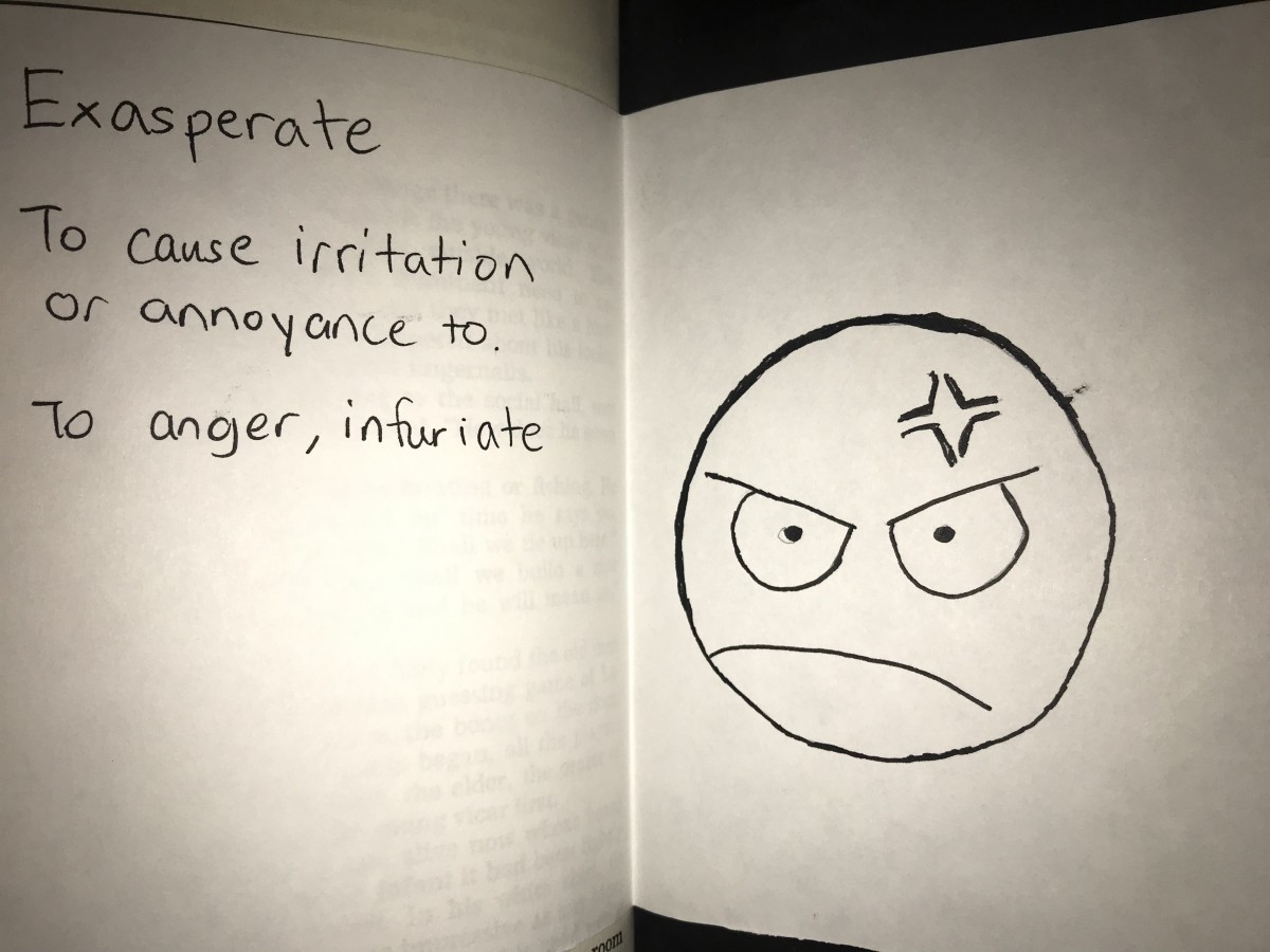
The page requires readers to open a folded paper. The word on this page is exasperate. The definition of exasperate is to cause irritation or annoyance to. I drew a picture of a annoyed face to show the meaning of the word.
Didatic 2
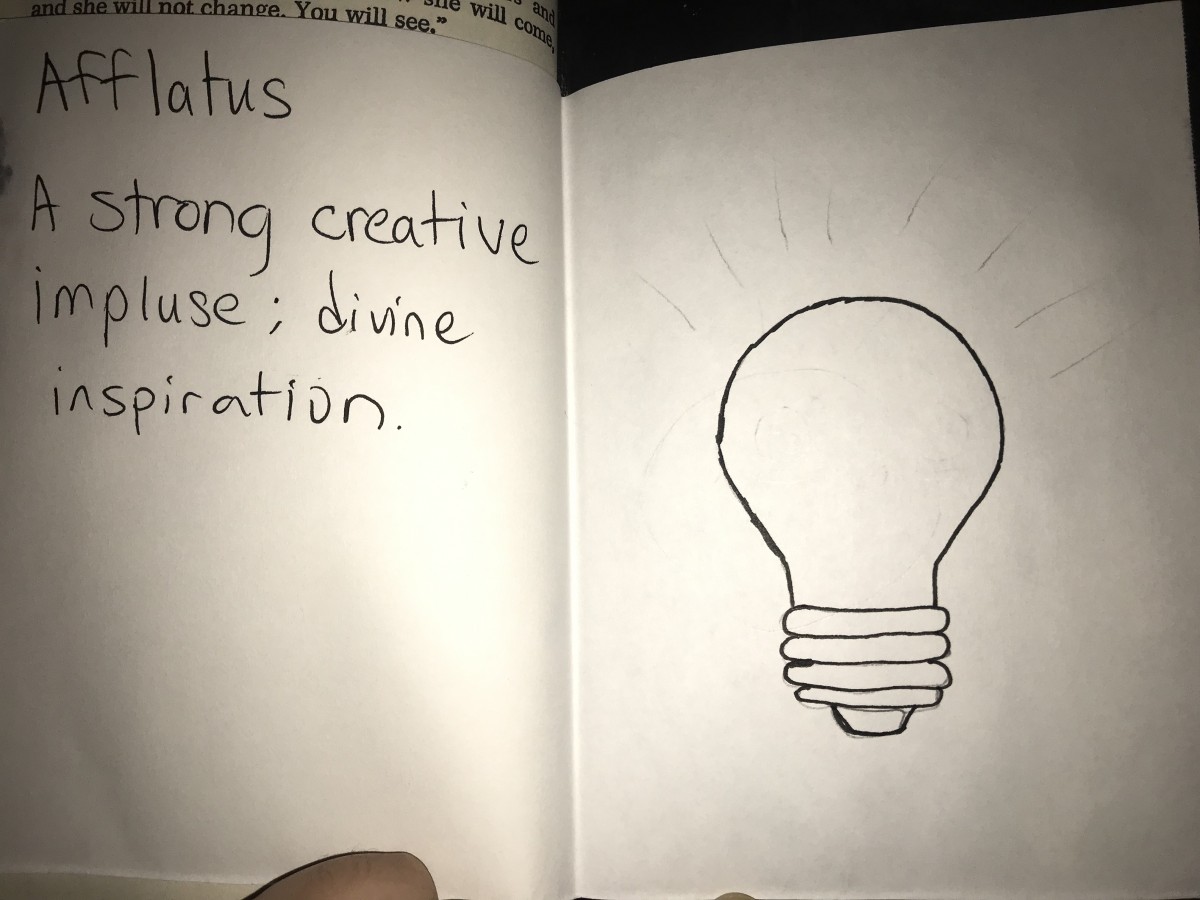 The page on this book has a folded paper that requires you to open the paper and there you will discover and word. The word on this paper is afflatus. The definition of this word is a strong creatice impluse; a divine inspiration. I drew a picture of a lightbulb because it represents a idea. When getting inspired and a idea a lighted up light bulb usually represents that.
Didatic 1
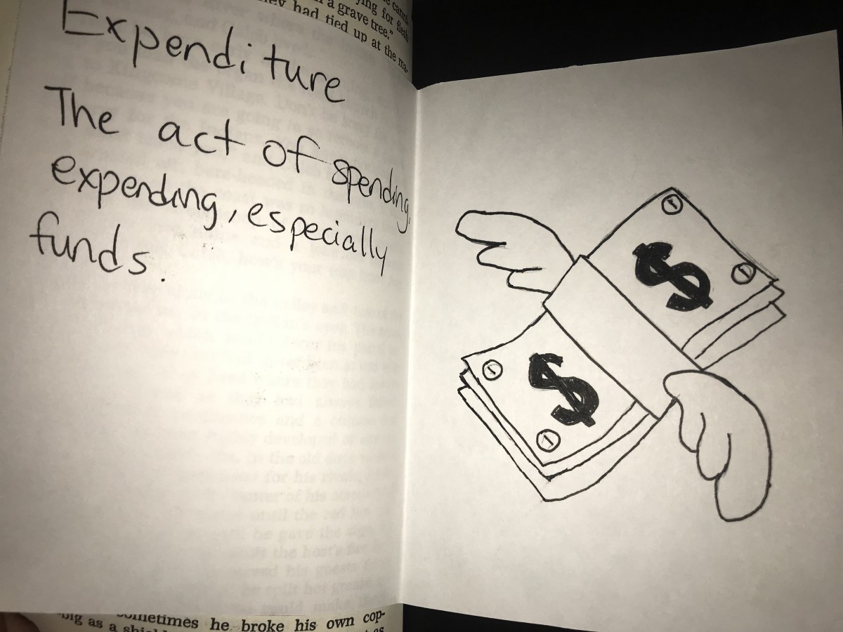 This page in the book has a folded paper and it will require you to open the paper to see the definition and drawing. The word in the page is expenditure. This word means the act of spending, expending, especially funds. I drew the picture that shows a stack of cash with wings, showing that definition the act of spending will cause the money to be gone quick.
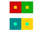
Color Harmony: Phase 2
By: ContempoGallery
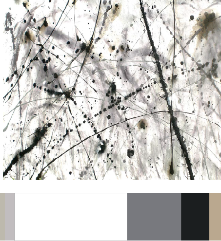
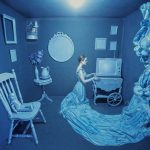
I used this painting because it relates to my theme. I found this painting on google when i was looking at splatter artwork. In my book majority of my pages were painted black similar to blackout poetry and has a white paper with the drawings inside. I want to make my book cover with white with a bit of splatter paint on it. I also chose these colors because in my book majority of the color is black and white with some muted colors. I spent around 30 minutes.
Fylc project part 2
The semester is coming to an end, it felt like time flew by fast since the first day of being in college. When I first attended city tech, I was a confused and a lost student. As time went on, I adapted to this new environment like it was my new habitat. City Tech is a big place and it has many students. Being in City Tech for a few months, I learnt many new things about this college and I still haven’t explored the entire college yet. I believe that i’m more responsible now compared to my High school self. I had a nice afternoon schedule, i’m a morning person but i do not like working hard in mornings. My classes were easy to find and I have nice classmates and professors. I am a communication design student and i’m required to present a lot in my major, but i’m not a fan of talking. The classes I take has helped me stepped up and gave me more courage to speak in front of groups of people. My classes also required us to partner up and work together and I believe that was the most helpful to me because it allowed me to communicate with classmates that I usually don’t talk to. My classes had a few trips and it was fun, we got to use our outside experience of what we learnt and use it for our lessons. Sometimes I feel like of my classes teaches too fast, some projects would be due within the same week and with other classes overlapping it would require a lot of time to finish them. I also had a math class on Saturday, it was hard to stay awake on a weekend. I am never taking any classes on the weekend ever again. Overall this semester was a fun experience and i’m looking forward to my next semester.
Multihyphenate
Multihyphenate (noun)
Definition: someone who does several different jobs, especially in the entertainment industry.
”Wolfe outlines a philosophy that reflects his multihyphenate nature, blending the artistic approach of a photographer with the rigor of a lawyer.”
I understand this word now because the author, Chuck Wolfe has more than one job. He is a lawyer, photographer, writer and more. He works more then one job.
Encountered from Sisson, Patrick. “How better photos can help you document, and shape, your neighborhood”
Color Harmony: Phase 1
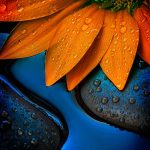

The first photo is monochromatic because it’s using only one color, blue and you can also see different shades of blue. The second photo is complementary because blue is complement to orange. The last one is Analogous because there is red, orange and yellow. These three colors are next to each other on the color wheel.
Color Interaction Pairings: Phase 4
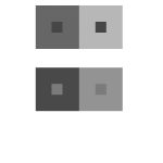
This project was a fun project about colors. I learnt a lot about colors and you cannot see them how they really are. There’s more to colors than what you can see. In phase 2, i learned that complementary colors affect the way we see other colors when put together. Overall this was a nice project to learn about colors and how our eyes see different colors.
Color Interaction Studies: Phase 3

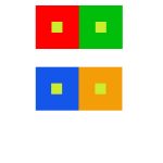
My partner was Saalik and i chose a lion for him. Lions are calm and laid back animals but when they’re hungry they’ll go for it, I believe Saalik is calm and laid back but when it comes to music, he strives for it similar to a lion getting what their prey. As for the color it was his favorite color and it also is a calm color. As for the middle blue, it was a shared color.
Color Interaction Studies: Phase 2

Spent around 2 hours on this.

