This panel is using two pages because i wanted to really visualize like people hearing hokum. I wanted to have like ears and dialogue bubbles like as if people hear non sense and ears. And pointing at words in the book because to other people that dont know what the book was before all those words are nonsense or hokum. I used permanent marker, tape, and cut out of dialogue bubbles.
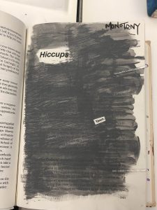
Didactic 1: Monotomy
This panel is the second to last panel and it says the word Monotomy which means the same thing, or boring, same tone. I used the color grey for the background because its known for being a boring color and i kept it at the same tone. I used the word hiccup as like the title because its the same tone over and over again. I used acrylic paint and cut up one word that says “yawn”
Color Harmony: Phase 4
This is the project I liked the most because I liked looking into color theories and finding out what I think would go nicely with my Glossument. I enjoyed it because i had to really think what would go with my title, and the theme of my book and I think I picked the right one.
I think something I could’ve done better was not rushing it because that what ended up happening with Phase 3, and tried to make it more creative like make it really look like the photo i chose.
Color Harmony: Phase 3
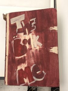
My book cover was heavily based on the colors that I used for phase 2 of the vintage photograph of my mother. I wanted it to look used but have the same bold typography I was using throughout my whole book. The orange colors were hard to make with the paint but I’m happy with how it came out.
This process took me an hour and half. I used acrylic paint and tape.
Color Interaction Pairings: Phase 1
I learned that color was never seen as the greatest medium in art when it actually is. In Josef Albers Interaction of Color, he emphasizes on not only on seeing color, however also feeling the relationships between colors. According to an article about Josef Alber’s theory on color The Magic and Logic of Color:
“Practical exercises demonstrate through color deception (illusion) the relativity and instability of color. And experience teaches that in visual perception there is a discrepancy between physical fact and psychic effect.”
Another point that Josef Alber talks about that I agree with and learned a bit from, is that our brains are conditioned to just look at something and point out the obvious, very literal things we see instead of really considering and admiring the richness of seeing. “And when he talked about visual perception, he meant something much more profound than just the way we look at the word – he would stop and look at the world look at the smallest object, smallest event, and see through it in a deep kind of way.”
Color Harmony: Phase 2
This image is a vintage photograph of my mother, and the type of colors that are in this image really drew me because they also reminded me of one of my favorite movies from Wes Anderson “Fantastic Mr. Fox”. These to me are different tones of orange. The title of the book is “The Book of Me,” so I felt like these were things that had to do with me.
Color Harmony: Phase 1
Prevalent
Adjective
Definition: powerful or very dominant
This word was found in the article “A Natural Fix for A.D.H.D.” written by Richard A. Friedman. This word is used to describe that A.D.H.D is “the most prevalent psychiatric illness of young people in America affecting 11 percent of them at some point between the ages of 4 and 17.”
The word is used to describe how intense and common this disorder has become in the younger generations. The author proves the point in the article by saying because of how prevalent this disorder has become such a common disorder among the younger community.
Deficit
Noun
Definition: a deficiency or failing, especially in a neurological or psychological function.
The word was encountered in “The Natural Fix for A.D.H.D.” written by Richard A. Friedman. The author uses this word to explain what A.D.H.D abbreviates for, “Attention deficit hyperactivity disorder”.
I knew what A.D.H.D was, I just didn’t understand what deficit meant which is apart of defining the type of disorder it is. This word has other definitions but all surround the same definition of something “failing”
Catalogue Entry
The glossument book The Book of Me has entries of vocabulary words learned by the artist, and they’re illustrated in a way of trying to portray the definition. This project was drawing inspiration from Tom Phillips’ The Humument, which was a book filled with blackout poetry.The Book of Me is supposed to represent a concept of being able to use anything as a canvas to convey your artwork.
Another concept that the project drew heavy inspiration is from the comic book style, or even pop art. The use of bold colors and the type of graphics there are in comic books or pop art are seen various times in The Book of Me. Each page has its own mood that it’s expressing by using different color backgrounds and materials that make each layout telling individual stories like in a comic book.
Blackout poetry wasn’t a concept that the artist tried to take away from The Humument, but the concept of having words stand out from the rest of the page is what they took from it.
(NOT FINISHED)


