Saturation Studies: Phase 4

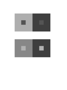
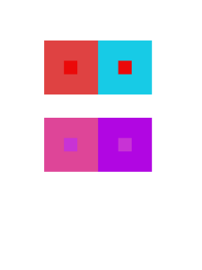
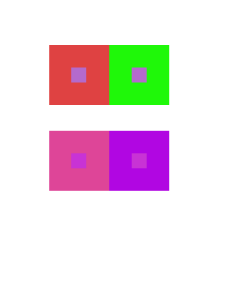
This project taught me the different aspects of the color wheel and the different shades of color. There are more to color than we all think that there is. Color reflects senses and also reflect our past and future. I also learned new terms that I wasn’t as familiar with in my past knowledge on art.  I had a difficult time mixing the colors in phase 2 of the project because to me I guess it was a bit confusing. The other parts had its fair share but all in all this project wasn’t as hard as I thought it would be.

Phase 1

Phase 2

Phase 3


Saturation Studies: Phase 3

The temperature of my group was cool and we also got the poster named “Ween”. My group decided to have the word soft echo. The sense relating to Soft was the sense of touch and the sense relating to echo was the sense of sound. For a cool temperature some would usually think of blue of green but I thought of the color white and orange. The color white is known to reflect heat is that was the reasoning behind picking white. The color orange may seem like its the color that relates to heat but I look at it as a cool breeze while the sunset is coming closer toward the ocean breeze. I wanted to use a Helvetica font but for some reason my computers fonts were not changing my word into the font I wanted. But al in all this is the poster we thought of.

Time: This part of the phase took me about 2 hours because there was a lot of thought put into deception and alignment.

Catalogue Entry

The glossument book called i heard the book called my name is originally remade from a book called i heard the owl call my name. In this book, it contains vocabulary that the artist discovered and learnt throughout the first semester of the first college year. The pages in the book are covered in black paint and the idea was inspired by blackout poetry from “A Humument” by Tom Phillip. The author is not much of a artist so it was a first time experience. This glossument book was made by Giraffe, a first year college student.

Giraffe made a lot of research before starting this project to make sure the book isn’t wasted. Giraffe’s inspiration was from a ted talk video that was showed in class and some articles. One article Giraffe learned from was “What is Blackout Poetry?”. The article was the first step for Giraffe, her first time doing blackout poetry. The article gave her guides for blackout poetry, what to do right and what not to do. These research has gave Giraffe many ideas on how to customize the glossument book using a different way of blackout poetry.

The author’s concept was to cover the pages in black and use a folded paper with writings and drawings on the inside, when seeing the folded paper, you will be required to open it and read it, similar to opening a book again. The author wanted to give the readers a sense of a new book when opening the page within the glossument book instead of just having a feeling of opening the book before it was edited. Giraffe wanted to draw the readers to the book like its calling them to open my paper just like the title of the book, “I heard the Book Call My Name”. The material used for the pages in the book was gouache paint, sketchbook paper, pencils and inking pen.

The process on making this project requires a great sacrifice of the book. You would need to rip some pages out due to the fact that the sketchbook folded paper takes up the space and also paint every two pages with black paint. It takes a lot of time because the paint, two pages because the pages are very thin and can be paint through. It also needs to dry before being able to paint the next page. After the pages of the paint drys the artist folded and cut up sketchbook paper and glued it to the painted page. Then comes the glossary words and art that is drawn and written into the sketchbook paper. The author used only one concept, blackout poetry and didn’t want to use others because it wouldn’t look organized, she wanted to stick to one thing only.

The theme of Giraffe’s book is a plain simple book. She didn’t want to make it complicated and confused the readers and lead them to something else and this was the first time for her when it comes to art. She mostly just enjoys working on digital so she decided to work on a theme that suits her. Some colors she used in this glossument book is black and white. This project was a simple project it wasn’t all that hard but it takes time. Giraffe has used that time to create pages in a page in her book.

Catalogue Entry

The glossument book The Book of Me has entries of vocabulary words learned by the artist, and they’re illustrated in a way of trying to portray the definition. This project was drawing inspiration from Tom Phillips’ The Humument, which was a book filled with blackout poetry.The Book of Me is supposed to represent a concept of being able to use anything as a canvas to convey your artwork.

Another concept that the project drew heavy inspiration is from the comic book style, or even pop art. The use of bold colors and the type of graphics there are in comic books or pop art are seen various times in The Book of Me. Each page has its own mood that it’s expressing by using different color backgrounds and materials that make each layout telling individual stories like in a comic book.

Blackout poetry wasn’t a concept that the artist tried to take away from The Humument, but the concept of having words stand out from the rest of the page is what they took from it.

(NOT FINISHED)

Class Notes: Catalogue Entry

Important aspects of E.N.’s draft:

  • working outside of the digital is a departure from usual workflow
  • makes an argument about the materials used
  • HAS A RATIONALE for the work included in the book
  • links to sources
  • different topics: everyday objects; uniformity; blackout poetry; digital vs analog/physical/material/tactile
  • show what from the outside sources is relevant and how it influenced the work or how it relates to your work
  • process, choices–how you ended up making what you made
  • what effect did you want this to have? who are you including or excluding? what message did you want them to take away from spending time with your work?
  • highlight the 4 pages/spreads you write the didactic panels about–though without repeating exactly what you say in those didactic panels
  • artist’s bio: how does this represent your artistic vision, your aesthetic sensibility, how is it a departure?

To do BY THE END OF 12/3:

  • post a brainstorm of your catalogue entry
  • post your 4 didactic panels
  • Use the category ENG 1101 Project #4 and any tags you want

Saturation Studies: Phase 4

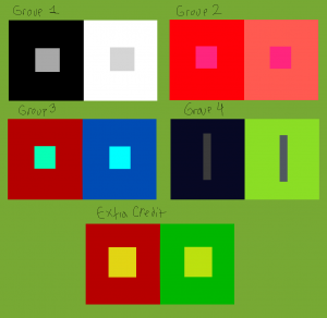
This project taught me a lot about the color wheel in general, and how much of a difference it makes when you change the saturation or value of a color. The painting and the poster taught me more about that, and how tone, saturation, and value can set a type of mood. I struggled a lot with the painting part of this project because it took a lot of times to start over. However, the digital part of this project was pretty easy to me only because of me knowing how to do it. I think I enjoyed this project a little, and it taught me a lot about the differences of mixing colors with not just white and black and actually using different colors.

Phase 1

Phase 2

Phase 3

Saturation Studies: Phase 3

Time: 2 hrs

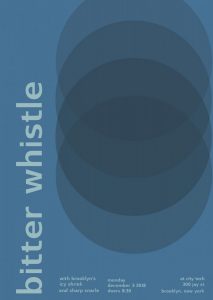
The temperature my group was cool, and we got the swiss poster called Pavement. My group decided to have the bitter whistle as our main word, and as our “featured bands” the names icy shriek, and sharp snarle. For a cool temperature you instantly think of blue, and especially of our words we wanted to have a blue poster. This particular poster didn’t use the font of “Universalis”, like how Professor Spevack’s was. Instead the other swiss font it had was called “Switzera”. The only thing i struggled with was that because it was the Switzera font for some reason I had to adjust the point size to what I thought was exact as the poster because it wasn’t exactly the same. Especially, since the word bitter whistle is longer than pavement.

Saturation Studies: Phase 1


Time: 1 HR

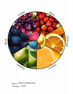
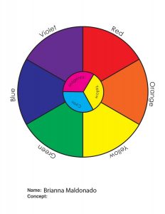
The image on the right is the original color wheel, and my unique color wheel was centered around the concept of fruits. I knew some fruits off the top of my head that fit in the color wheel, especially for the “rare” colors like magenta and cyan. Just so you can know those fruits aren’t just photoshopped to the color you can look up the fruits for magenta & cyan, which are dragonfruit and blue quandong.