
During my observation, i saw that the colors were complement to each others and that how the background color changes how the center object will appear with an illusion. That the hue will change between the two, like one will appear more warmer, while the other will seem more lighter. It also talks about how distinct color effects are produced-through recognition of the interaction of color-by making, for instance, two very different colors look alike, or nearly alike.
Color Harmony: Phase 2
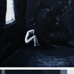
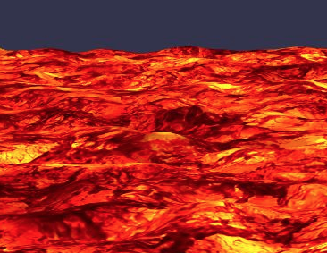
So i found this image based off my book i design. My theme is dark so i wanted to find an image that represents it more. So i discover this artist and her work and i like the dark colors that she included and the idea of her showing what is like to have depression and anxiety. This color reference will be use in my book and any of future ideas i have, i can always come back to this. I spend about 25 minutes on this project alone.
Color Harmony: Phase 2
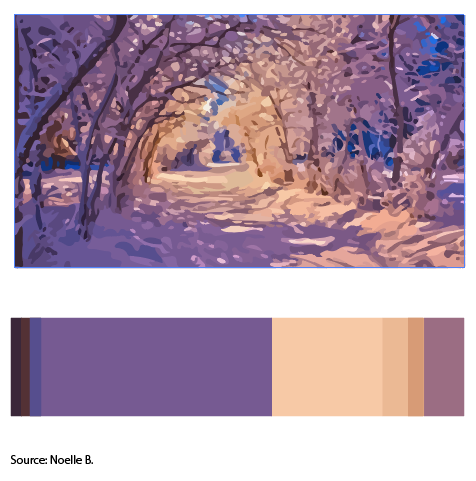
Image 2 by Noelle B
Its a picture of winter sunset. In this activity I learned the terms Dominant color(Purple tint), sub dominant cream, the accent color will be muted yellow. Color references could be utilized in future work to create a sense of harmony in the image so that it is visually pleasing. It helps balance out from an image being high in contrast or too low in contrast keeping the image interesting to look at. I’ll use this for my cover because the title contains the word joyous which I associate them with warm colors in the trees.
30 minutes
Color Harmony: Phase 1
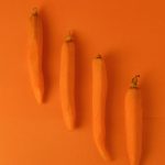
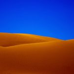

So the first image you see is carrots that are peeled and lined up. This is monochromatic because you can see the difference in the shade of orange and this is caused by the shadow of the carrots. Second image you see next is the desert that is purely saturated to show the contrast between the sand and the sharp blue sky. This is complementary because blue is complement to orange. The last image is analogous because the red, orange, and yellow is together just like in the color wheel.
Color Harmony: Phase 1

post altogether took maybe 15 minutes?

Color Harmony: Phase 1
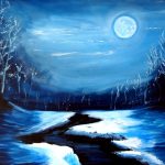

Image 1 by Katy Hawk
Image 2 by Cassandra Penner
Image 3 by Noelle B.
The monochromatic one is supposed to be one color with different shades/tints. This first image is dominantly blue and contains all its shades varying from light blue/blue/navy blue. The analogous color are colors next to each other on the color wheel so in this image it would be purple/violet/red. The complementary color is colors across the color wheel so in this third image that would be violet and orange/yellow.
30 minutes
Class Notes: Project #4 Cover Letter
Upcoming schedule:
- M 12/10:
- draft formal cover letter for Project #4
- add 14th (and 15th) glossary entries
- W 12/12:
- Post complete draft of Project #4
- Q&A about Project #4
- Review for final exam
- receive copy of final exam reading
- draft FYLC writing response about adjusting to college
- Th 12/13
- Project #4 due online
- M 12/17:
- Write final exam
- Glossary Write-Up due
- W 12/19:
- Complete survey about ENG 1101/Ways of Seeing
- Final presentations/critique/showcase of work (bring your Glossument book, please!)
Project #4 formal cover letter (questions? ask them here!)
Whether you’re submitting an application for a job or materials to be reviewed for submission to a gallery, or writing for publication, or any number of other things, you’re going to want to include a cover letter. For the purposes of this assignment, the cover letter is a business letter designed as a way to let the recipient know about your project and about you as a designer/artist/writer. As we’ve discussed, we’re writing some of the same information in each part of the project (gallery catalogue entry, didactic panels, and cover letter), but they’re each with a different purpose and a different audience in mind.
For the cover letter, we’re going to follow a template:
Your Address
Date
Recipient’s Full Name
Recipient’s Title
Recipient’s Address
Salutation with Recipient’s Name: (note the colon not comma here)
I am writing to you to inquire about your gallery/museum/etc space and to propose an installation based on the work my classmates and I have compiled. I am a Communication Design student at New York City College of Technology studying…interested in… Together with my classmates, we have developed an installation entitled A Glossument. Inspired by Tom Phillips’s A Humument, this project…
[fill in blank areas]:
- classes you’re taking
- interests you have (could serve as transition)
- what A Glossument is: altered book, using glossary entries, image and text
- gives the books new meaning…rewrites, recasts, reimagines
Our installation includes….My work, in particular, [work in the name of your project]….Each piece to be displayed has already been prepared with appropriate didactic panels (see “Title 1,” “Title 2,” “Title 3,” and “Title 4,” as well as catalogue entries for my and each artist’s contributions.
- explained more about what A Glossument is
- technique
- goals for the project
- goals for the installation: what visitors would take away from seeing this work
My classmates and I hope that this installation is of interest to your (gallery/museum/etc). If I can answer any additional questions, please reach out to me at the address above. I look forward to your reply.
Sincerely yours,
Signature [don’t include your real signature!]
Your Name [ or your display name]
Glossary Write-Up
Your Glossary Write-Up will be due on Monday, 12/17. Follow instructions posted in the Glossary assignment information.
Color Interaction Parings: Phase 3
This entire project, i would say, took me around an hour, it was fun to do designs for each color
For my partner in this project , Gary, I went with a deep dark blue. While getting to know him, he said his favorite color was black, but his personal interests were vibrant and held a lot of emotion in them. A music style he said he liked was jazz, which Immediately associated with the song ‘ rhapsody in blue’. so I chose this particular shade of blue because when you first glance at it, it’ll look black, but looking at it more you’ll see that it’s blue, which I hope can visually express how when you first meet Gary he might appear as g o t h but he’s actually really cultured and talented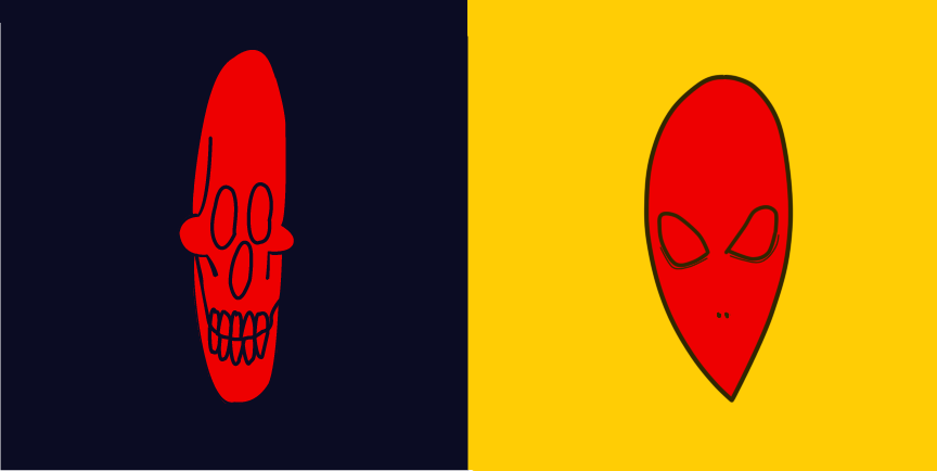
Value-Added Portraits: Phase 2
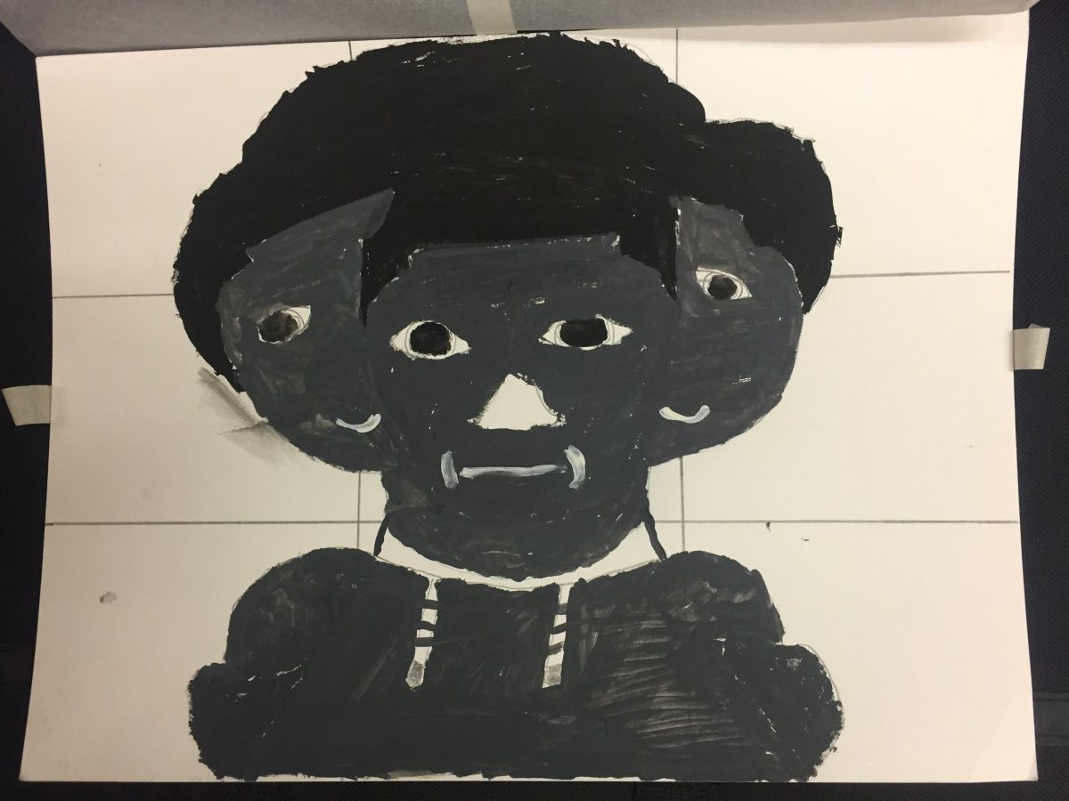
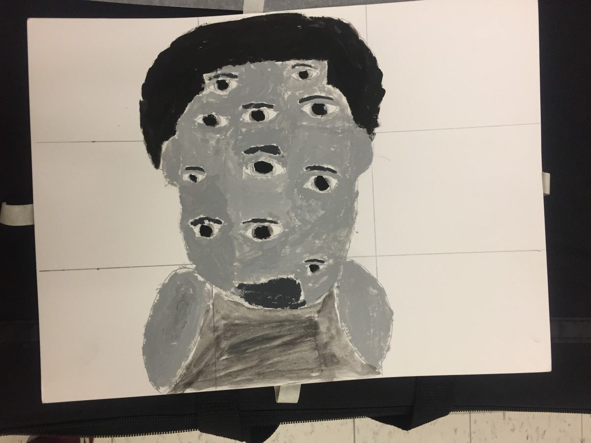
The first picture was meant to be mysterious and more of an expiriment. The second piece was more of an artistic style. I tried to convey the theme of illusion and humor at the same time.
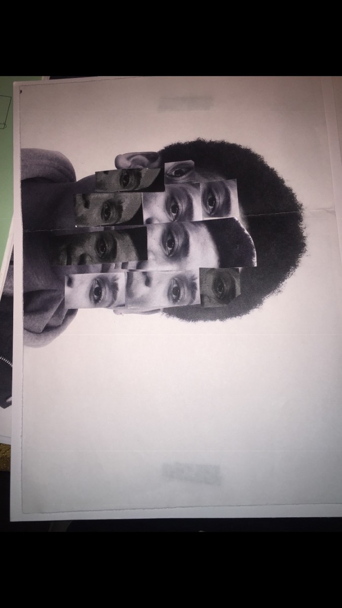
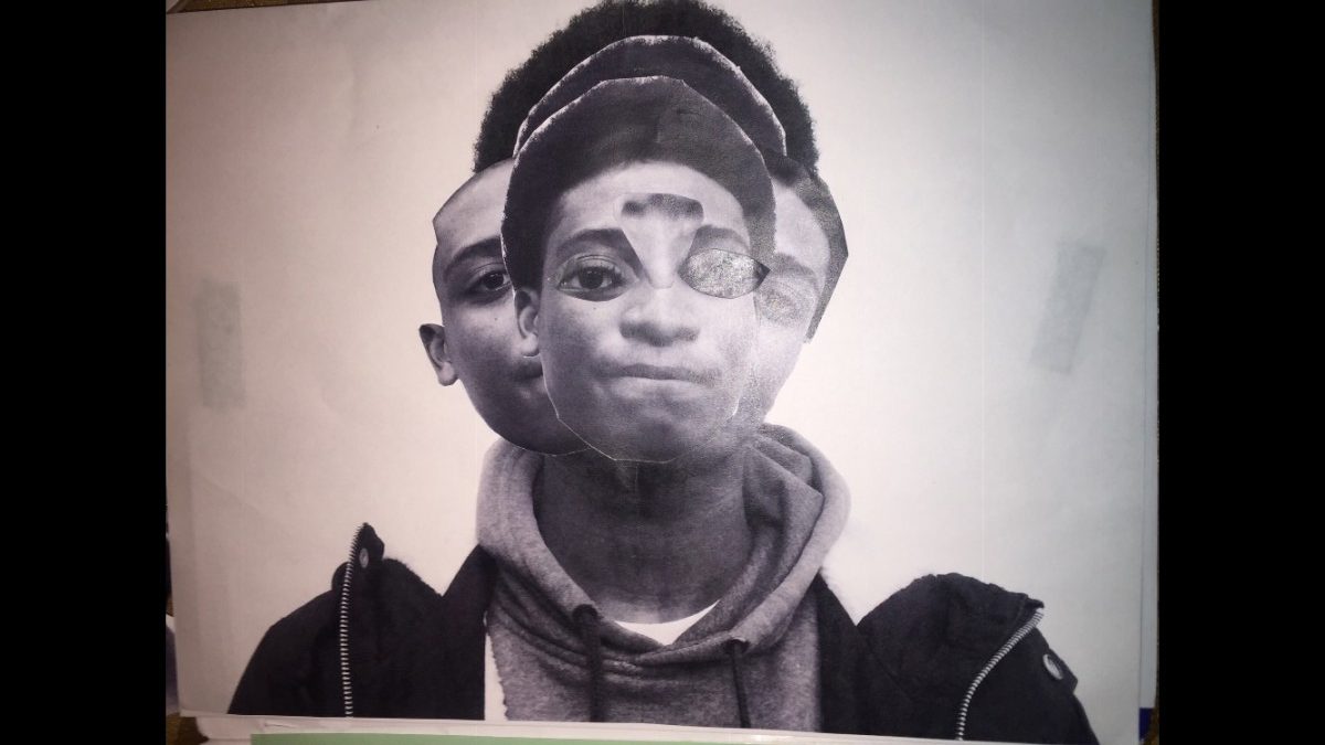
This part o the project took me about 5 hours of cutting out and putting glue to Mae these posters work.
Catalog Entry
The glossument book ” The Mark”, contains illustrations that represent the word chosen from Eng1101 glossary list or our glossument. The words chosen all fit the theme of the book. The book has a dark theme, it contains a little horror, a little of a somber tone or mood. The author chose a dark theme for his book because he enjoys the dark and horror genre. The artist mainly uses black and white in his illustration because he believes there are really great and strong colors that give off a kind of dark feel or vibe, although there are some images containing a little color besides the colors black and white. The artist created these images mainly using a brush pen to help color or cover the page at a faster rate and inking pens to outline and circle words, he uses pens as well to create detail illustration or add any detailed aspect in his work, he also uses pencil for one of his pieces in the book to add a little shading. The author gets inspiration from other book altering artworks and artworks that convey a dark theme.
This project was inspired by the book ” A Humument” created by the artist Tom Phillips. The idea was to find a book and alter every page by painting, collage and cut-up techniques to create an entirely new version. Tom did this to book called A Human Document by W.H. Mallock, he transformed it into A Humument. The author took the method altering books and an applied it to a book of his own, which he found lying around in his house.
The book he altered was called ” The Mark of Athena”, written by Rick Riordan. The author took this book and transformed it into “The Mark. The author got his inspiration from other illustrations or blackout art that was created by other artists, some who specialize in altering books or creating book art. He also looked at artwork that conveyed a dark or horror theme. He used some of the other artwork as a reference for the artwork of his own which his altered book. The motivation the author had working on this project was basically trying to discover the ways he could express or represent a word through the process of imagery, the way things are drawn, and through emotion. He also enjoyed looking at other work that related this project and tried to basically incorporate a piece of the work seen during his research, into his own.
There were not many steps in the process of creating or altering a page in the book. The author wanted to keep his work simple, but he also wanted to add some detail. After the author chooses a word to incorporate in his book, the first step the author does to visually represent that word, is to create an illustration, an illustration when seen to, the viewer would have an idea what word it is trying represent. After taking his time to finish creating the illustration, the author begins to black out the page. The author does this to block out the words which would distract the viewers from the focal point of the page. The author may circle words he wants to incorporate into a poem or words that relate to the word being represented in some way, beforehand so that when he is blacking out the page, he knows to go around them. Blacking out a page took a lot of time, even with the black brush Pen. The author says that to him this was the most annoying part, but also the most necessary.
Didactic panels:

