Doing this project was pretty fun; learned more about photoshop, I didn’t know the program could also be used for animation. At first it was a bit time consuming, trying to make the mashup sync with the music was a bit of a challenge. The end result was pretty cool and the amount of work that was put into the animation payed off.
Page 31 of 47
October 24, 2016
What’s Due?
- Complete VALUE RANGE RESEARCH:
- Post your paragraphs and 2 images (high key and low key) to the class blog (see Project #3: Phase 1 Guidelines.) Don’t forget to comment on at least 3 other students posts.
- Bring in the completed value scale exercise we started in class.
- Complete (1) Narrow Value Range Collage (either high-key or low-key) using your portrait printouts, refer to Project #3: Phase 2. Come ready to work on your paintings.
Materials Needed:
- white and black gouache paints
- sable-type watercolor brushes (do not buy brushes for acrylic or oil)
- FLAT: 1/2″ angle, #4
- ROUND: #1, #5
- two water containers (yogurt cups, soda bottles with tops cut off, soup cans)
- palette (round 10-well)
- cotton rags (old white t-shirts or scraps)
- Sketchbook, pencils, eraser, knife/scissors, ruler/T-square, drafting tape
Critique
Students will present completed (1 of 2) 6″x6″ collages to the class.
- (1) Narrow Value Range: either high-key or low-key
HOW TO GIVE AND RECEIVE A GOOD DESIGN CRITIQUE:
Do the compositions presented follow the guidelines?
- Is there a sense of MOVEMENT / COMPOSITIONAL FLOW to direct the viewer to a clear FOCAL POINT emphasized through the use of CONTRAST and changes in VALUE?
- Are the compositions 6×6″ squares?
- Do you observe new shapes and lines created from the original portrait?
- Is the value range, narrow (high or low) and does it convey a certain mood?
- Is the work clean, neat, and thoughtfully presented?
Lab
Continue work in class on Project #3: Phase 2 & Phase 3.
Demo
Painting Prep:
- Take a photo of your finished and approved collage, just for future reference.
- Use a small piece of tape on the back of each square to adhere them to a piece paper in your sketchbook.
- Create a viewfinder frame, so that you only see one square at a time while you are working.
- Keep everything clean and neat.
Once collage compositions are critiqued and approved, work on recreating your Broad Value composition in paint.
Broad-Range Painting:
- Recreate your broad-range collage in paint.
- Using your collage pieces as a visual reference, you will be using a viewfinder and grid and painting each area in isolation (independently) from its neighbor. This is VERY important.
- Create a viewfinder frame, so that you only see one area of your composition at a time while you are working. Draw grid lines around the edges of your collage (NOT ON TOP) to keep track of your progress.
- On a piece of clean, 9×12″ bristol trace or measure the dimensions of your collage squares from the exercise above.
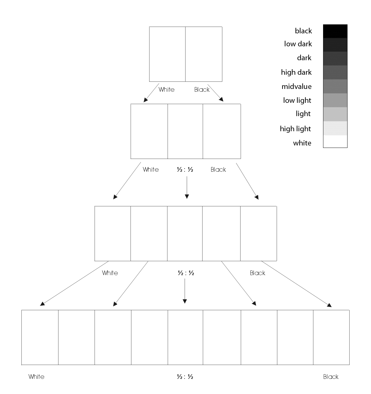
- Using your Value Scale as a guide, recreate (in gouache paint) each area of your composition using a range of black, white, and gray values- achieving continuous tone in areas where highlight and shadow blend together.
- Painting Tips:
- Do not worry about accurately rendering an eye, nose or ear, see/think only in terms of value and the boundaries of each value relationship.
- Notice how some values crossover shape boundaries into adjoining areas (open-value), while others are limited by the edges of the shape (closed-value).
- Remember to work on each square independently and protect your finished painting with tracing paper as you work. Gouache is very delicate and can easily pick up the dirt and oils from your hands.
- Mix a very small amount of water thoroughly into the paint, for each value you create. The consistency should be like whole milk or cream. Before you apply paint to paper make sure it’s completely mixed in the palette to produce a flat consistent appearance. We want flat, blocks of paint with few streaks or brush marks.
- Wash your brush after each value is mixed and applied. Keep two containers of water, use 1 for washing your brushes and 1 for adding water to paint.
- Use a paper towel or rag to get excess paint and water off the brush before mixing a new value.
- When you have completed your composition carefully protect all elements with a piece of clean tracing paper and cardboard.
- We will cut and mount the painting with the original collage together in class.
Homework
For next class:
- Broad and Narrow Value Collages finished.
- Come prepared to continue to work on Painting.
- Same materials as today.


My high key image is the light reflecting on the tile. Since the tile is glossy, the light on top reflect on the tile, and creating a gradient like highlight on the floor.

My low key image was the room next door, it was a glass,see-through room. The room was dark because the curtains are down. But light from the outside escape through the gaps of the curtains of one window to the other. Since it is a see through room, the outer layer is glass, so it reflect what is on the outside of the hallway.
Phase 2
During this project, I learned more about how different sounds can be portrayed and translated into various images. I began to realize how I can create those images to create an image for viewers. However, I feel that I could have improved my designs and been more careful as to which pattern interacts with another. While I was working on this project, I was a little mislead but worked very hard to find a way to improve my work a little bit more than usual. I believe if i work on another project similar to this i can reflect on my experience again.
This project for me was very interesting. I enjoyed collaborating music and art together, because those are my two favorite things. I’ve gained knowledge in understanding the difference between Staccato and Legato, it’s something that I didn’t know anything about before. Next time I want to create more thumbnail’s because those definitely helped me out, it enabled me to organize what I wanted to draw. The critique in class helped me identify my weaknesses, therefore next time I will make sure my composition is much more detailed and neat.
https://openlab.citytech.cuny.edu/schmerlerspevackfylcfa16/2016/09/25/sound-visualizations-phase-1-6/
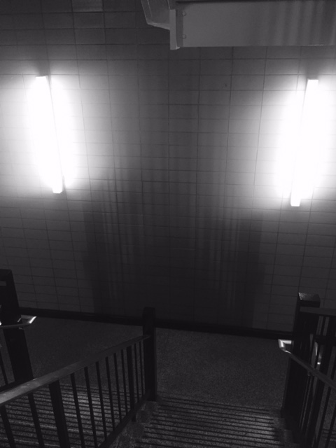
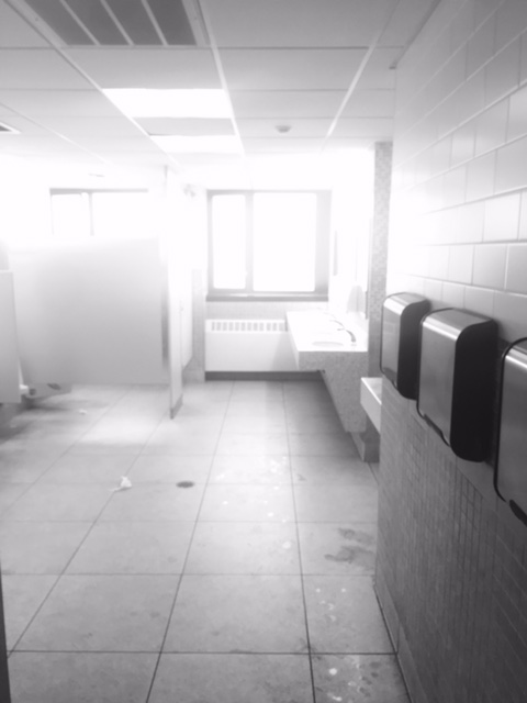
okay so in these two photos i took i thought abut the differeces in lowkey and highkey , lowkey being the darkest and highkey being the lightest . the phot i took in the staircase gave off a very dark shadow after the two lights exposed the steps shadow. and in the bathroom picture the light from the sun bounced off the light paint gave a blinding high key picture as the result

I believe that the light values in this photo help to actively guide the eye down the corridor and into the doorway. I also feel that the subtle dark values give the eyes a place to rest, which gives the doorway in the picture an important function.
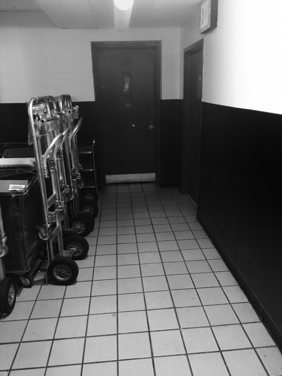
I feel that the wall paint serves a good purpose as the main dark value for this photo. It also has shadows that add to the darkness of the photo. It allows the lighter values to find a way to blend into the main dark value. While there is a fair amount of light elements in the picture, I feel like they help the darker images stand out in the composition.
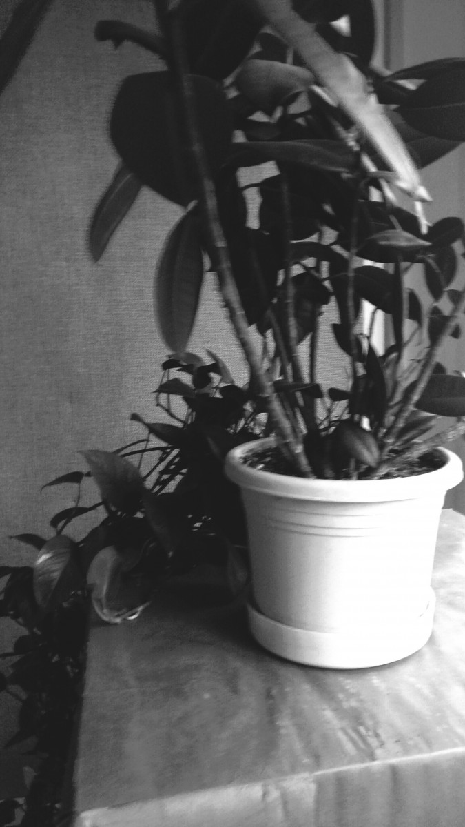
My high key image demonstrates a calm afternoon. The plant is next to the window. This gives it a strong glow which make the high tones. The high tones go from left to right getting darker. The focal point is the plant pot. The drama feel is calm.
My low key image demonstrates a dark type of feeling. The lone “EXIT” sign gives a sense of emergency as everything around it is dark and the most visible things are the words. All throughout the picture, the tones are very dark. The only exception is the sign letters. The drama feel is a sense of emergency.

Work time: 30 minutes
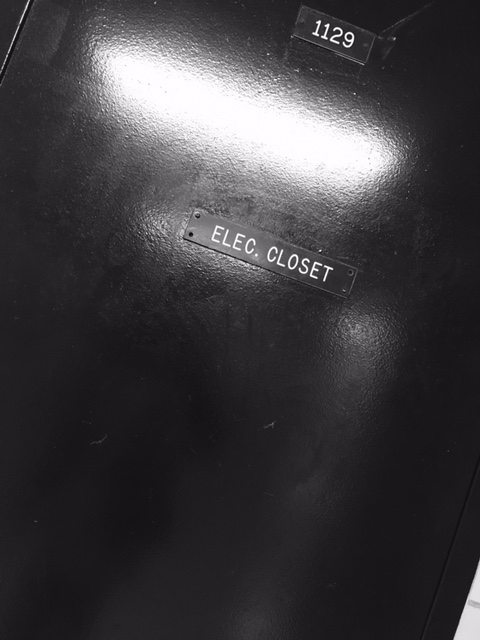
In the first picture below , the image of the door automatically gives off the sense of low key (predominantly black). The door creates the mood of apprehension. Furthermore, in the picture you can tell the relationship between the highlight and shadow. The highlight helps the door have a 3 dimensional form. The shadow however, doesn’t play a huge role in the picture , but it’s shown in the.
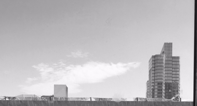
In the second picture , the image of the buildings outside give you the sense of high key ( predominantly white) . The sky gives off the mood of serenity. Moreover, the relationship between the highlight and shadow play a house role in this picture. The highlight helps the audience draw their attention to the focal point (the sky). The shadow helps to emphasize the attention towards the focal point.
High and low
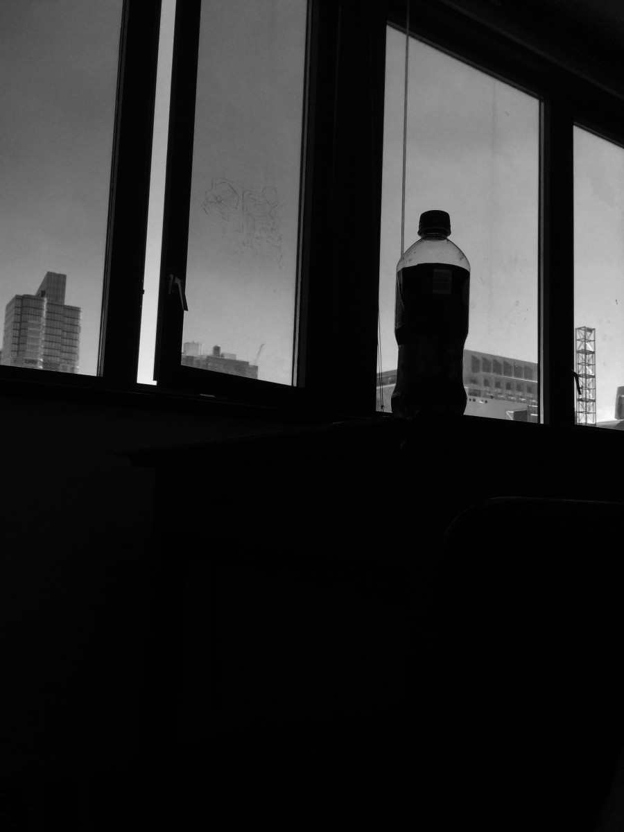
my Low key shows a matter of stillness , the dark background has a dramatic effect on the bottle ; the low top of it shows a bit of grey low grey . The drama feel as dark and Terrifiying day .
My high key shows too objects with a bright back ground ; the light is affect the two object different one has , light boncing of it ; because of its metal like features , the other has a dark center . The mood show A artist feeling the page and thinking of what to do next .


Recent Comments