For professor Spevack: My project 6 phase 3 pdf versions you asked me for
Author: Franco (Page 1 of 3)


Time worked on: 3 hours
Time worked on: 2 hours
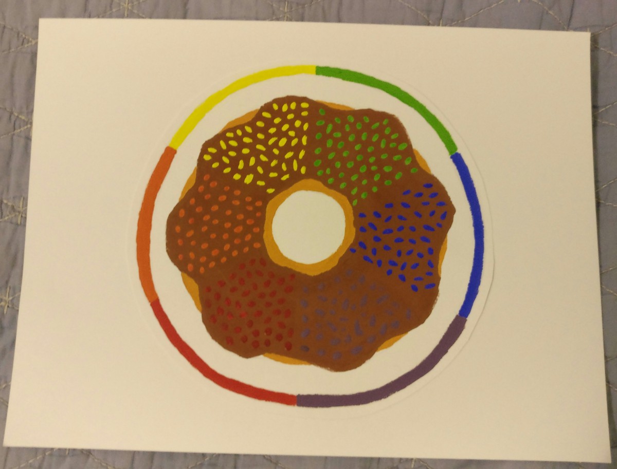
I really enjoyed this project because it was fun to work with color and I got a better understanding of how colors should be used. I enjoyed learning about complementary colors. I didn’t enjoy the gouache phase of the project even though I did like the way my color wheel turned out. The most fun I had was working in photoshop to create my poster. I really enjoyed the cold color scheme and style of the poster and overall learned a lot with this project.
Time worked on: 1 hour
Time worked on: 2 Hours
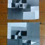
During this project, I was able to better understand value, broad-range, and narrow-range terms. It was somewhat challenging to work with gouache paint since it was a bit of a hassle. I enjoyed recreating one of the portraits in photoshop since I have a lot of experience with that program. I was also able to recognize what images had a broad range and which ones had a narrow range, that was something I had difficulty with at the beginning of this project.
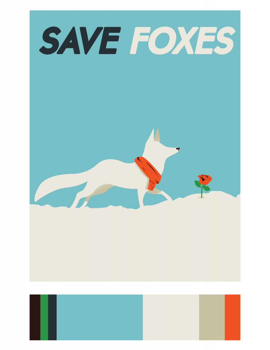
For this stage of the project, I decided to create a poster with a similar style. The reason why I chose a fox was because of the previous project we did, I thought the idea of an arctic fox would be nice. I also included the message Save Foxes because global warming continues to affect wildlife, and the arctic foxes are one of the affected species. The dominant, sub-dominant, and accent colors are the same and I decided to portray the accent color through the scarf and rose. This part of the project was very fun in my opinion, I learned a lot and thoroughly enjoyed it.
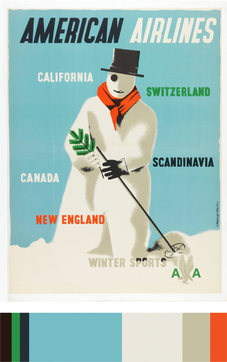
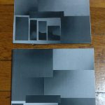
While exploring on the interactive table at the museum, I encountered this poster. I really loved the color scheme and thought I could create something decent with these colors. I learned what a dominant and sub-dominant color was. I was a little confused with the accent colors but now I think I understand. The dominant color is the pale blue, the sub-dominant would be the white, and the accent color would be the orange.
Time worked: 30 minutes
-
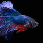
- two-color-progression
-
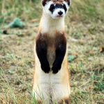
- shade-progession
-
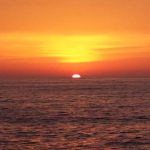
- tint-progession
I chose the fish for the two color progression because you can clearly see the change of color in the fish’s body and fin. It goes from blue to red, as well as in the tail it has bits of red. I chose the ferret for the shade progression because you can notice in it’s chest and arms, it gradually goes from brown to black. I chose the sunset because in my opinion, it was the best example for tint progression since sunsets always have many different tints of many colors. There you can see light oranges, vivid oranges, etc.


Recent Comments