First Year Learning Community

Tag: Phase 3: Develop (Page 1 of 2)

Color Harmony: Phase 3

lmartinez_phase3pt2

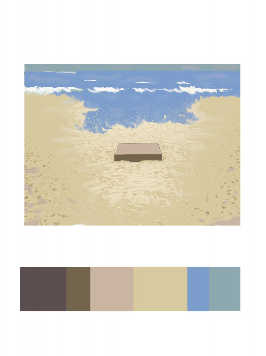
For Phase 3, the colors I got inspired by making a scenario of the beach. From the original composition, it remained me of sand. I use light brown on top of the wood box and the sides dark brown to give it shade. Most of the composition has light brown. For the blues, I used the ocean and the sky as well. The dominant color is the light brown, the sub-dominant is the sea blue, the accent color is the white or the medium brown from the wood box.

Hours Worked: 1 Hour and a Half

Color Harmony: Phase 3

Owe'neh Bupingeh Preservation Project

Owe’neh Bupingeh Preservation Project & Proportional Color Inventory

Summer

Summer

For this Free-Study composition, I decided to use my proportional color inventory to create a beach scene which I have named “Summer”. For this composition, I wanted my dominant color to be the blue hue I obtained from the sky in the original picture. I also decided to use the yellow accent to cause contrast in the composition and bring the viewers eye to the figure in the composition, which would be the man on the floating tube. After that, I wanted to use the sub-dominant shades of beige to be next to the water as a secondary figure. I also positioned it to be in the lower-right corner because I believe that this is where the eye is least likely to look first and thus leave the attention to the primary figure in the top-left. I also gave the beach coast a descending feeling by organizing the shades to grow darker as they approach the end of the composition and continue outside the page.


Hours worked: 3 hours

Color Interaction Pairing: Phase 3

color_interactions_phase_3


The color I chose for my partner, Gabriela, would be a muted purple with a bit of blue because I see her as a well-organized person. I also see her as being more reserved, calm and cool-headed. The symbol I used for her would be a deer to show that while she is gentle, she can be strong when she needs to be.

Hours Taken: 2 hours

By Aaron Hollingsworth

Color Interaction Pairings: Phase 3

lmartinez_aillustration

ShanShan and I created a paired color identities with simultaneous constrast. I chose the color blue for ShanShan because she is shy, intelligent and relax. We chose the color green as our influence color because we wanted to make the theme about nature. A symbol representing her is a tree, because when I think of a tree, I imagine a person laying back on the tree reading a book and relax.

Hours Worked: 2 Hours

Saturation Studies: Phase 3

lmartinez_bandillustration

By: Lilian Martinez

By: ShanShan Yu

By: ShanShan Yu

Our band name is Spicy Crush, I wanted the blocks to be chromatic grey, the background to have a pure color, and the letters to be muted. ShanShan and I could not decide which one was best for us because they both looked similar but different order in saturation and ShanShan wanted to change hers again.

Hours Worked: 2 Hours

Sound Visualization: Phase 3

Animation Mashup

I think this project was interesting because its the first time I made a video in Photoshop. I had some difficulties throughout this project, very challenging, however, I learned how to use timeline and adding audio in Photoshop. In the end of the video, I put some layers out of place because the music in the background sounds chaotic.

Hours Worked: 2 Hours

Sound Visualization: Phase 3

Animated Mashup

Hours worked on: 2 hours

I had a couple complications while trying to get this animation done. Never really used photoshop until i started the semester. Overall, i worked pretty hard on making it look as nice and clean as i could. Hope you guys enjoy my 12 seconds !

« Older posts