First Year Learning Community

Tag: Phase 1: Discover (Page 1 of 3)

Urban Artifacts: Phase 1

Woodside 61st street station- Creative utensil which could’ve been re-used with purchase of lead. What a waste of creative usage.

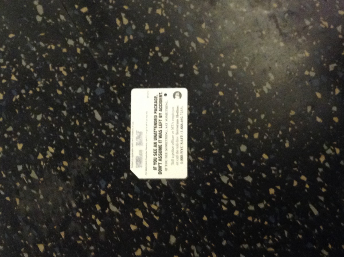
Woodside 61st street station- Another re-usable item (Metro Card) discarded in the wrong place by a irresponsible citizen.

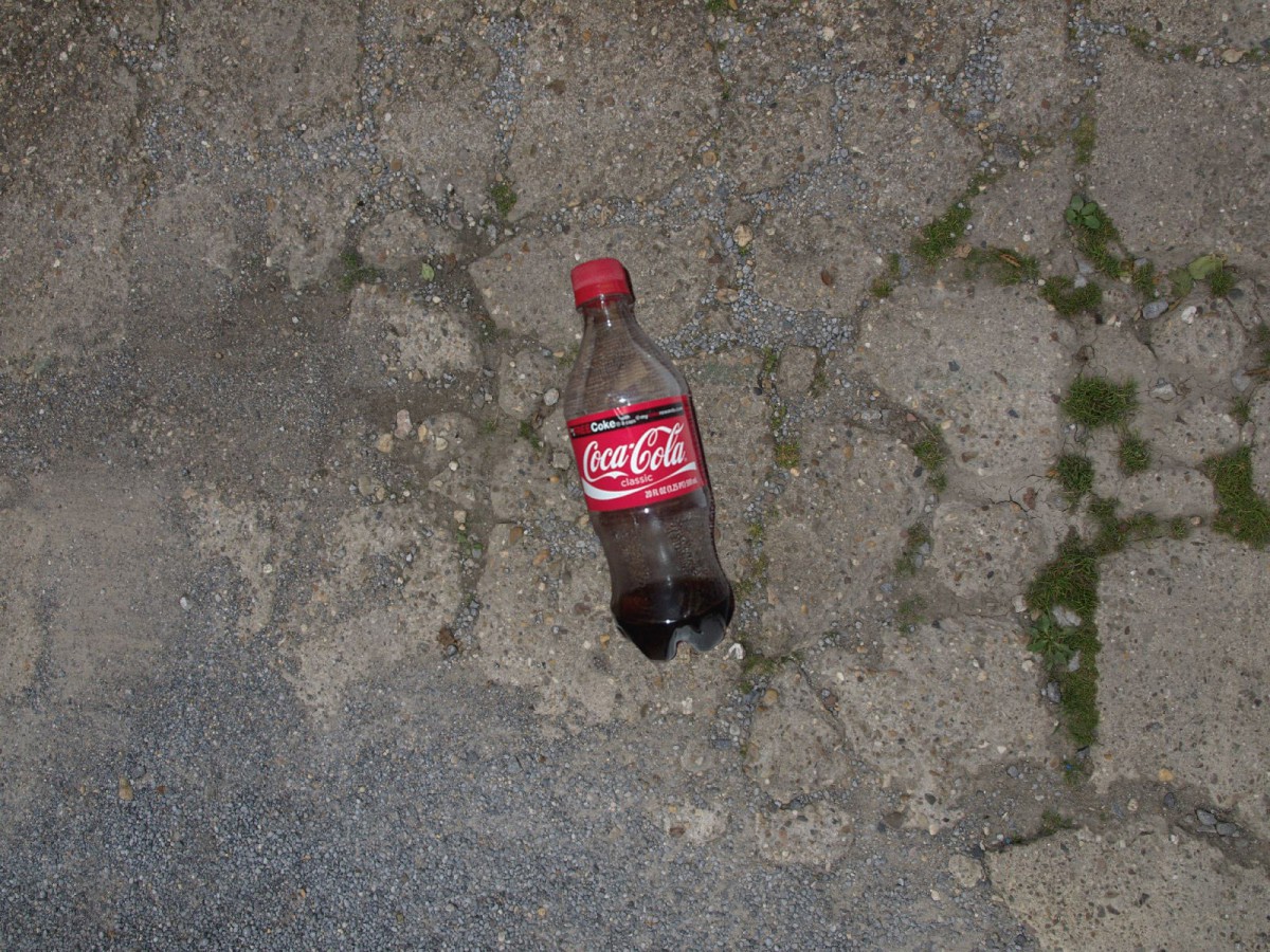
Woodside 60th street- Recyclable item (Plastic Bottle) discarded in the wrong place once again by another litterbug.

In this Urban Archeology Walk I found out there are many irresponsible citizens who misuse everyday items. Two of the objects I found are geometrically shaped which is clearly the metro card and the pencil. The plastic bottle had certain curves and circular edges which makes that object an organic shape.

These objects came from irresponsible citizens who don’t know how to recycle or are unaware of where things belong. These misplaced items have their own distinctive usage which makes them quite different. The only similarity they have between one another is their plastic and smooth texture and their irresponsible owner.

Hour(s) spent: 1.5


Color Harmony: Phase 1

Shade Progression - Bugatti

Shade Progression – Bugatti Veyron Grand

In this picture, a Bugatti Veyron Grand is displayed in black and crimson. I believe this serves as good shade progression because of the close relation of shade between the two colors. On the car, you can see some light tints where the light hits the car, but as you look at where the color meets the black parts of the car, the division of color is clean while the red is still turning darker as it gets closer up to a point.

Color Progression - Eyeball

Color Progression – Eyeball

This picture uses the human eye as an example of good color-to-color progression. I believe that this is a worthy example becase of how the blue and orange segments of the iris are separate at opposite ends of the iris and begin to mix as they meet in the center line of the iris.

Tint Progression - Flamingo

Tint Progression – Flamingo

This flamingo serves as a good example of tint progression because of how its feathers fade to a whiter tint as they progress towards the back of the bird. The reason a flamingo feather has any color is because of all of the shrimp that they eat as they grow up. The shrimp that they digest causes their feathers to absorb the pigment of the shrimp, gradually turning their feather from white to pink.


Hours worked: 1 hour

Color Harmony: Phase 1

img_3535

Two-Color Progression

581bc18a-3064-4c0a-ae83-876cc018d1f9

Tint Progression

img_3539

Shadow Progression

The first image shows two-color progression because of the green has different tones that turn into black.  The tint progression shows the sunset, the tint shows the yellow orange colors, they are analogous. The shade progression shows the clouds white then turning darker, to medium black.

Color Interaction Parings: Phase 1

e178b40cc70dc29ab3d24c70a7db0267imagesmi0srvix

The left picture is the atmospheric perspective of the sky in Alaska. I see these colors combining together and different shades of blue and orange. I see tint of purple and greenish color and I think that no color is being center of attention. It catches the person interest towards  above then slowly down in the composition. In the second picture it shows a person head with different colors. There are colors and different shades of it because of the background color surrounding it. For instance, the blue looks light on the orange but not in the red.

Color Interaction Pairings: Phase 1

Obtained from Wikipedia

Bismuth

Bismuth Crystal

I find the color interactions on a Bismuth crystal to be fascinating because of all of the different hues that appear on the surface of the crystal. The reason that Bismuth shines in so many different colors is because of the different levels of oxide that reside on its surface. This causes for light to reflect in different wavelengths off of the crystal and appear as different hues.

Obtained from Pinterest

The Paradise Tanager

The Paradise Tanager

This image caught my eye because of the contrasting colors on this tropical bird. The reason for this was because of the different color contrast that appears on its feathers. I like how while all of these colors seem very vibrant, the change in value differentiates them from each other. This allows for the birds overall appearance to really stand out without clashing against itself.

Value Added portraits- Phase 1

The first image is of the water fountain that’s next to the class. The image gives an ominous mood, if it wasn’t for its reflective surface, it would have been difficult to see that it is a fountain. The second image I chose to make high key because of the amount of light that bounced of the floor and on to the plants surface, which gave it a reflective amount of light even with the grayscale filter.

« Older posts