During this project, I learned about the relationships between different colors and how these relationships can work to enhance or dull the presence of each color depending on their positioning. I believe that I maintained a good understanding of the progression of colors in tints, shades, and color transitions. The understanding of these three topics helped me to find a good example of color harmony during our trip to the Cooper Hewitt Design Museum and gave me the opportunity to use these color relationships to recreate them in my own fashion. So overall, I believe I encountered and digested a great amount of knowledge and potential from this project.
Author: Aaron (Page 1 of 3)
Owe’neh Bupingeh Preservation Project & Proportional Color Inventory

Summer
For this Free-Study composition, I decided to use my proportional color inventory to create a beach scene which I have named “Summer”. For this composition, I wanted my dominant color to be the blue hue I obtained from the sky in the original picture. I also decided to use the yellow accent to cause contrast in the composition and bring the viewers eye to the figure in the composition, which would be the man on the floating tube. After that, I wanted to use the sub-dominant shades of beige to be next to the water as a secondary figure. I also positioned it to be in the lower-right corner because I believe that this is where the eye is least likely to look first and thus leave the attention to the primary figure in the top-left. I also gave the beach coast a descending feeling by organizing the shades to grow darker as they approach the end of the composition and continue outside the page.
Hours worked: 3 hours
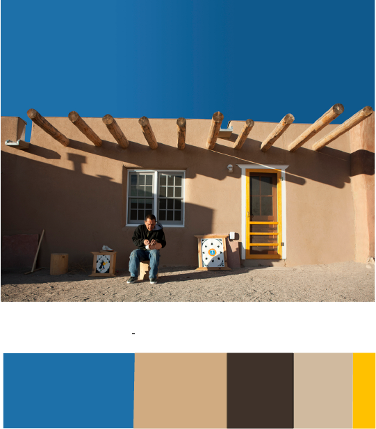
Owe’neh Bupingeh Preservation Project
During my visit to the museum, I happened to have encountered this exhibit and found that image as a composition to be interesting. I liked how the sky in this picture makes a clear contrast with the pueblo and helps it to pop out at the viewer by sinking into the background with a darker value. I also like the value contrast between the pueblo walls and its shadows, which causes the eye to be drawn to it. Because of these details in the composition, I learned about how important the positioning of two different colors can be in a composition.
Aaron Hollingsworth’s Cooper Hewitt Page
Hours worked: 1 hour
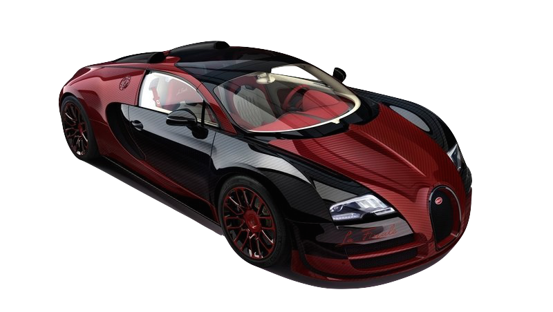
Shade Progression – Bugatti Veyron Grand
In this picture, a Bugatti Veyron Grand is displayed in black and crimson. I believe this serves as good shade progression because of the close relation of shade between the two colors. On the car, you can see some light tints where the light hits the car, but as you look at where the color meets the black parts of the car, the division of color is clean while the red is still turning darker as it gets closer up to a point.
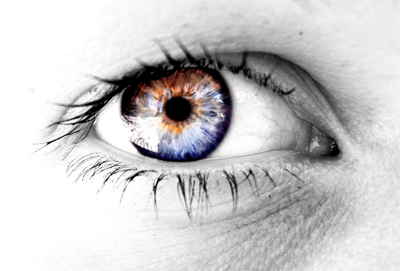
Color Progression – Eyeball
This picture uses the human eye as an example of good color-to-color progression. I believe that this is a worthy example becase of how the blue and orange segments of the iris are separate at opposite ends of the iris and begin to mix as they meet in the center line of the iris.
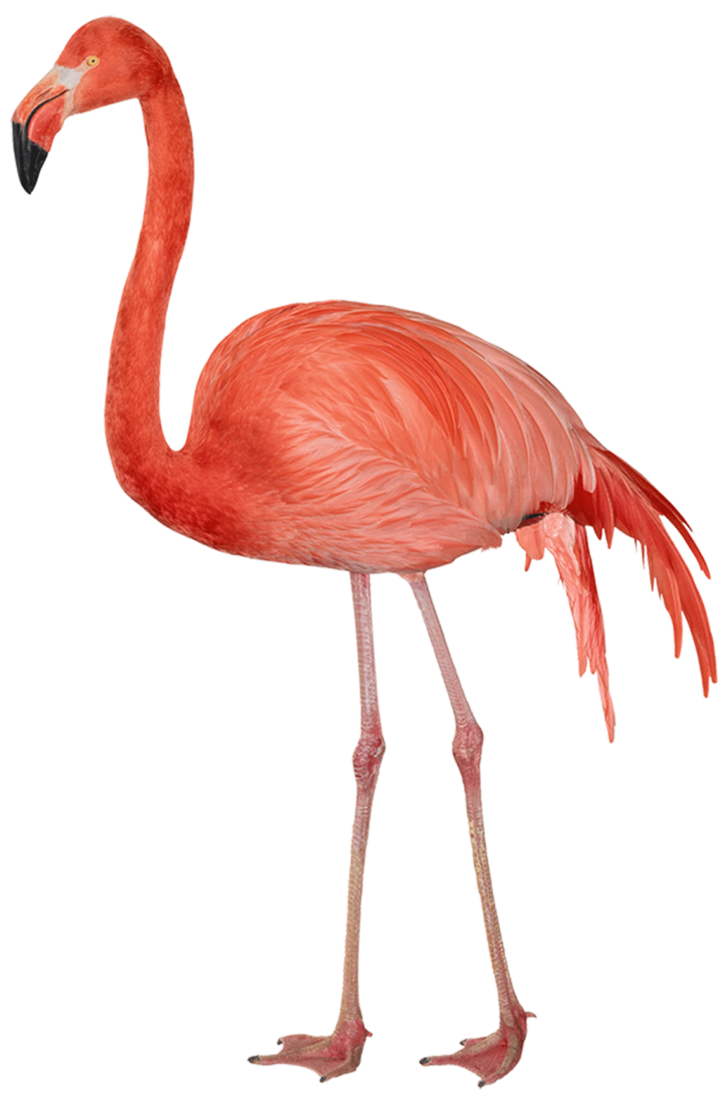
Tint Progression – Flamingo
This flamingo serves as a good example of tint progression because of how its feathers fade to a whiter tint as they progress towards the back of the bird. The reason a flamingo feather has any color is because of all of the shrimp that they eat as they grow up. The shrimp that they digest causes their feathers to absorb the pigment of the shrimp, gradually turning their feather from white to pink.
Hours worked: 1 hour
During this project, I learned about how how some colors can be perceived differently depending on whatever colors surround them. I also learned that a certain hue of a color can have a variating shade that helps them to stand out. While I was working on this project, I felt that it took a little bit of time to train my eyes to be able to see the changes in color, but I believe that my ability to see the difference in value was what helped me excel in this project.

The color I chose for my partner, Gabriela, would be a muted purple with a bit of blue because I see her as a well-organized person. I also see her as being more reserved, calm and cool-headed. The symbol I used for her would be a deer to show that while she is gentle, she can be strong when she needs to be.
Hours Taken: 2 hours
By Aaron Hollingsworth
-
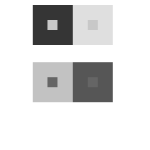
- Value
-

- Hue
-
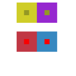
- Hue not Value
-

- Hue and Value
Hours Worked: 1.5 hours
Obtained from Wikipedia
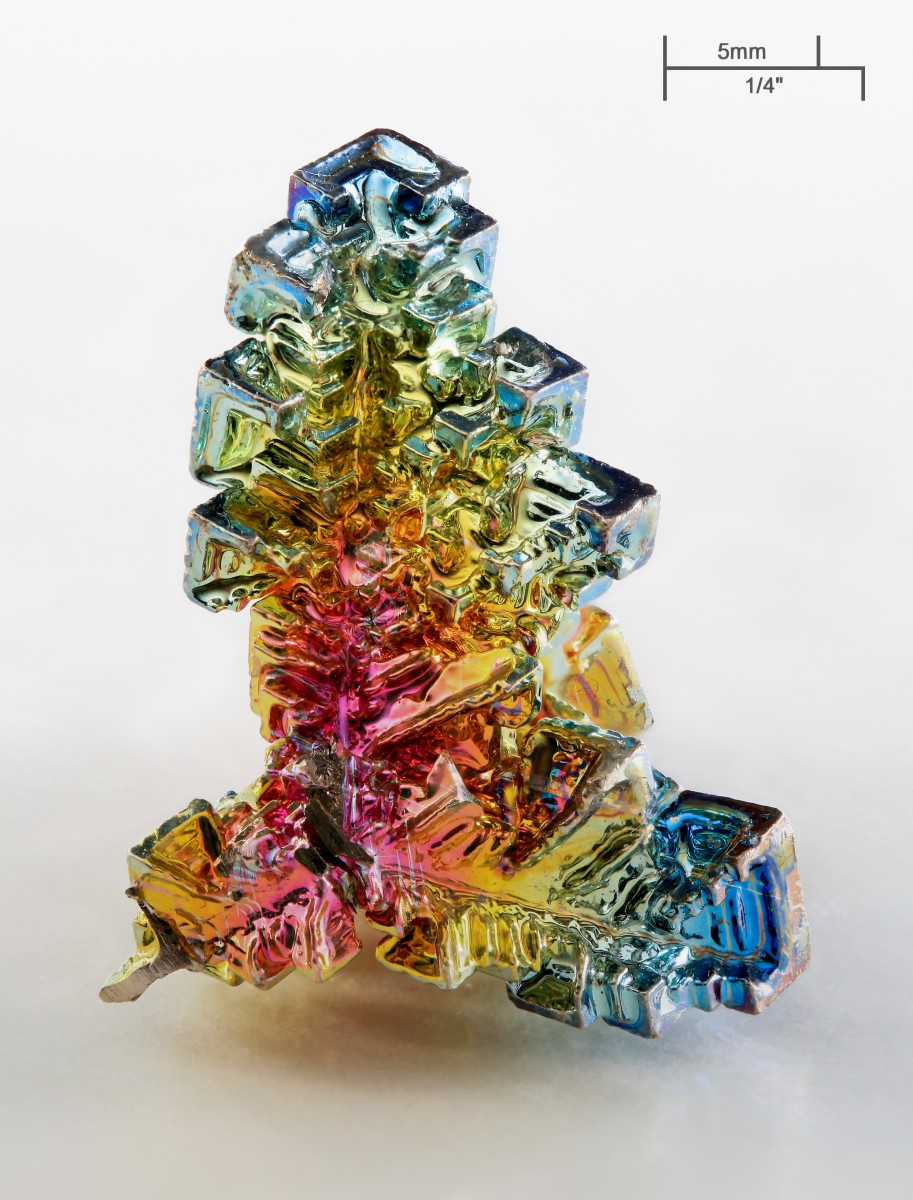
Bismuth Crystal
I find the color interactions on a Bismuth crystal to be fascinating because of all of the different hues that appear on the surface of the crystal. The reason that Bismuth shines in so many different colors is because of the different levels of oxide that reside on its surface. This causes for light to reflect in different wavelengths off of the crystal and appear as different hues.
Obtained from Pinterest
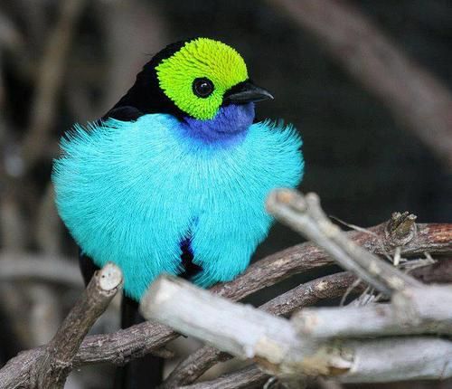
The Paradise Tanager
This image caught my eye because of the contrasting colors on this tropical bird. The reason for this was because of the different color contrast that appears on its feathers. I like how while all of these colors seem very vibrant, the change in value differentiates them from each other. This allows for the birds overall appearance to really stand out without clashing against itself.
During this project, I reviewed a familiar yet complex topic in the subject of color, brightness, and saturation. I feel that I could have improved my craftmanship closer to the beginning of the project and still remains as a problem for me. However, I do feel like I have come to understand the nature of different colors in a new way.
Hours: 1.5 hours


Recent Comments