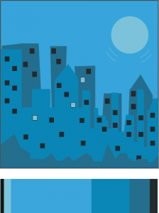
I always enjoy drawing different versions of the city. So for my freestyle i decided to use this color palate to create a piece of the city in another media, illustrator. The dominant color is the light blue, the accent color is the light turquise, and the medium colors are thr darker toned turquises and the dark gray and black.
Recent Comments
- ShanShan on Color interactions: Phase 4
- Franco on Color Harmony: Phase 3
- Franco on Color Harmony: Phase 3
- Franco on Color Interaction: Phase 3
- ShanShan on Color Harmony: Phase 3
Archives
Categories
Tags
#phase3
BRIC
Color Harmony
Color Harmony: Phase 1
Color Harmony: Phase 2
Color Harmony: Phase 3
Color Harmony: Phase 4
color interaction
Color Interaction: Phase 1
color interaction: Phase 2
color interaction: phase 3
Color Interaction Pairings: Phase 4
color interactions
gelek samphel
Midterm Grade
phase #2
phase 1
Phase 1: Discover
Phase 2: Define
phase 3
Phase 3: Develop
phase 4
Phase 4: Deliver
Project 2
Saturation Studies
Saturation Studies: phase 1
Saturation Studies: phase 2
saturation studies: phase 3
Saturation studies: phase 4
Saturatio studies: phase 3
Saturatio studies: phase 4
Sound Visualization Phase 1
sound visualization phase 2
Sound Visualization Phase 3
Sound Visualization Phase 4
Sound Visualizations: Phase 1
Urban Artifacts
Urban Artifacts: Phase#2
Urban Artifacts: Phase 2
Urban artifacts phase 3
Urban Artifacts Phase 4
value-added portraits: phase 2
Value Added Portraits: Phase 4
value added portraits phase :1
Value added portraits phase: 3


Nice job, I can relate to that because I’ve also enjoyed creating drawings of the city. I really enjoy the color scheme and think your artwork looks good!