It was a little difficult comprehending certain terms and applying that knowledge on to the project (phase 2). However by the end of it, I understood the terms and I was able to apply it to my projects correctly, hopefully. Understanding color interactions is extremely important when composing an image with more than 1 color to see how it might affect one another. I did have difficulty with phase 2 but I think I understood it by the end and I am hopefully correct.
Category: COMD1100 Project #5 (Page 1 of 6)

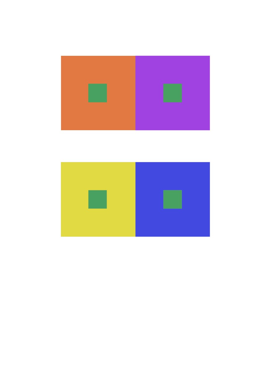
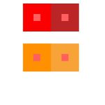
To start off, we used our zodiac signs to gain inspiration and we built off from that. It wasn’t too difficult to choose the background colors that represented us however selecting a color that showed a proper color interaction vividly was a little difficult. We tried a few different colors but ended up with a darker shade of red. It vividly shows the color interaction. When surrounded by the shade of orange, the red seems darker. When surrounded by the darker violet, the red appears lighter.
Hour(s) Spent: 1
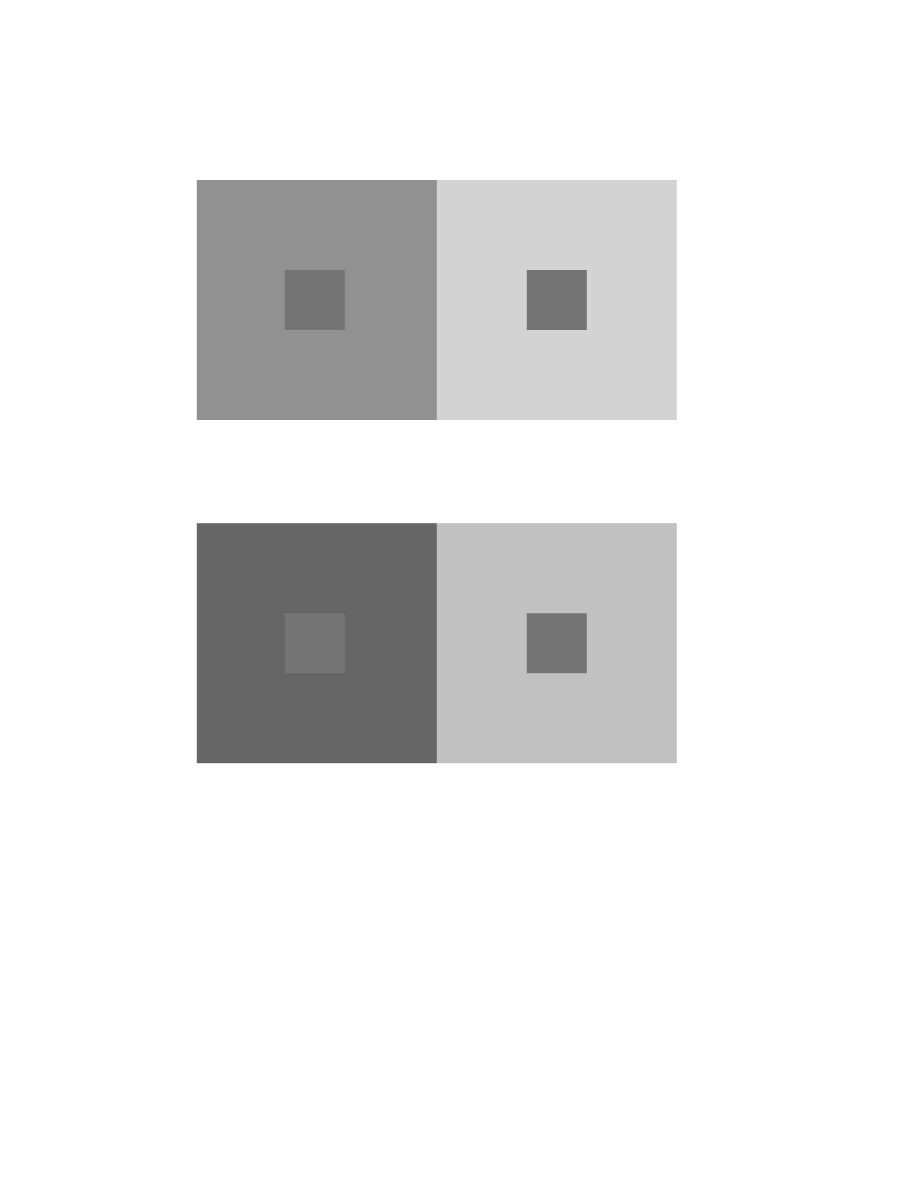
Achromatic Grays Shifting Value

Color Shifting Value
Color with Shifting Hue
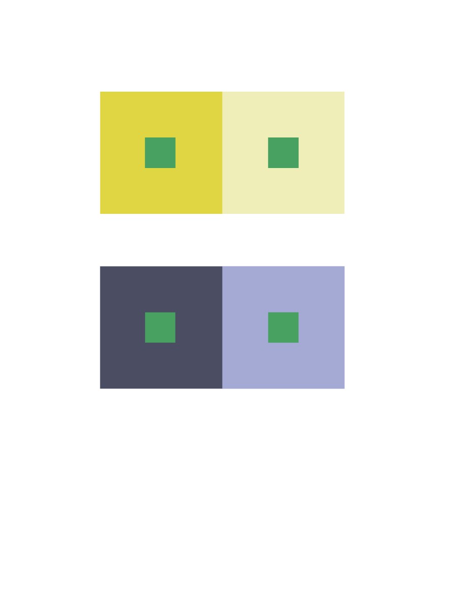
Color with Shifting Value and Hue
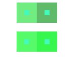
For all of these color interactions, I learned the the surrounding color and affect the color getting surrounded to the viewer when it isn’t being changed at all. For each interaction, I also got to understand terms like hue and value. The colors change when you shift either of these.
Hour(s) Spent: 1
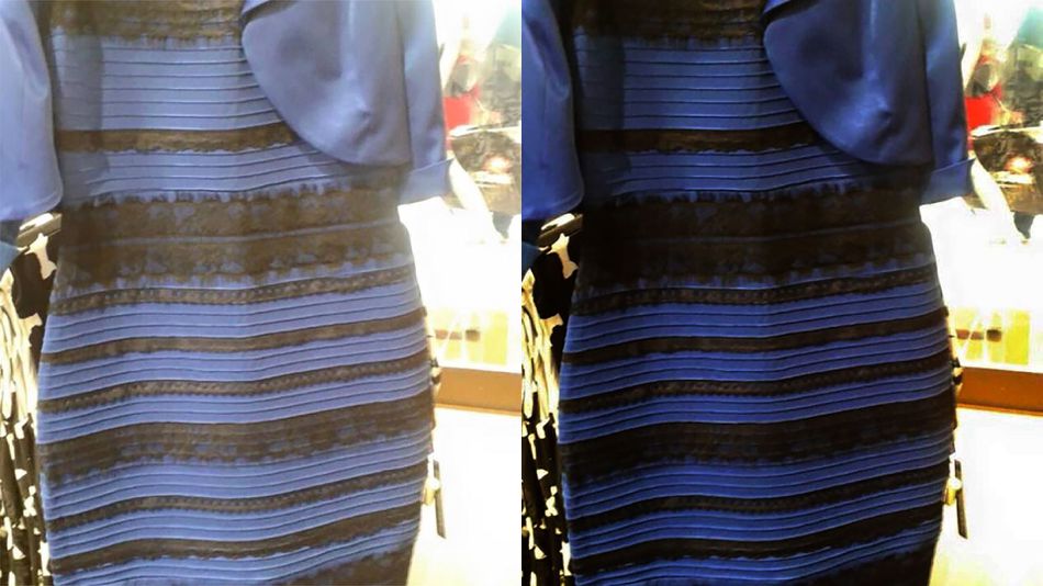
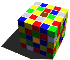
The ‘blue and black dress’ took over the internet when people couldn’t figure out what color it actually was. The lighting and saturation of the images of the same dress makes it so confusing to figure out what color it actually is. Although it’s the same dress, the surroundings of the dress affects its representation. Same thing happens in the cube picture. The colors are the same on all the sides but due to the ‘shadow’ it creates an illusion that is might be different colors.
https://openlab.citytech.cuny.edu/schmerlerspevackfylcfa16/2016/12/15/color-interaction-phase-3-5/
Group project with Donasia and Ely
-

- value with color
-
- shifting hue and value
-

- chromatic greys
-
- shifting hue
Hours taken: 1 hour
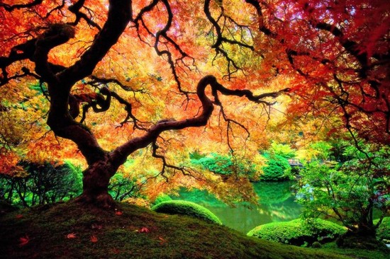
I chose both of these images because I really like how each image blends in on it’s own. The first one has a night time sky setting in, with the lights reflecting on the water. The second shows off different colored leaves on the tree, showing that autumn is beginning.

I choose this picture that I took around the high line. Because the whole picture is made up of color. I took it during the summer and the picture pretty much shows that it was taken around a warm sunny day. The contrast on the mural was edited a bit but in the original it express the same amount of contrast.

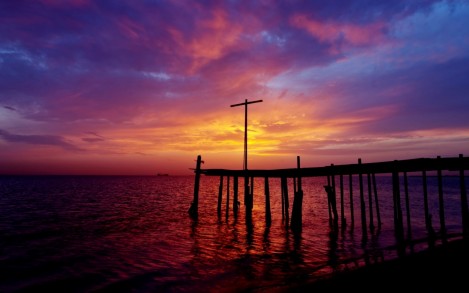
This picture I took around my block, the natural light in the sky during the sunset was very beautiful and eye attracting that I had to take it.
Doing this project help me understand why picking the color for a theme is important. Color gives meaning to a project. This something I never thought of because when I think of color all the pops in my head is green, red and blue, but after doing this project I see that color is much more than that. This project helped train my eyes to see the difference in color when I see a portrait or picture. As well by placing complementary colors next to each other makes one another visually appear different.


Recent Comments