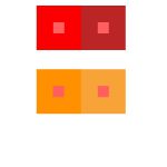
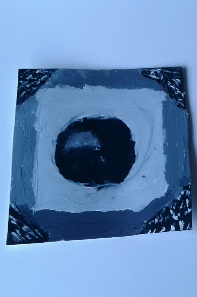
For the most part, I think this project went well. Understanding the color interactions wasn’t too hard so I got the hang of it. The group project we did was pretty fun too, but I wish we got a chance to detail the gingerbread men a little more.
First Year Learning Community
https://openlab.citytech.cuny.edu/schmerlerspevackfylcfa16/2016/12/15/color-interaction-phase-3-5/
Group project with Donasia and Ely


Hours taken: 1 hour
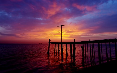
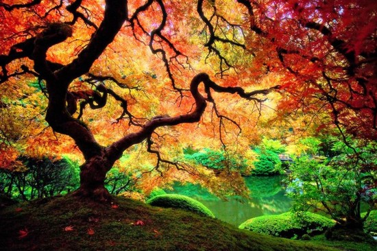
I chose both of these images because I really like how each image blends in on it’s own. The first one has a night time sky setting in, with the lights reflecting on the water. The second shows off different colored leaves on the tree, showing that autumn is beginning.
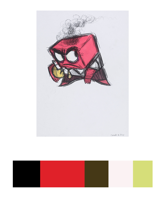
CONCEPT ART, ANGER, INSIDE OUT, 2015
Work time: 1 Hour
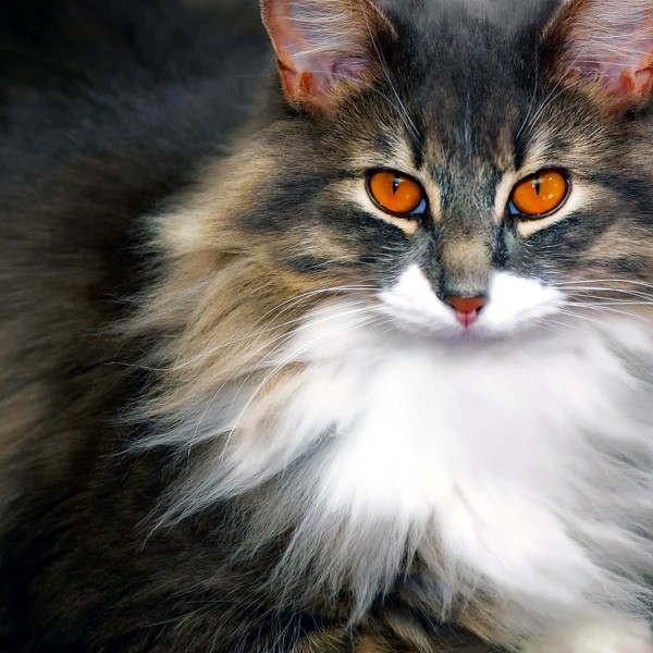
This picture of a cat does a good job of color to color progression because of the different colors of its fur. It starts off with a dark-ish brown tint, to gradually getting lighter to a natural light.
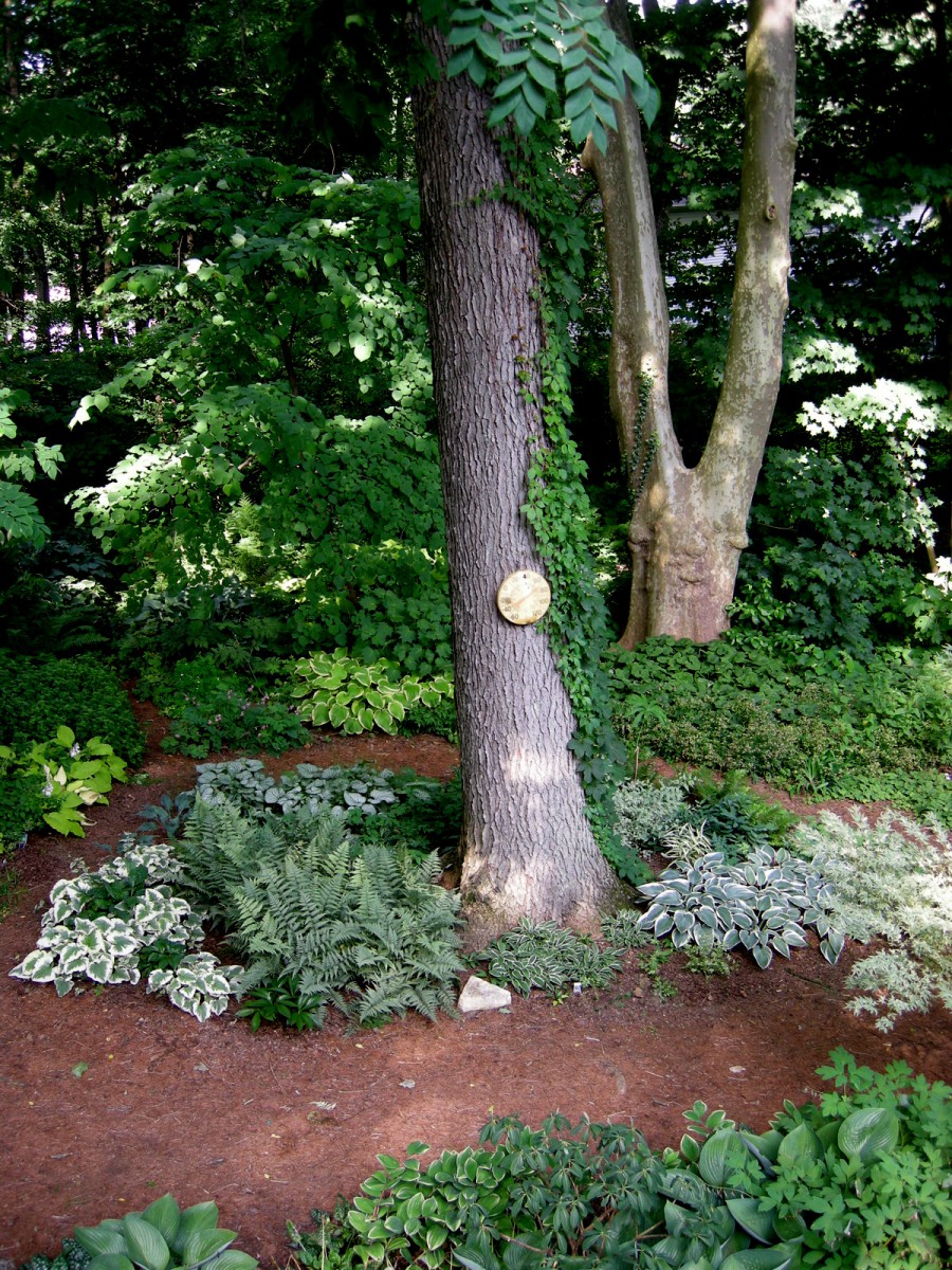
Because of the shadows, the leaves in the background; as well as the top areas of the tree, become darker and blends in with each other showing off Shade progression.

This displays tint progression since the hood of the car goes from black to a white tint.
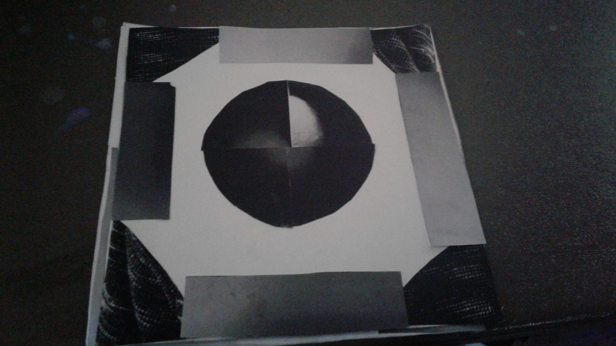
Me and Kofi worked on this together.
Took about 2 hours
High key portrait:
Low key portrait:
Hours taken: 2 hours
From these projects, I learned how to make better use of high key and low key portraits in photos. I think if I had something I could have improved on, it would probably be interacting with my peers more on the projects so I can learn from them. I also believe I could have taken better photos for the first part of the project to better emphasis the difference between high key and low key portraits.
Low key
High key

Hours taken: 2
© 2024 PLAY WITH YOUR PROBLEMS – FYLC Fall 2016
Theme by Anders Noren — Up ↑
The OpenLab is an open-source, digital platform designed to support teaching and learning at City Tech (New York City College of Technology), and to promote student and faculty engagement in the intellectual and social life of the college community.


Recent Comments