First Year Learning Community

Tag: Phase 2: Define (Page 1 of 2)

Color Harmony: Phase 2

lmartinez_colorharmony

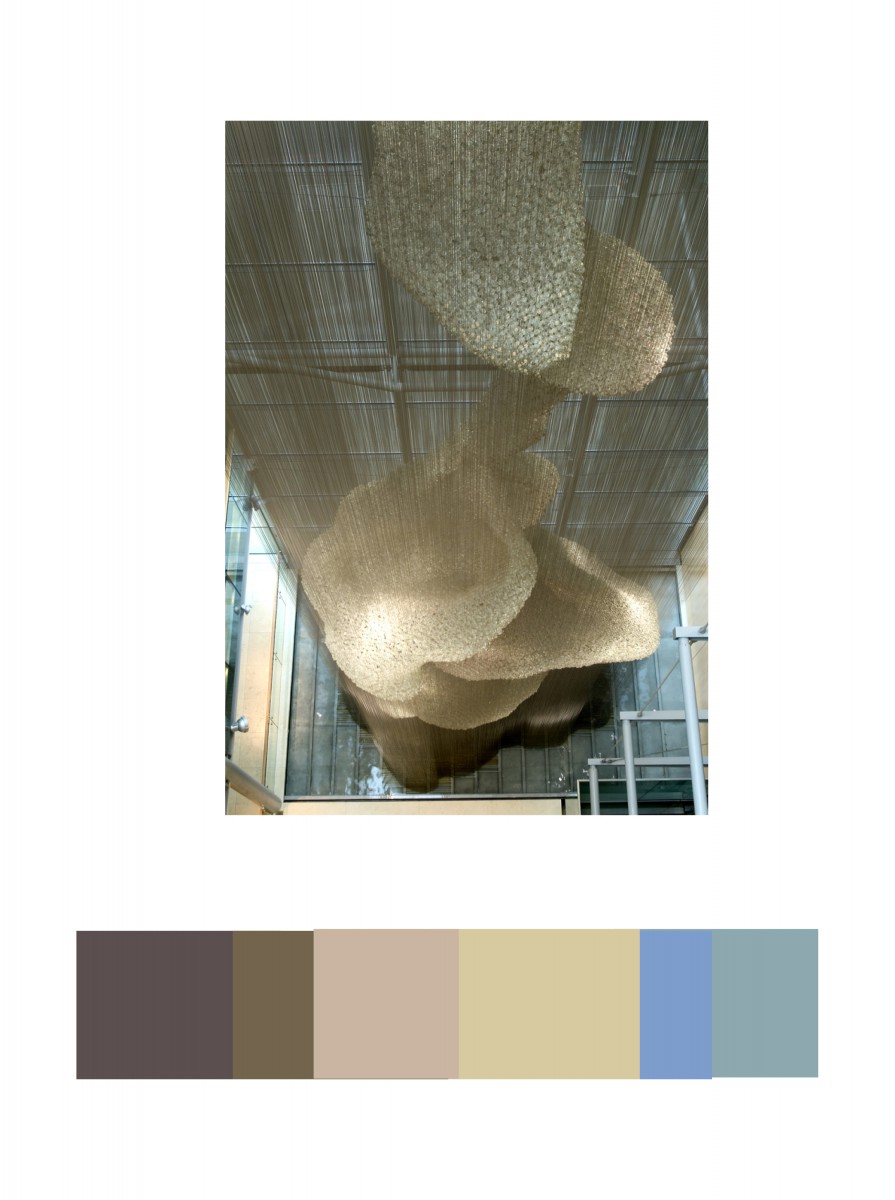
In the Cooper Hewitt Museum, I looked through the big table with the giant screen collection they have in the current and old exhibition. This has caught  my eye because of different shades of light brown. IN the background you could see a little bit of light blue and medium blue. This was done by Heatherwick Studios and Thomas Heatherwick in 2003, called Bleigiessen.

My Copper Hewitt research page.

Hours Worked: 45  minutes

Color Harmony: Phase 2

Owe'neh Bupingeh Preservation Project

Owe’neh Bupingeh Preservation Project

During my visit to the museum, I happened to have encountered this exhibit and found that image as a composition to be interesting. I liked how the sky in this picture makes a clear contrast with the pueblo and helps it to pop out at the viewer by sinking into the background with a darker value. I also like the value contrast between the pueblo walls and its shadows, which causes the eye to be drawn to it. Because of these details in the composition, I learned about how important the positioning of two different colors can be in a composition.

Aaron Hollingsworth’s Cooper Hewitt Page

Hours worked: 1 hour


Color interactions: phase 2

Color Interaction Pairing: Phase 2

Hours Worked: 1.5 hours


Value added portraits: Phase 2

Time spent: 2 hours

« Older posts