In this Project, I learned the colors used in a composition and the dominant, sub-dominant, accent, and tint colors would be. What I believe I could have done better is create the waves more realistic and show more black. From what I learned in this project that I could apply in anything project would be knowing what colors are common and be able to make them fit together.
Author: Lilian (Page 1 of 3)
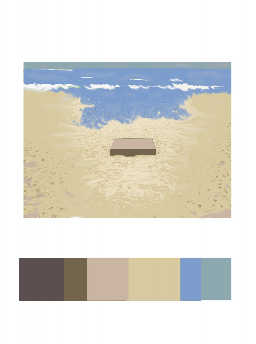
For Phase 3, the colors I got inspired by making a scenario of the beach. From the original composition, it remained me of sand. I use light brown on top of the wood box and the sides dark brown to give it shade. Most of the composition has light brown. For the blues, I used the ocean and the sky as well. The dominant color is the light brown, the sub-dominant is the sea blue, the accent color is the white or the medium brown from the wood box.
Hours Worked: 1 Hour and a Half
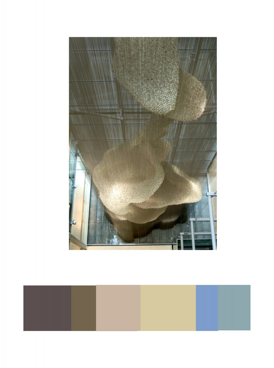
In the Cooper Hewitt Museum, I looked through the big table with the giant screen collection they have in the current and old exhibition. This has caught my eye because of different shades of light brown. IN the background you could see a little bit of light blue and medium blue. This was done by Heatherwick Studios and Thomas Heatherwick in 2003, called Bleigiessen.
My Copper Hewitt research page.
Hours Worked: 45 minutes

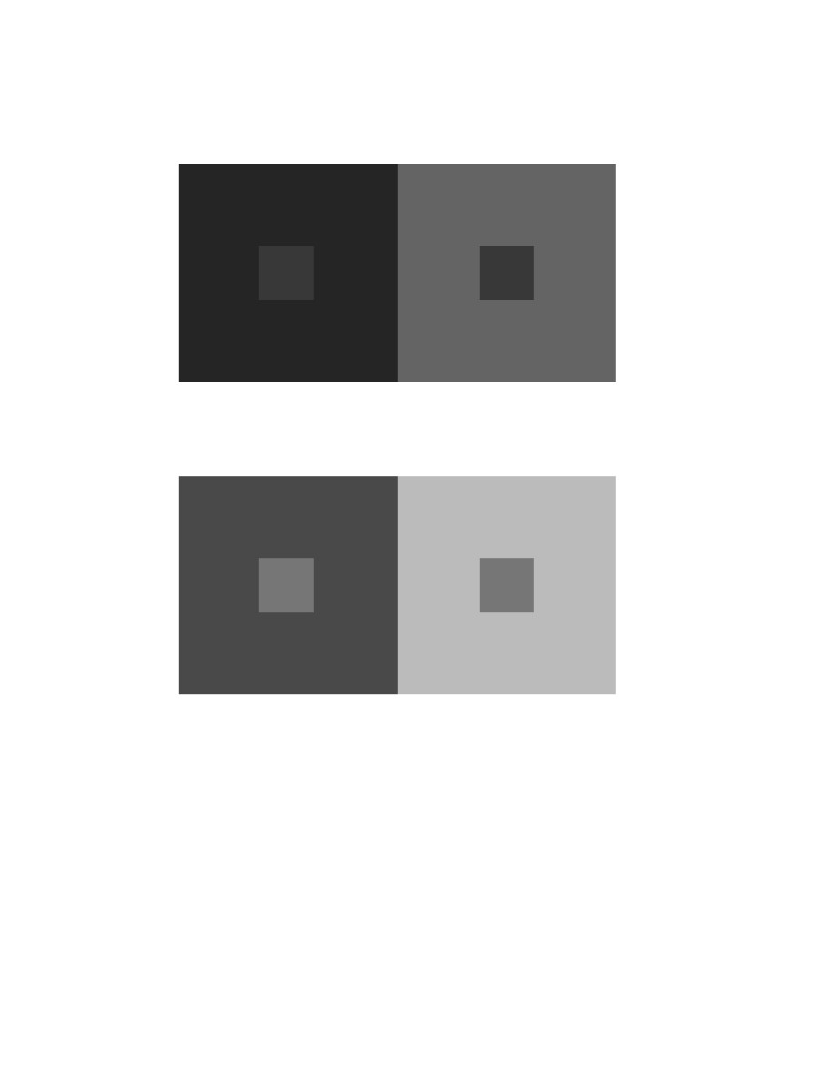
Chromatic Gray Studies – Exercise 1 & 2

Muted Color Studies – Exercise# 1 & 2

Prismatic Color Studies – Exercise 1 & 2

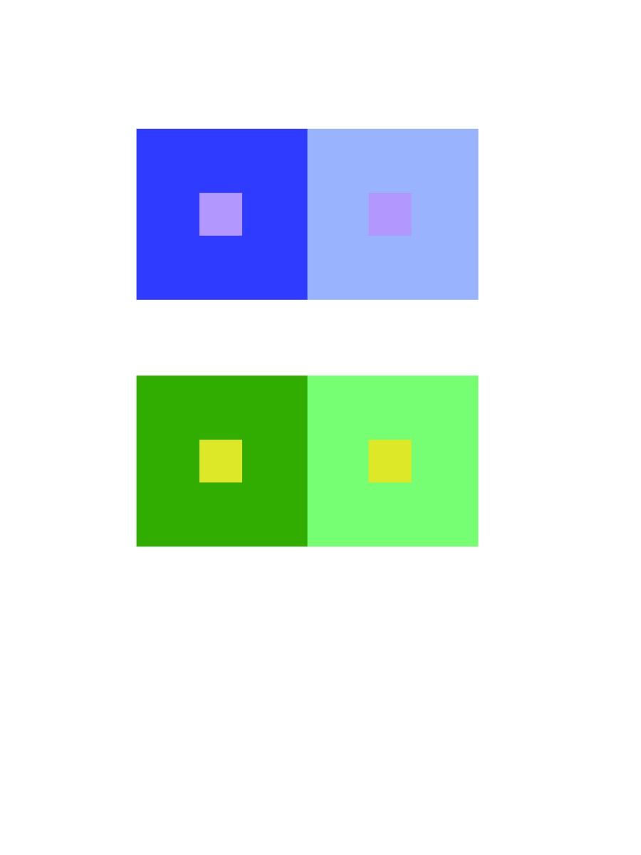
Two-Color Progression
Tint Progression
Shadow Progression
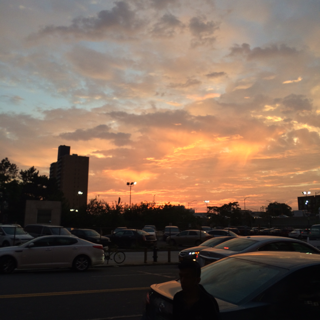
The first image shows two-color progression because of the green has different tones that turn into black. The tint progression shows the sunset, the tint shows the yellow orange colors, they are analogous. The shade progression shows the clouds white then turning darker, to medium black.
What I learned in this project is the color value and saturation. For instance, the color is the same in a composition but it appears different because of its influence color and the saturation. What I would like to retry again would be Group 4 Shifting Hue and Value, it was very challenging for me to see and make the hue different from one another. For our next project, I would use the color wheel and know the complimentary of each color.
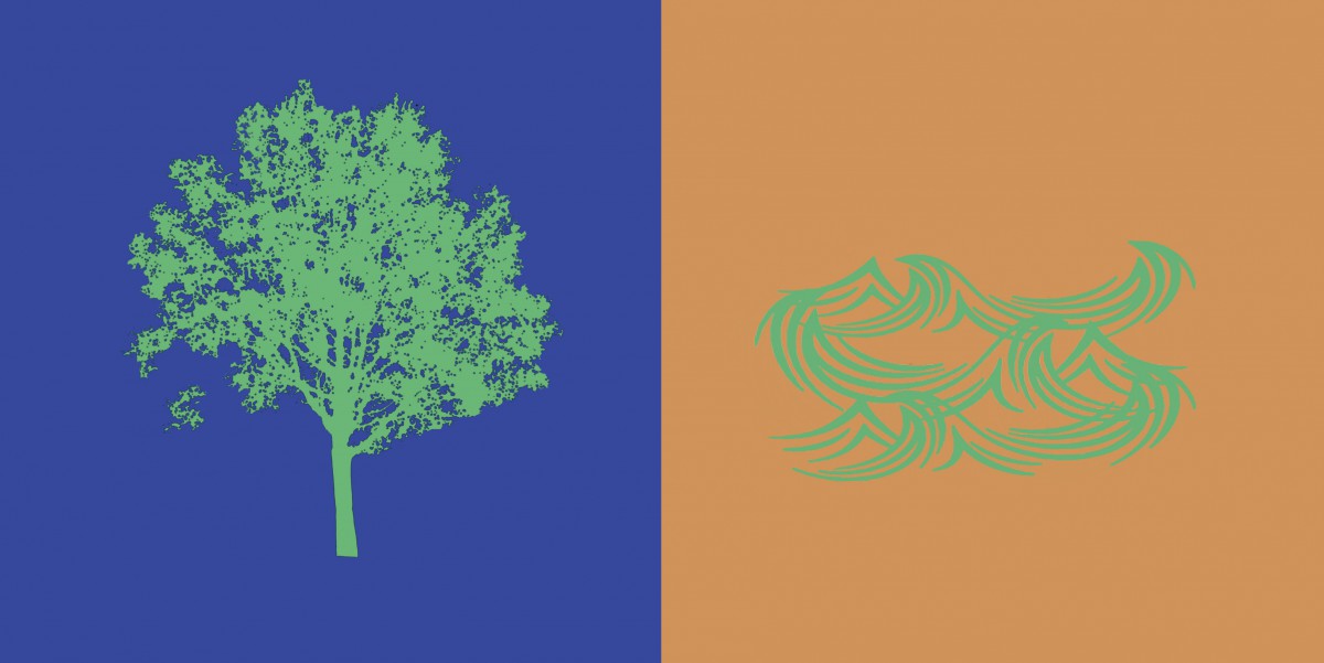
ShanShan and I created a paired color identities with simultaneous constrast. I chose the color blue for ShanShan because she is shy, intelligent and relax. We chose the color green as our influence color because we wanted to make the theme about nature. A symbol representing her is a tree, because when I think of a tree, I imagine a person laying back on the tree reading a book and relax.
Hours Worked: 2 Hours
Chromatic Gray Studies
Shifting Value with Color
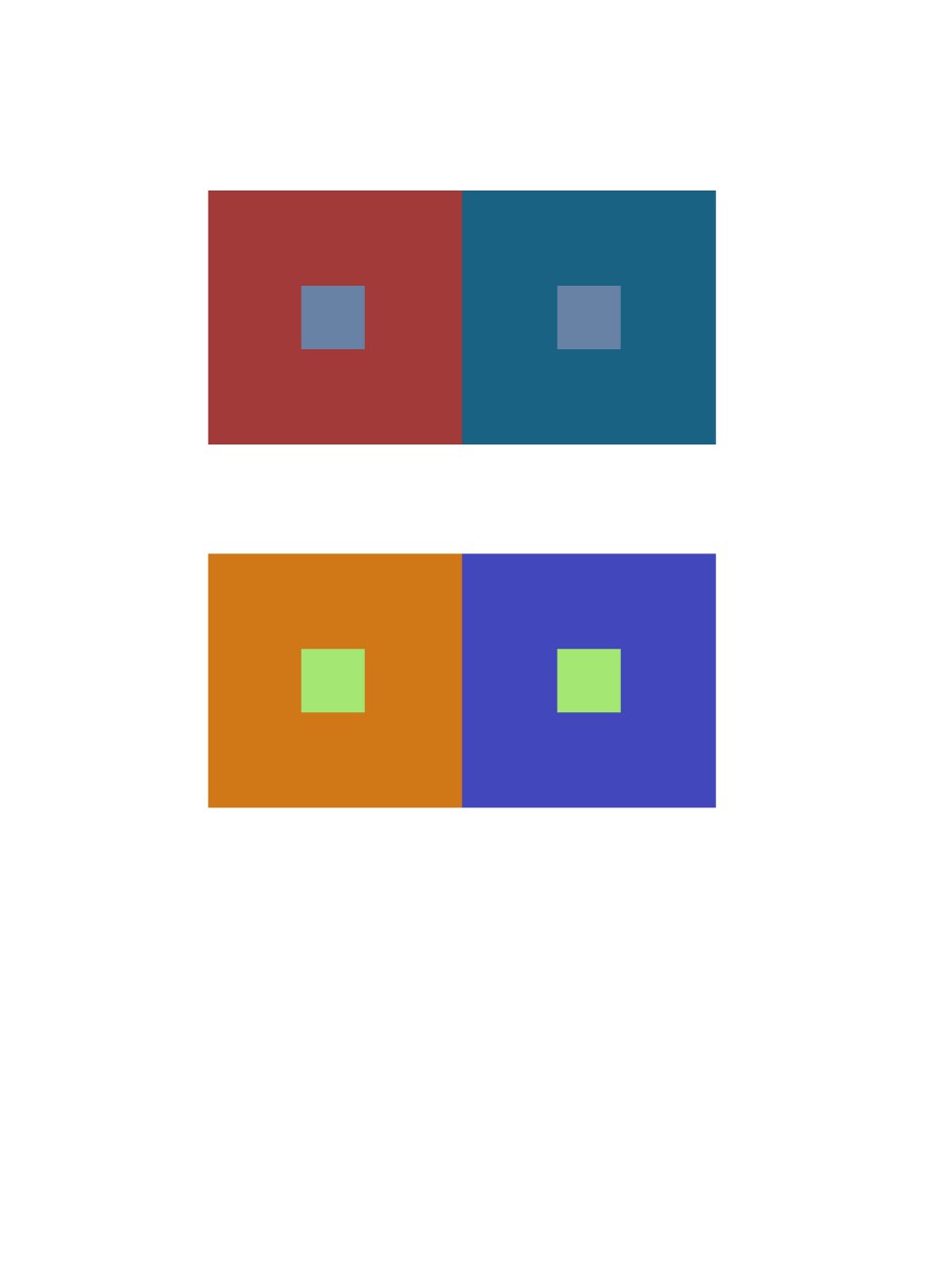
Shifting Hue, Not Value

Shifting Hue and Value
Hours Worked: 3 Hours
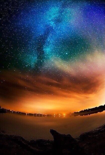
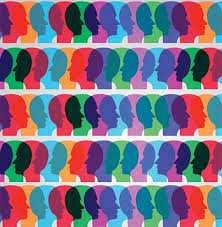
The left picture is the atmospheric perspective of the sky in Alaska. I see these colors combining together and different shades of blue and orange. I see tint of purple and greenish color and I think that no color is being center of attention. It catches the person interest towards above then slowly down in the composition. In the second picture it shows a person head with different colors. There are colors and different shades of it because of the background color surrounding it. For instance, the blue looks light on the orange but not in the red.
In this project I learned the complimentary colors of each color in the color wheel and know how to change a color more lighter by adding white, and making it darker by adding black. What I believe I could have done better is work more on my chromatic grey exercise, it was difficult for me to get the right color and make it look muddy. I learned the colors of chromatic grey, muted, and pure colors and how are they seen differently. For the next project, I will apply this by knowing what area are the colors are and its saturation.


Recent Comments