First Year Learning Community

Category: Student Posts (Page 1 of 40)

Color Harmony: Phase 4

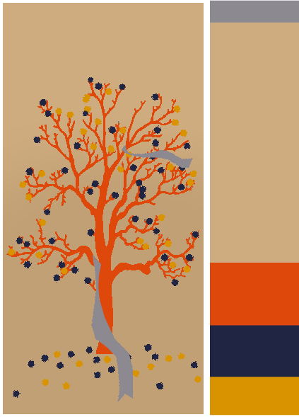
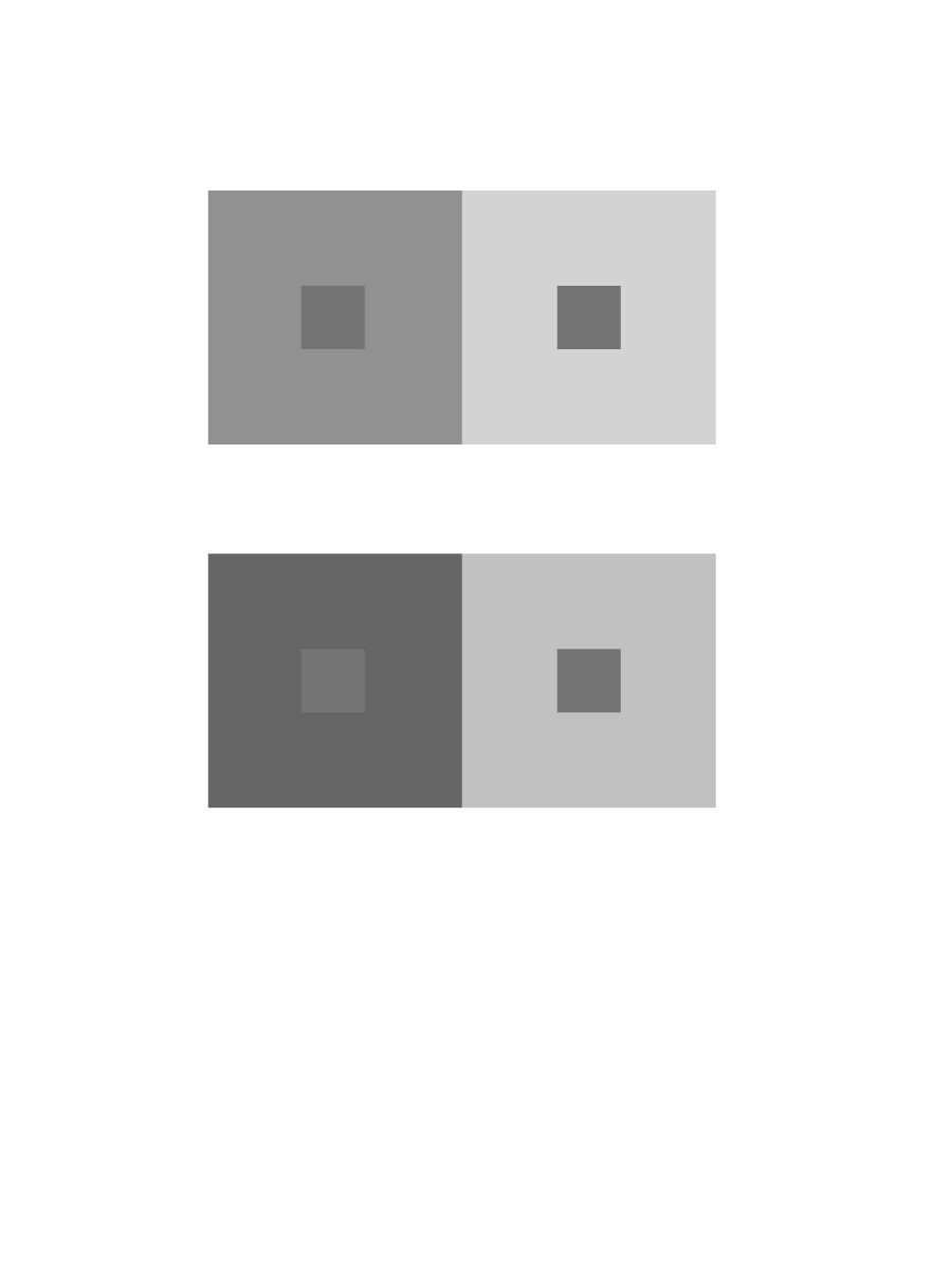
https://openlab.citytech.cuny.edu/schmerlerspevackfylcfa16/2017/01/25/color-harmony-phase-1-15/

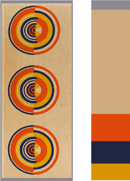
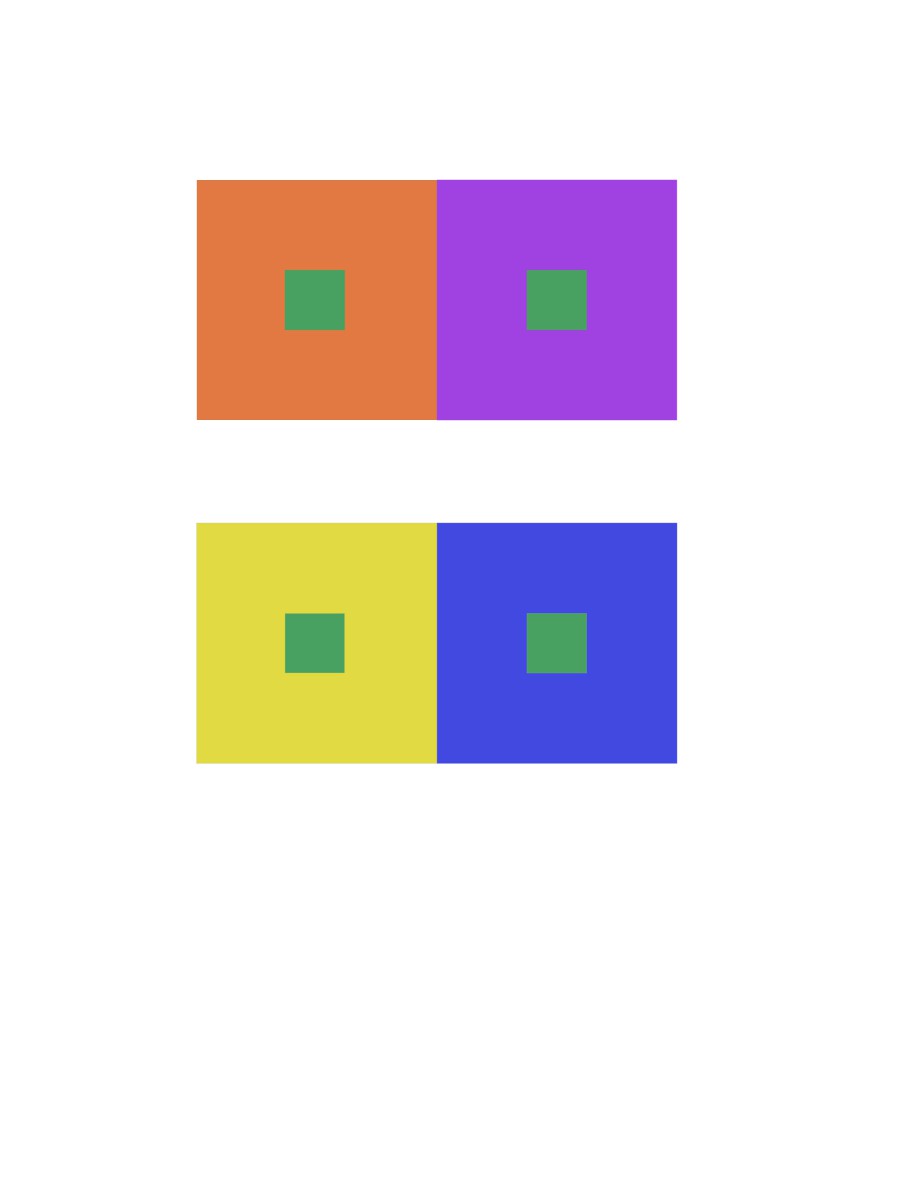
https://openlab.citytech.cuny.edu/schmerlerspevackfylcfa16/2017/01/25/color-harmony-phase-2-15/

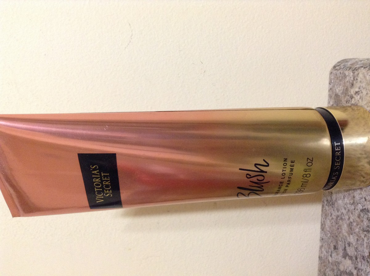
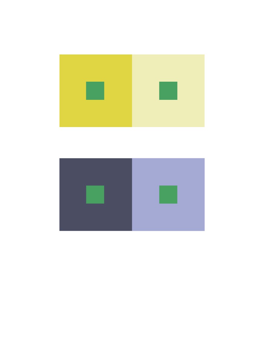
https://openlab.citytech.cuny.edu/schmerlerspevackfylcfa16/2017/01/25/color-harmony-phase-3-12/

We got an opportunity to visit another museum that I had never heard of. It was extraordinary and what made it even better was the interactive pens we got to use. That was pretty unique, something I never experienced. They museum also had another interactive room where what your digitally drew was presented on the walls of that room. During this project I learned terms like tint, shade, dominant, sub-dominant and accent colors. Understanding these terms will help us in the future as graphic designers when we compose images and we have to represent it to people.

Color Harmony: Phase 3

This final free study was created digitally. It has been composed with the same color inventory I had made earlier in phase 2 from ‘Textile, Loco Sole, 1968’ by  Gae Aulenti. The dominant color is the beige which is clearly the largest portion of the color inventory. That color is entirely in the background and that is also the color that has a very light shade. The red orange is the accent color since it is the most vibrant, its the first thing that catches the eye. I believe the navy blue is the sub-dominant color.

Hour(s) Spent: 1.5

Color Harmony: Phase 2

TEXTILE, LOCO SOLE, 1968

https://collection.cooperhewitt.org/objects/18636035/

This is a textile. It was designed by Gae Aulenti. It is dated 1968 and we acquired it in 1991. Its medium is linen and its technique is screen printed. It is a part of the Textiles department.

This object was donated by George and Louise Beylerian. It is credited GIft of George and Louise Beylerian.

Hour(s) Spent: .5

Color Harmony: Phase 1

Tint Progression

Two- Color Progression

Shade Progression

My first image attached to this post represents tint progression because the petals on the artificial flower have a gradient from light pink to white. My second image represents two-color progression since the top of the lotion bottle starts with rose gold and fades into a golden shade. My last image represents shade progression because the dark brown fades into the shadows which is black.

Hour(s) Spent: .5

Midterm

https://openlab.citytech.cuny.edu/schmerlerspevackfylcfa16/2017/01/21/urban-artifacts-phase-4-17/

https://openlab.citytech.cuny.edu/schmerlerspevackfylcfa16/2017/01/21/sound-visualizations-phase-4-5/

https://openlab.citytech.cuny.edu/schmerlerspevackfylcfa16/2017/01/22/value-added-portraits-phase-4-deliver/

So far we’ve learned quite a few things in this class. We learned terms like ambiguous and obvious figure ground, low key, high key, rule of thirds and others terms relating to our projects. I’ve learned the importance of adding weight, depth and contrast with value in my work to allow the viewer to concentrate in the area I want them to. We haven’t gotten to work with colors yet. I’ve got to work with new materials I wasn’t aware of before and utilized it to create certain compositions.

Next time, I’m going to organize and schedule things before hand so my work isn’t late as far as grading is concerned. I will revise my work like how I did once before and double coat inking projects and craft things a little carefully.

Color Interaction Parings: Phase 4

https://openlab.citytech.cuny.edu/schmerlerspevackfylcfa16/2017/01/24/color-interaction-parings-phase-1-6/

https://openlab.citytech.cuny.edu/schmerlerspevackfylcfa16/2017/01/24/color-interaction-parings-phase-2-2/

https://openlab.citytech.cuny.edu/schmerlerspevackfylcfa16/2017/01/24/color-interaction-parings-phase-3/

It was a little difficult comprehending certain terms and applying that knowledge on to the project (phase 2). However by the end of it, I understood the terms and I was able to apply it to my projects correctly, hopefully. Understanding color interactions is extremely important when composing an image with more than 1 color to see how it might affect one another. I did have difficulty with phase 2 but I think I understood it by the end and I am hopefully correct.

Color Interaction Parings: Phase 3

To start off, we used our zodiac signs to gain inspiration and we built off from that. It wasn’t too difficult to choose the background colors that represented us however selecting a color that showed a proper color interaction vividly was a little difficult. We tried a few different colors but ended up with a darker shade of red. It vividly shows the color interaction. When surrounded by the shade of orange, the red seems darker. When surrounded by the darker violet, the red appears lighter.

Hour(s) Spent: 1

Color Interaction Parings: Phase 2

Achromatic Grays Shifting Value

Color Shifting Value

Color with Shifting Hue

Color with Shifting Value and Hue

For all of these color interactions, I learned the the surrounding color and affect the color getting surrounded to the viewer when it isn’t being changed at all. For each interaction, I also got to understand terms like hue and value. The colors change when you shift either of these.

Hour(s) Spent: 1


Color Interaction Parings: Phase 1


The ‘blue and black dress’ took over the internet when people couldn’t figure out what color it actually was. The lighting and saturation of the images of the same dress makes it so confusing to figure out what color it actually is. Although it’s the same dress, the surroundings of the dress affects its representation. Same thing happens in the cube picture. The colors are the same on all the sides but due to the ‘shadow’ it creates an illusion that is might be different colors.


Saturation Studies: Phase 4

https://openlab.citytech.cuny.edu/schmerlerspevackfylcfa16/2017/01/23/saturation-studies-phase-1-11/

https://openlab.citytech.cuny.edu/schmerlerspevackfylcfa16/2017/01/23/saturation-studies-phase-2-16/

https://openlab.citytech.cuny.edu/schmerlerspevackfylcfa16/2017/01/23/saturation-studies-phase-3-10/

I really enjoyed all the phases of this project because we were able to include our creativity with less restrictions. We got to learn about saturation of colors and we got an opportunity to use gouache paint once again but with colors. Understanding saturation got a little difficult when we came to phase 2 when we had to create broad range and narrow range saturation studies. The saturation studies included chromatic grays, muted colors and prismatic colors. Understanding the saturations of colors can help use in the future when we are placing colors together or when we are trying to create a certain mood of a composition.

« Older posts