First Year Learning Community

Category: COMD1100 Project #4 (Page 1 of 6)

Saturation Studies: Phase 4

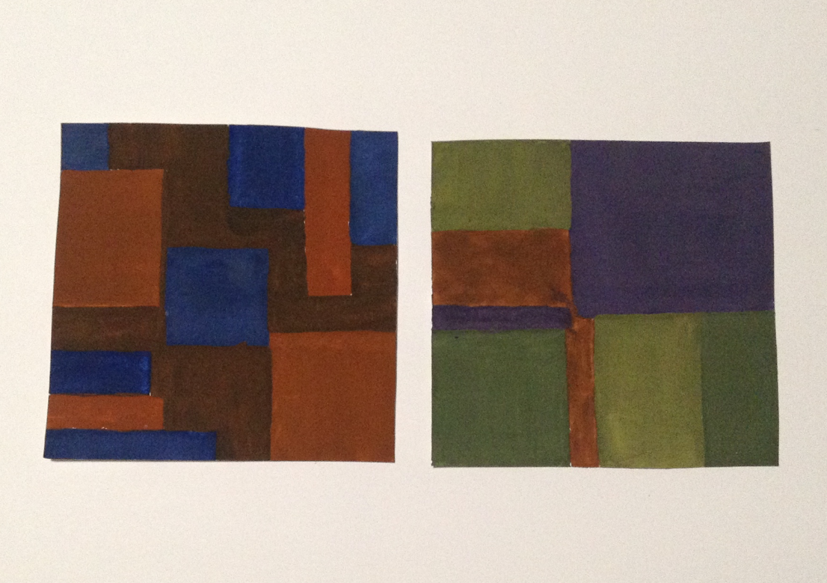
https://openlab.citytech.cuny.edu/schmerlerspevackfylcfa16/2017/01/23/saturation-studies-phase-1-11/

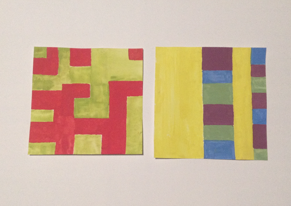
https://openlab.citytech.cuny.edu/schmerlerspevackfylcfa16/2017/01/23/saturation-studies-phase-2-16/

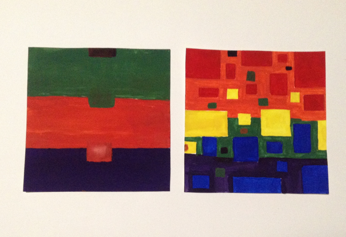
https://openlab.citytech.cuny.edu/schmerlerspevackfylcfa16/2017/01/23/saturation-studies-phase-3-10/

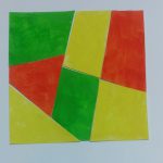
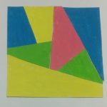
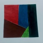
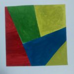
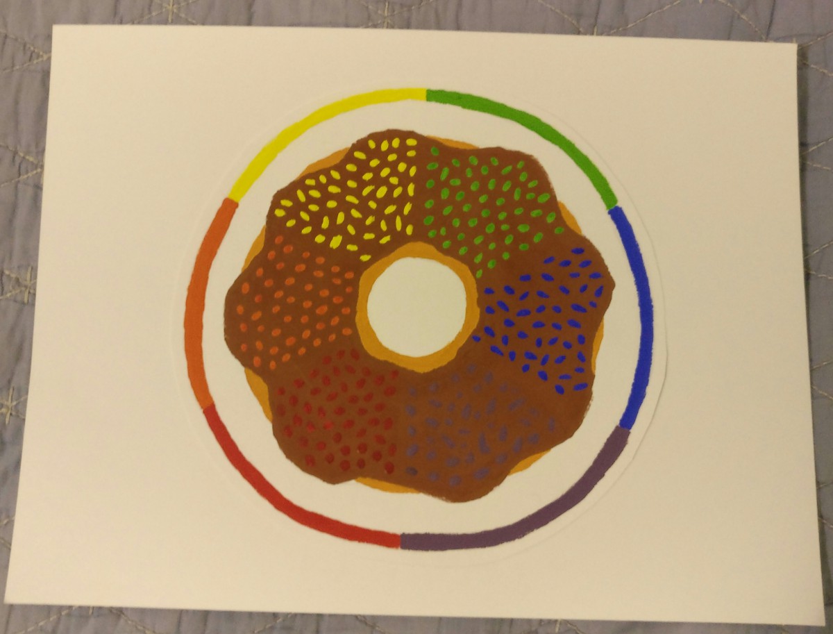
I really enjoyed all the phases of this project because we were able to include our creativity with less restrictions. We got to learn about saturation of colors and we got an opportunity to use gouache paint once again but with colors. Understanding saturation got a little difficult when we came to phase 2 when we had to create broad range and narrow range saturation studies. The saturation studies included chromatic grays, muted colors and prismatic colors. Understanding the saturations of colors can help use in the future when we are placing colors together or when we are trying to create a certain mood of a composition.

Saturation Studies: Phase 2

Left- Narrow Range | Right- Broad Range

Chromatic Grays

Left- Narrow Range | Right- Broad Range

Muted Colors

Left- Narrow Range | Right- Broad Range

Prismatic Colors

The compositions on the left are the narrow ranges and the ones on the right are broad ranges.

Chromatic Grays are colors that are the closest to the gray shade. These colors are basically tints of gray and they are the least saturated colors from the ones mentioned above.

Muted Colors are a little more saturated so they are basically between Prismatic and Chromatic Grays. By adding white or a little bit of complimentary colors to the prismatic color, you can make muted colors.

Prismatic Colors are the most saturated so basically they’re the pure colors.

Hour(s) Spent: 4.5


Saturation Studies: Phase 1

Paint Stroke- Color Wheel

Instead of doing something a little straight forward and choosing objects, I decided to compose something a little abstract. I used the primary colors and created a a swirly stroke using gouache paint. To make that color wheel stand out I sketched a hand holding a paint brush with no colors at all.

Hour(s) Spent: 1

Saturation Studies: Phase 2

Time worked on: 3 hours

Saturation Studies: Phase 4

I really enjoyed this project because it was fun to work with color and I got a better understanding of how colors should be used. I enjoyed learning about complementary colors. I didn’t enjoy the gouache phase of the project even though I did like the way my color wheel turned out. The most fun I had was working in photoshop to create my poster. I really enjoyed the cold color scheme and style of the poster and overall learned a lot with this project.

Phase 1

Phase 2

Phase 3

Color Interaction Pairings: Phase 3

lmartinez_aillustration

ShanShan and I created a paired color identities with simultaneous constrast. I chose the color blue for ShanShan because she is shy, intelligent and relax. We chose the color green as our influence color because we wanted to make the theme about nature. A symbol representing her is a tree, because when I think of a tree, I imagine a person laying back on the tree reading a book and relax.

Hours Worked: 2 Hours

« Older posts