Unlisted link to the interview.
Openlab does not let me upload the file itself.

Unlisted link to the interview.
Openlab does not let me upload the file itself.
https://youtu.be/hjIZ_zVsSik
OpenLab said video was not allowed to be uploaded for security reasons?
Unlisted on YouTube
Gabriela Calabretta November 24th, 2017
CDMG 1111-D306
Final Draft
JPMorgan Chase Bank
The history of Chase Bank’s logo dates back all the way to September 1st, 1799 when they first started off as Bank of the Manhattan Company. They later merged with Chase National Bank of the City of New York (est. 1877) to become Chase Manhattan Bank in 1995, and during that same year, Chase Manhattan Bank was merged with Chemical Bank (est.1991), still keeping to their original name of Chase Manhattan Bank. While the bank’s name has gone through so many changes, the logo for this bank has gone through few, from lettering and an image of the United States, to the hexagonal shape we know today.
Chase Bank was originally founded by Aaron Burr on September 1st, 1799. During its founding though, it was originally called The Manhattan Company, and was a way to bring clean water into Manhattan during the time of the yellow fever outbreak. This business was also a front, for Burr was creating New York’s second bank, competing against Alexander Hamilton’s Bank of New York. While competing, other banks began to emerge in the New York area, The Manhattan Company began to merge with other banks. The name “Chase” had come from merging with Chase National Bank which was named after former United States Treasury Secretary and Chief Justice Salmon P. Chase even though he had no connections to the bank whatsoever. Chase National Bank had merged with countless smaller banks during the 1920’s. This continued into the 1930’s where they merged with one of Rockefeller’s trust companies, successfully making Chase National Banks one of the largest in the country and the world.
Throughout the various changes and merges, the bank we know of today as JPMorgan Chase & Co. their logo has gone through very few changes. On the left we have one of the company’s first logos used from 1954 through to 1960. There is not much information on who made this, how much it originally was to make this, and when it was made, only that this image is not intended to be used for free by any other company and is to only be used to identify the company. The logo was later on changed again, this time using the well-known hexagon. The idea for the hexagon came from three designers known as Ivan Chermayeff, Tom Geismar and Sagi Haviv in 1961. They wanted something modern that still payed homage to the banks origins. The original idea for the logo was to use a symbol rather than initials so the logo would stay recognizable while the company evolves. The hexagonal shape comes from the wooden pipes used when the company was used for bringing clean water into Manhattan. On the left is one early use of the logo, made in 1962. With this imagery, they worked it into a modern-day symbol that would be able to be recognized worldwide.
The hexagonal icon is one of few banking icons that is easily recognizeable by both our nation and citizens worldwide. While J.P Morgan Bank had gone through various name changes and merging’s, the logo itself has gone through very few changes, most notable being the color changes and the different designs used for variety of personal and business related banking. From a water company front to one of the nations, and world’s largest banks, J.P. Morgan Chase has been iconic, long standing and one of today’s symbol of today’s modern banking.
Bibliography
“Chase Bank.” Wikipedia, Wikimedia Foundation, 26 Nov. 2017, en.wikipedia.org/wiki/Chase_Bank.
Chase Alumni Association, www.chasealum.org/article.html?aid=175.
Chermayeff & Geismar & Haviv, www.cghnyc.com/identities/chase-bank/.
“Chermayeff & Geismar & Haviv.” Wikipedia, Wikimedia Foundation, 6 Nov. 2017, en.wikipedia.org/wiki/Chermayeff_%26_Geismar_%26_Haviv.
“Chase Bank – Credit Card, Mortgage, Auto, Banking Services.” Chase Bank – Credit Card, Mortgage, Auto, Banking Services, www.chase.com/.
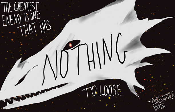
I decided to edit these concepts to more extremes since the quote is from Christopher Paolini, the writer of the Inheritance cycle. The books are about a dragon rider fighting a war so for this first one I decided to try and make a dragons head with embers along with the quote hand written, with emphasis on “Nothing” going across the head in black.
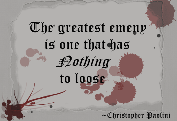
For these final two, I decided to go for more of torn paper and blood to bring back to the fact that the quote is from a high fantasy story featuring dragon riders and war. The first version has darker text while in the second version the test is tinted gray and there is more emphasis on the blood, hinting at loss and war.

I prefer the last, tinted text version because the gray of the text looks better on the torn and stained paper rather than looking cleaner like the darker text version.
The exhibit was originally a mansion build by Rockefeller before being turned into a modern art museum by the Hewitt sisters. This is exhibit showcases modern art from all over, and holds art considered ‘modern’ for its era. Some pieces from the museum that had caught my eye were PLATE (USA), 1886-1890, PITCHER (USA), 1887,CARVED DRAGON VASE # 3 VASE, 1879–90.


The exhibits I visited in the museum held vintage and classic potteries and ceramics. They caught my eye because of their delicate Japanese style paintings and designs along with once being usable. All of these art works are from the Product Design and Decorative Arts department. The plate had caught my eye because of its gold, delicate designs of flowers and dots, along with the high contrast with the deep navy blue of the plate itself really brought out the stylistic floral designs. The pitcher got my attention because of the soft gradient from a subtle peach to teal up to a deep royal blue, and from there delicate white cherry blossoms followed by gold crosshatching and a bolder gold design resembling cracks. This pitcher although made in the late 1800’s has a delicate modern feeling to it because of the soft colors and delicate paintings and golden accents. The carved dragon vase was also an eye catcher because of its heavy classic Japanese art style featuring the might dragon coming up off the vase and circling around it. The vase itself is medium glazed and painted, the off-white base color along with blues and reds painted on give a classic Japanese vibe, with the sculpted addition of the dragon tying it all together.
 I made the first two using quill and ink playing around with the use of the word “Nothing” to put emphasis on the quotes meaning of fighting someone who has nothing to loose and everything to gain.

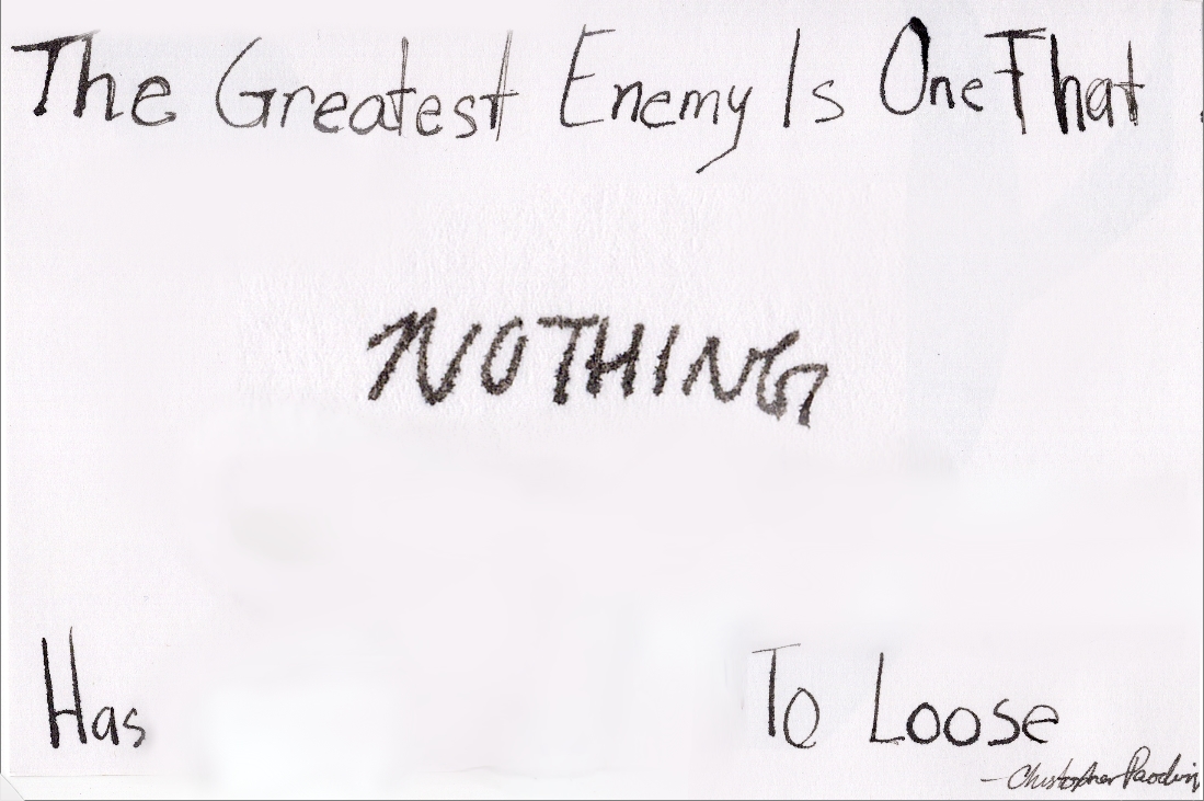
For this version I decided to make it digitally, placing the white “nothing” over a strip of black on the white background to look like it was possibly cut out to show a void of color unlike the rest of the text which is black on a white background.
“The greatest enemy is one that has nothing to lose.”
― Christopher Paolini, Eragon
This is the first post on your Learning Blog. Edit or delete it, then start blogging!
The ePortfolio is both a Learning Blog and an Academic Career Portfolio. Use the Learning Blog to document your learning experiences and class assignments each semester. As time goes by, add content to the Academics and Career sections to show your department, graduate institutions, or future employers how well prepared you are for your chosen career.
NOTE: Remember to add appropriate Categories and Tags to your posts. This will help your professors and other visitors find the content they are looking for. The Categories “Coursework” and “Field Trips” and the Tags “OpenLab” and “City Tech” have already been applied to this post. Feel free to make changes!
The OpenLab is an open-source, digital platform designed to support teaching and learning at City Tech (New York City College of Technology), and to promote student and faculty engagement in the intellectual and social life of the college community.

