First Year Learning Community

Tag: Color Harmony: Phase 2

Color Harmony: Phase 2

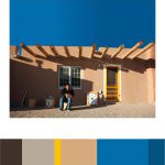
As I walked around the gallery room, I saw this photo of a man and a rural house. It was intriguing to see because the natural light from outside gave the setting a beautiful progression from light to dark. As you can see the the shadow of an object is blocking out light. So the dominant color is the picture is the blue and the sub-dominant is the peach like color and the accent color is the yellow.

Color Harmony: Phase 2

cooper-hewitt           img_3977

The trip to Cooper Hewitt was very fun for me, a lot of the different pieces caught my attention. This one was my favorite, at first it looked like pills I don’t know why I thought of that. To me this piece symbolizes balance because of how the colors are filled up, and then the white fits into it. The museum was occupied with pieces that had a great amount of detail, as well as culture.

Color Harmony: Phase 2

lmartinez_colorharmony

In the Cooper Hewitt Museum, I looked through the big table with the giant screen collection they have in the current and old exhibition. This has caught  my eye because of different shades of light brown. IN the background you could see a little bit of light blue and medium blue. This was done by Heatherwick Studios and Thomas Heatherwick in 2003, called Bleigiessen.

My Copper Hewitt research page.

Hours Worked: 45  minutes

Color Harmony: Phase 2

openlab

colors

This project is about the Harlem hospital center, 192,000 squared foot, shows off its highly advanced technological building design. The high curtain performance wall known as a facade,  replicates 3 panels from a Works Progress Administration mural that depicts scenes from the African diaspora story.

https://collection.cooperhewitt.org/objects/420777941/

work time-29 minutes