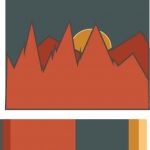
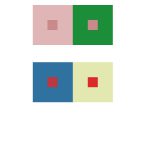
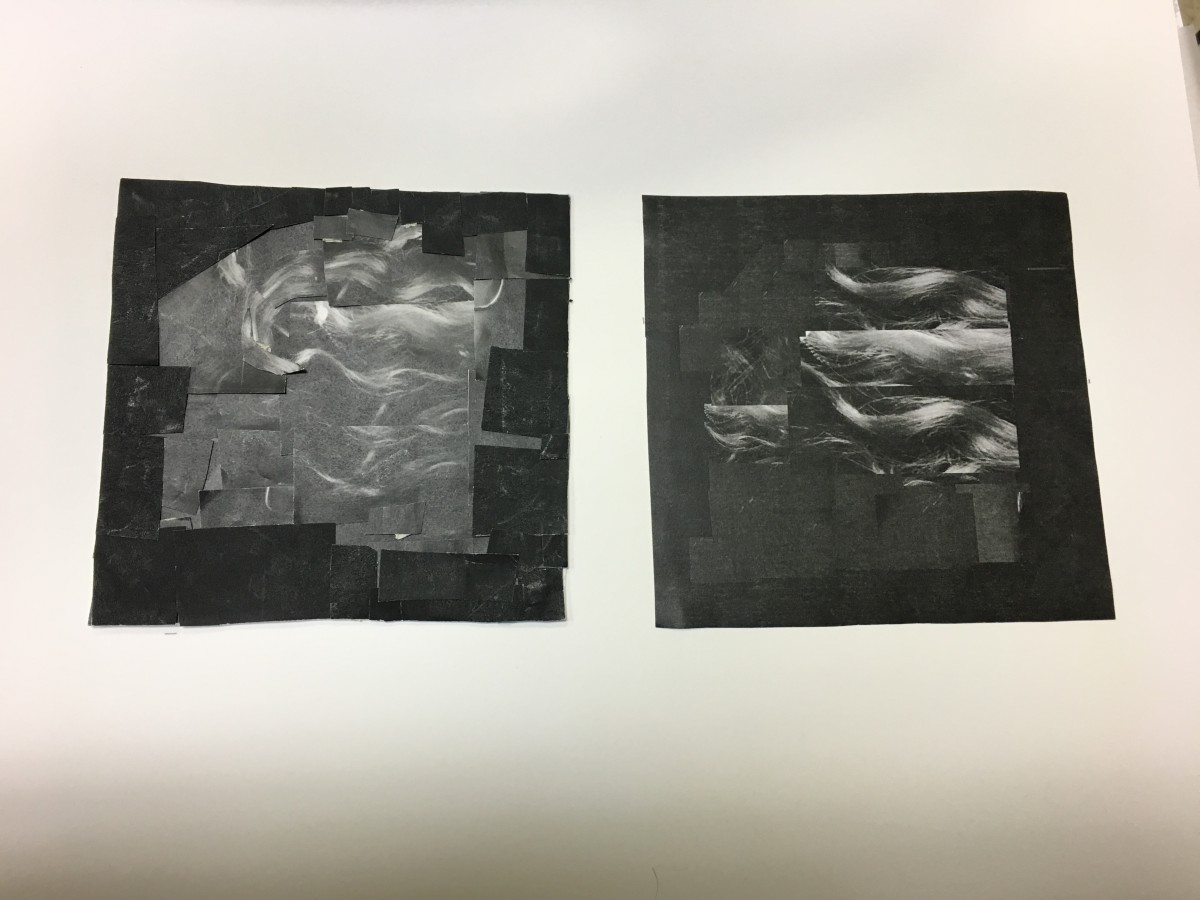
I decided to create mountains as well as a sun setting behind the mountains. It was hard to keep the scale that I obtained from the original image but I like the product created.
Hours: 1
First Year Learning Community
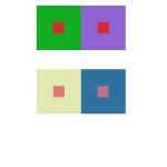
I decided to create mountains as well as a sun setting behind the mountains. It was hard to keep the scale that I obtained from the original image but I like the product created.
Hours: 1
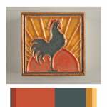
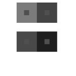
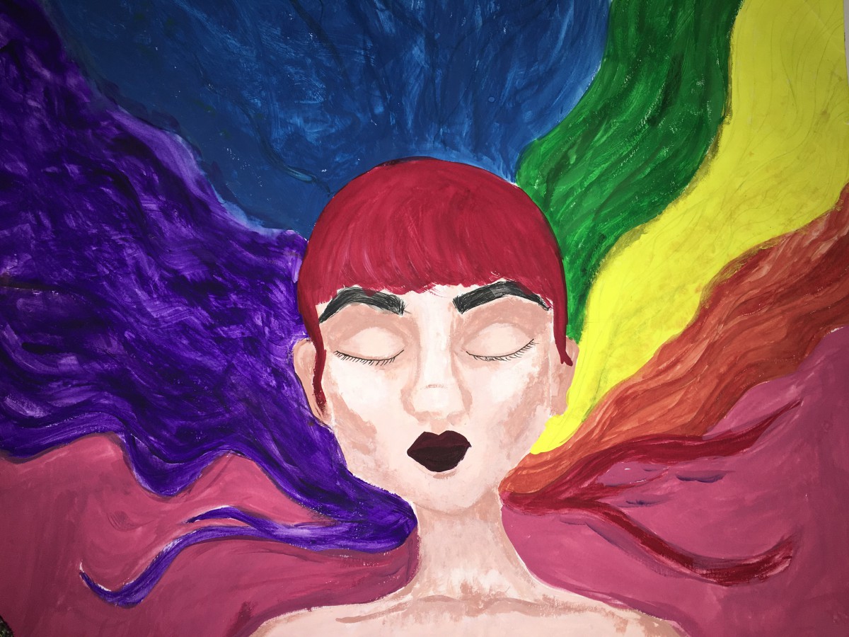
I decided to take this image because it has all the qualities that the image needed. It has color hierarchy although some are very close in amount like the sun red color and the dark gray on the roster.
Hours: 1
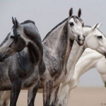
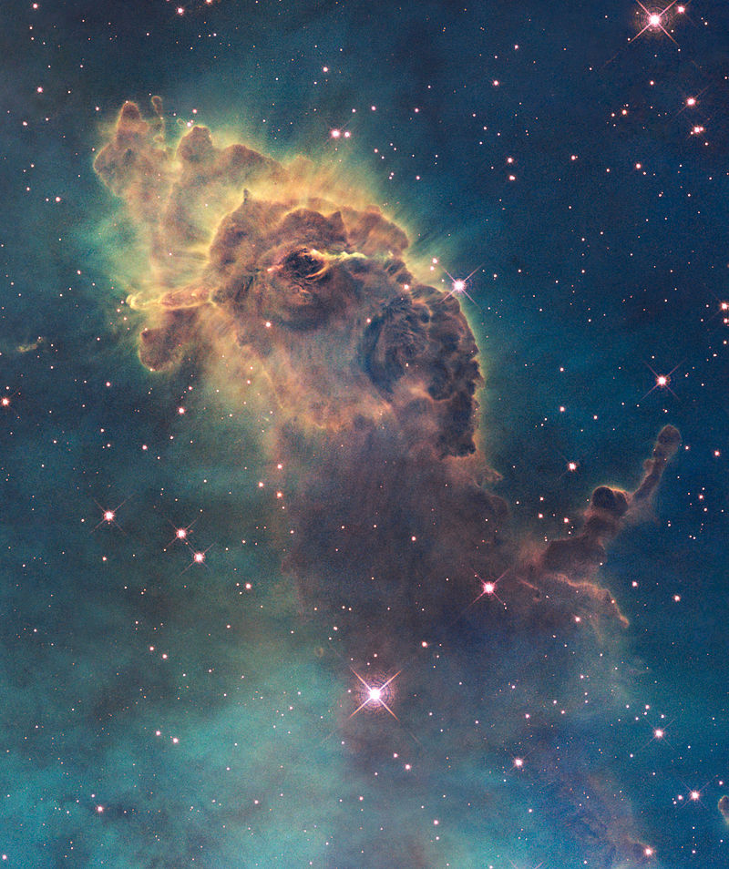
The best example of color harmony that I could find id something that has forever intrigued me. Space. There is just so many colors out there in outer space. One example which I also used on the previous project was a Nebula. Now this is just so extraordinary because is something found in nature, it’s not something that was carefully planned so that the colors could contrast each other. Is something that just happened by elements combining together to having chemical and physical reactions. As you can see in the picture, the red and green which are complementary colors make the nebula look super radiant and even with a feeling of an energy from a great magnitude. On the image with the horse we see shade progression as we move our eye to the left and tint progression as we move to the right
Hours: 1

Total Hours: 2
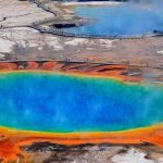
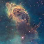
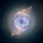
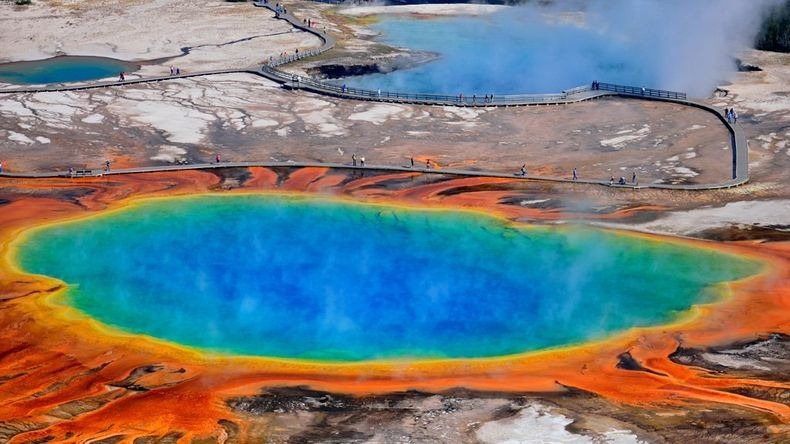
While watching the video and playing around with the app, I was thinking what things in nature have an interesting arrangements of color and three things came up. The Sunburst which is a hot spring in Yellowstone National Park ( a place that is in my bucket list), the Cat Eye Nebula, and the Carina Nebula. All these three things have an amazing interesting use of color, but what is the most amazing is that it just happened. Nobody arranged the colors in these three natural objects . For example, the colors in the hot springs is just different colonies of bacteria as well as decaying enzymes. The nebulas are interstellar clouds of dust, hydrogen, helium and other ionized gases. So as you can see sometimes beautiful things are not made, they just happen.
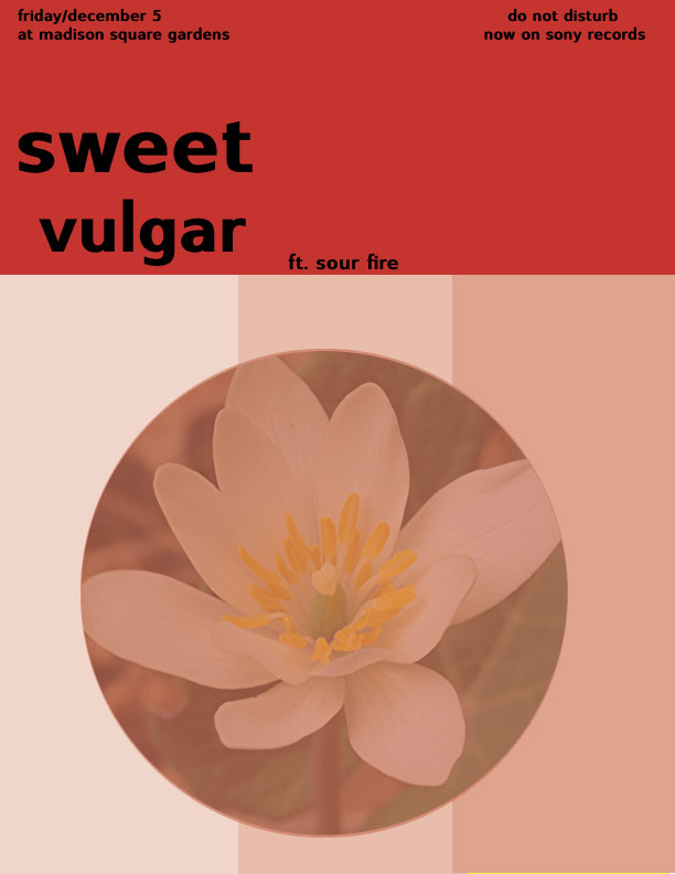
This project was one of the hardest ones we have worked on. At first all the vocabulary that was introduced was driving my brain crazy and the words value and hue were mistaken by each other. However, this project was also fun because we got to work with so many colors and it felt challenging. It was satisfying to see all the phases completed and it all flows together. My favorite one is phase 3 which was the swiss style poster, I really, really like simplistic things and this project was totally simple. I believe I have a better understanding of hue, saturation ad value.
It was definetly confusing on every single vocabulary word that relates to this project. It was so far the most annoying project to do, but honestly the best one as the end approached.
Hours: 1
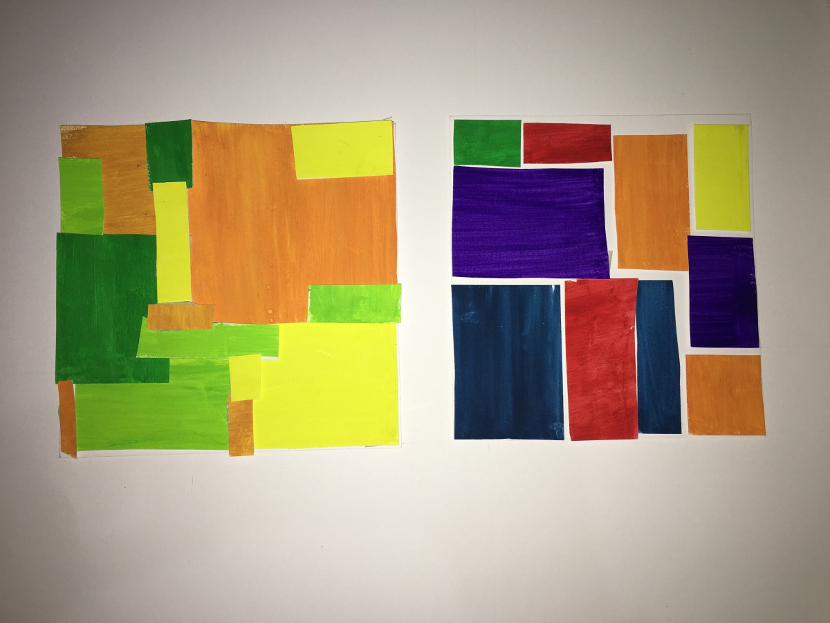
 I loved this phase one. It was a little bit hard on painting like always since wash is not what I’m used to paint with. But I liked that we had a partner and that we had an opportunity to come up with our own creative ideas. There was really room for our own creativity. I loved it.

Hours: 1
© 2024 PLAY WITH YOUR PROBLEMS – FYLC Fall 2016
Theme by Anders Noren — Up ↑
The OpenLab is an open-source, digital platform designed to support teaching and learning at City Tech (New York City College of Technology), and to promote student and faculty engagement in the intellectual and social life of the college community.


Recent Comments