Doing this project helped me better understand why we use color and how color can bring are work to life. I learned how to use photoshop and illustrator during the process. I got to say if wasn’t for those programs it would been hard to work with paint, especial gauche. I got to experience what real graphic designers have to go through in order to plan their work and be able to deliver it in hope that it brings meaning and attention to those that see it. This project was pretty cool and going to Cooper Hewitt was cool as well because it was place I never been before.
Author: Jasson C (Page 1 of 3)

For my free study I choose to make a desert, the inspiration came from the photo that I saw at the museum. The dominant color is blue which I used for the sky and the subdominant color is the peach- like brown and my accent color is the sun- yellow.
-
- Owe’neh Bupingeh Preservation Project
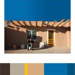
As I walked around the gallery room, I saw this photo of a man and a rural house. It was intriguing to see because the natural light from outside gave the setting a beautiful progression from light to dark. As you can see the the shadow of an object is blocking out light. So the dominant color is the picture is the blue and the sub-dominant is the peach like color and the accent color is the yellow.
-

- two color progression
-

- tint progression
-

- shade progression
The first picture is on a snowy night, that depicts a good example of tint progression because the street lamp gives reflects light off the snow a orange like color that laminates the block making the scenery a beautiful, relaxing experience
I choose this bird because its’ feathers show a change of shade from light to multiple shades of brown.
The fish demonstrated a shift of color from its tail to its body.

I choose this picture that I took around the high line. Because the whole picture is made up of color. I took it during the summer and the picture pretty much shows that it was taken around a warm sunny day. The contrast on the mural was edited a bit but in the original it express the same amount of contrast.

This picture I took around my block, the natural light in the sky during the sunset was very beautiful and eye attracting that I had to take it.
Doing this project help me understand why picking the color for a theme is important. Color gives meaning to a project. This something I never thought of because when I think of color all the pops in my head is green, red and blue, but after doing this project I see that color is much more than that. This project helped train my eyes to see the difference in color when I see a portrait or picture. As well by placing complementary colors next to each other makes one another visually appear different.

Time spent:1 hr
-

- Shifting hue and value
-

- 2 Pairs of chromatic colors
Doing this project made me see color in a different way, color gives meaning to a painting or poster and picking the right colors can make its visual perception more effective. Although it may sound like a simple topic, it’s not, reason why I say this is because it was quite difficult trying to pick the right colors and saturation to express each projects purpose. Like for example, muted colors give a sense of warmth/cool feeling and chromatic colors set a more serious tone. Stuff like that is important to know when designing, a designer must use the right colors in order to grab the attention of the viewer.

Hrs spent- 1


Recent Comments