First Year Learning Community

Author: Donasia White (Page 1 of 3)

Color Interaction: Phase 4

This project was very cool to me, I like how we were in groups and were able to communicate with one another about our personalities. This was one of the best projects I have to admit, because of how we had to come up with a theme. I’m satisfied with how the logos came out, because we actually sat and had a discussion about it. Overall I’m happy with how everything worked out and I’m also glad that I understand the terms more clearly now.

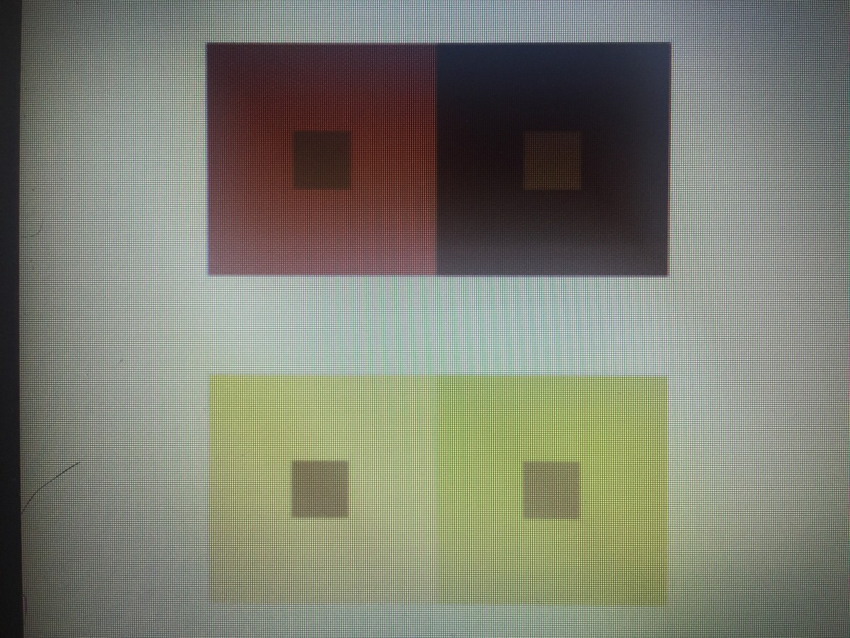
https://openlab.citytech.cuny.edu/schmerlerspevackfylcfa16/2016/12/08/color-interaction-phase-1-4/

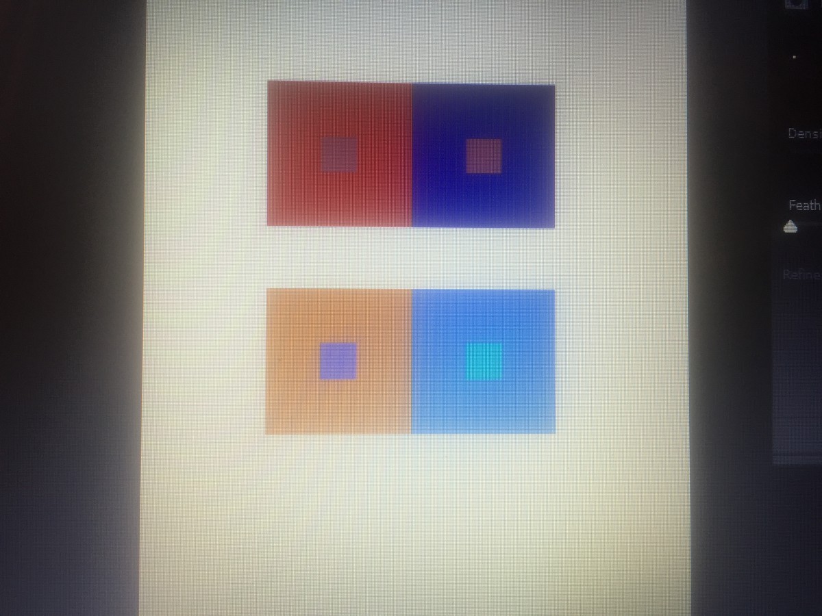
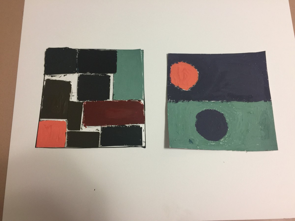
https://openlab.citytech.cuny.edu/schmerlerspevackfylcfa16/2016/12/19/color-interaction-phase-2-5/

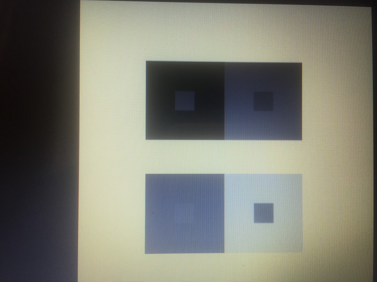
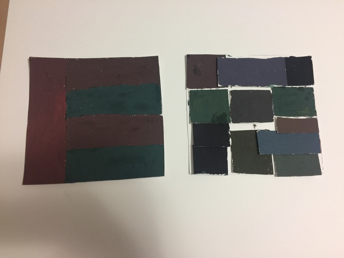
https://openlab.citytech.cuny.edu/schmerlerspevackfylcfa16/2016/12/15/color-interaction-phase-3-5/

Color Harmony: Phase 4

This project in all honesty, was extremely hard for me. Although I enjoyed learning new concepts and attending the museum, I need to increase my time when using apps like Photoshop and illustrator.  The trip was really fun for me I was able to go to a new place, and learn about many other artists that were skilled greatly. Next time I would like to come up with a neater free study, and make an even better composition. Practice is what I need, and I’m happy that I actually attempted to complete this project to the best of my ability.

https://openlab.citytech.cuny.edu/schmerlerspevackfylcfa16/2016/12/19/color-harmony-phase-1-12/

https://openlab.citytech.cuny.edu/schmerlerspevackfylcfa16/2016/12/19/color-harmony-phase-2-12/

https://openlab.citytech.cuny.edu/schmerlerspevackfylcfa16/2016/12/19/color-harmony-phase-3-9/

Color Harmony: Phase 1

color-progression   marguerite-daisy-beautiful-beauty       sunset_in_zadar_2

Two-Color Progression                                                                     Shade Progression                                                               Tint Progression

All of the three images above define the given key terms. Learning those terms were essential because now I can actually tell the difference between all of them which is important.

Color Harmony: Phase 3

img_3979-1

This part of the project was extremely difficult for me to complete, but I attempted to create something. My niece wanted me to draw what she drew for me, so I used Illustrator for the first time and tried it out. I’m not too proud of the outcome, but she actually liked it .

Color Harmony: Phase 2

cooper-hewitt           img_3977

The trip to Cooper Hewitt was very fun for me, a lot of the different pieces caught my attention. This one was my favorite, at first it looked like pills I don’t know why I thought of that. To me this piece symbolizes balance because of how the colors are filled up, and then the white fits into it. The museum was occupied with pieces that had a great amount of detail, as well as culture.

Color Interaction: Phase 3

3color-with-picturepink

Jeremy, Ely, and Myself decided to create a composition along the lines of a Christmas theme. As you can see these are gingerbread people, who are all In action in some way. All of the colors match each of our personalities really well, that is what’s really cool about this whole thing. All of the symbols used were thought out, and these were the best ones that fit into what we wanted to create.

Saturation Studies: Phase 4

Although painting isn’t my cup of tea, I actually had some fun completing this project. It allowed me to test out different colors throughout the color wheel, in which it also helped me learn several new concepts. Some of the key terms I learned were complementary, which means the color across from another color on the wheel. An example of this would be blue, the complementary of blue is orange. Some other terms I learned about are called muted, saturation, and chromatic. This project helped to expand my definition of art, it sure is something that I would do again sometime.

https://openlab.citytech.cuny.edu/schmerlerspevackfylcfa16/2016/12/08/saturation-studies-phase-1-9/

https://openlab.citytech.cuny.edu/schmerlerspevackfylcfa16/2016/12/13/saturation-studies-phase-2-14/

https://openlab.citytech.cuny.edu/schmerlerspevackfylcfa16/2016/12/08/saturation-studies-phase-3-13/


Color Interaction: Phase 1

interaction1 interaction-3

From my observation several different colors are interacting throughout both compositions. The colors in the first composition create an amazing visual of a person, this really caught my attention when I first spotted it. The purple and green really go together quite well, to where it makes the picture come alive in a way. The 2nd piece of art shows what looks like a room, divided into several different pieces. I personally like this image because the sky blue brings all the colors together, and everything else falls into place.  The pink to me fades a little bit and the blue stands out, in which this shows a great amount of interaction between all the colors.

« Older posts