For this project, we have a chance to make a composition of whatever we want by using the colors for the color inventory of the composition in the museum. It was fun to create our own composition, but the work spends a bit more time than what I had thought. I have to make change for few times while I was trying to post phase 3, I look back on my composition, the color inventory on the bottom was different placement on the top. So I have to make switch them a little bit and added more color to separate the dominant color and sub-dominant color. What I can do better next time will be spending a little more time to experiment with the different tools in photoshop and illustrator to make a better composition that match my imagination.
Author: ShanShan Yu (Page 1 of 3)
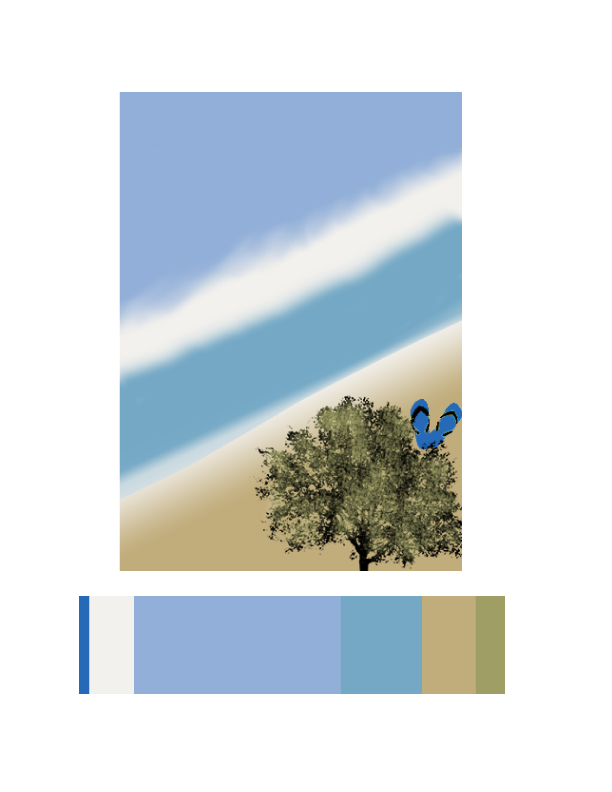
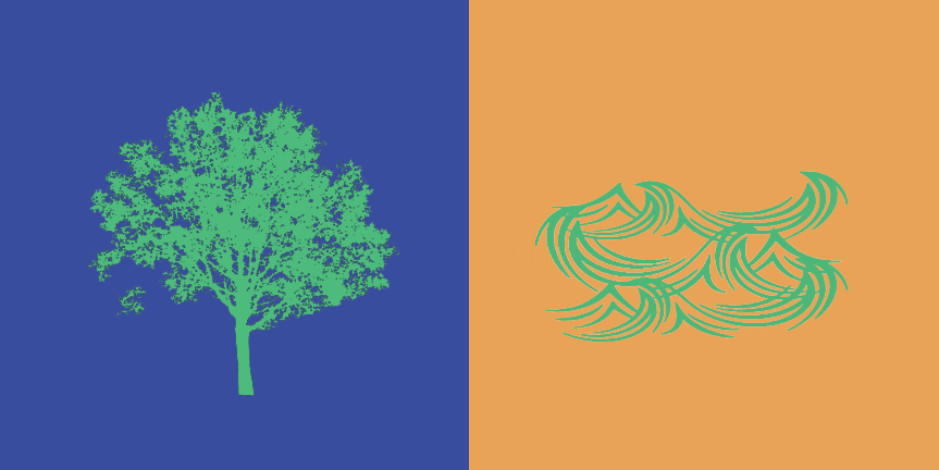
For my freestudy composition, I decided to do a beach scene because I have different kind of blues. My dominant color was the light purple blue for the sky with the beige white as use in the original composition and switch the placement of the color for my sub dominant color as the the light blue for the water and the beige for the sand. The accent color will be the darker blue for the slipper to be a little focus point. Lastly will be the tree in the front, it had a little shade of the green to darker green. Or a little tint of the blue between the water and the sand on the left corner.
Work time: 1 hr 30 mins
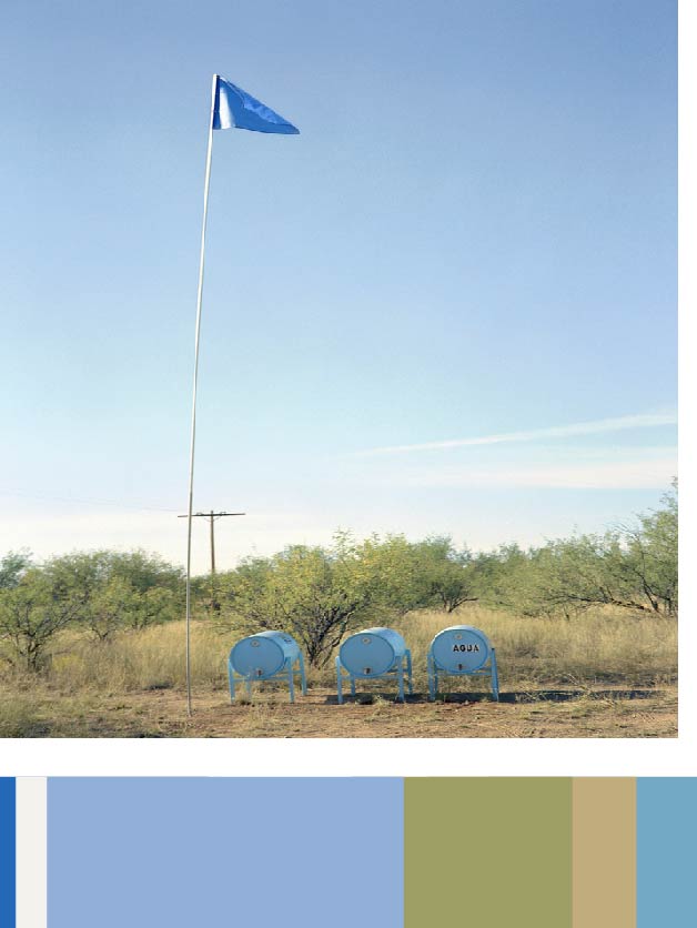
This is a project responding to migrant deaths along the Arizona-Mexico border due to dehydration, Humane Borders designed a system for placing water in the desert. More than 100 water stations, small tanks painted blue—the universal color of water—and tagged “AGUA” with a 30-foot-high pole and flag to increase visibility, have been deployed throughout southern Arizona, dispensing more than 100,000 gallons of water since 2001. A poster outlining the dangers of migrating on foot through the desert is distributed in shelters south of the border.
https://collection.cooperhewitt.org/objects/420777949/
Work Time: 30 mins
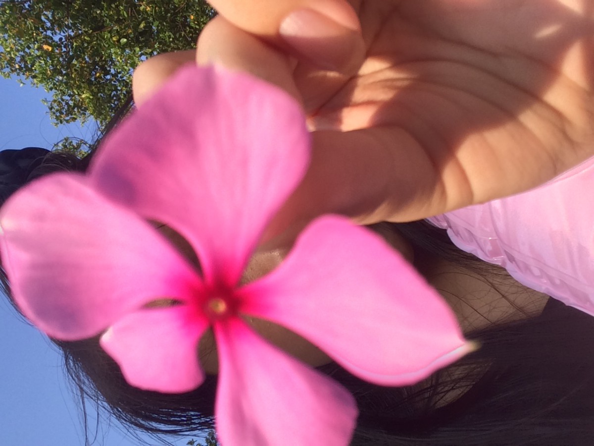
Two Color Progression
This picture had two color progression because the flower had changed its color from magenta to pink.
Tint Progression
The orange had made a tint progression as it gets closer to the bottom. The orange had become more desaturated with white.
Shade Progression
This picture had a shade progression because the blue had become more desaturated toward black as it get closer to the upper left corner.
Work Time: 1hr
While working on this project, we experiment with the app”Interaction with Color” by Josef Albers. Then we make our vision in photoshop. We try it with greyscale, switching hue not value, switching value not hue, and switching hue and value. Lastly we paired up with a classmate and choose a color and a icon that we represent each other. Thing that we learn from this project was that our eyes can see color in different colors by the angle that we are looking at. What I can do better what to take more time to make a better icon because we are rushing to finish the project, I didn’t have enough time to fix up my icon.
Work time: 2hrs
greyscale
value not hue
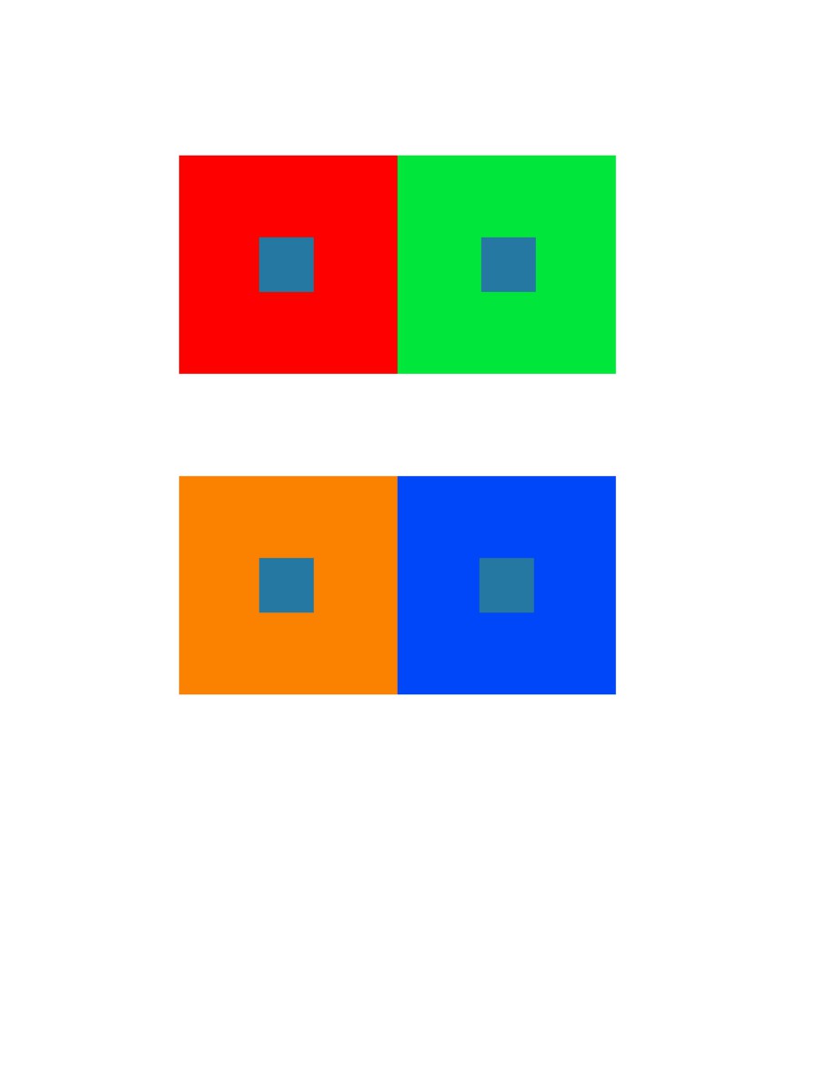
hue not value

hue and value
work time: 1 hr
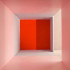
Empty – Erin O’Keefe
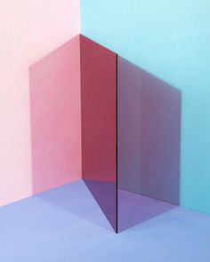
color/shadow/plane Erin O’Keefe
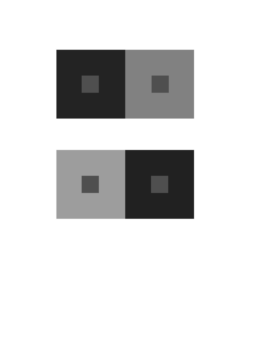
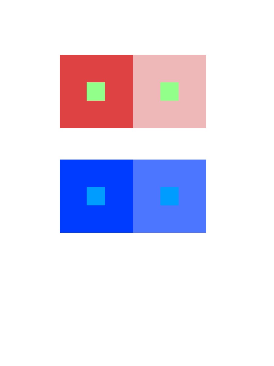
While playing with the app and search up pictures, I found out that when you put something in the middle of a color like a wall or a glass between the light and the wall, it reflected a different color as a shadow on the other side of the object in between. For example, red became a dark shade beside the wall compare to the original. The second picture was a glass in between two color wall and the reflection of it, creates other colors. Our eyes can see color in different colors by the angle that we are looking at.
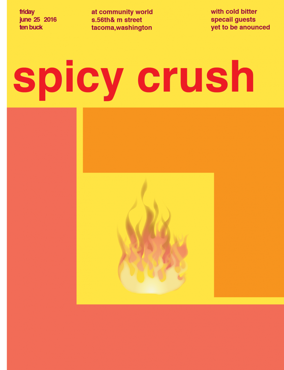
In this project, we learn about saturation,the difference between prismatic color, muted color and chromatic gray. First, we began with a color wheel freestudy. Second, we did the saturation studies, mix and match with little pieces of painted bristols. Lastly, we did a band poster by following the swiss style. We had choose warm or cool colors, a composition card, and come up with a band name that include two sensory meanings. What can I do better next time might be to make the flowers for the color wheel larger for easy visualization, and spend a little more time with the paint. I feel like I still cannot control the color of the paint because when it dry, the color came out different when I first painted.
By ShanShan Yu
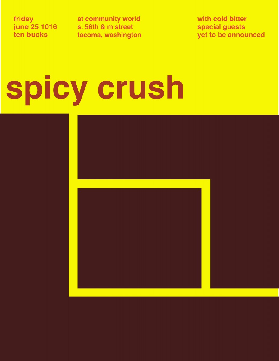
By Lilian Martinez
Our band name is Spicy Crush. We both agree on using yellow as our background. Then I decide to use pure color for the band name,the heading for chromatic grey,and the blocks to be muted color as paste colors. Since our band name is spicy crush, I decide to put a fire symbol in the middle.
Work time: 2hrs


Recent Comments