Out with the old, in with the new. This is New York City’s motto. This city is always evolving, whether it is the architecture, street art, or the culture itself. This may be exciting for some, but for locals it is sometimes devastating, as their some of their favorite classic pizzerias are being replaced with internet cafes. Their neighborhood is changing before their eyes. This is rezoning. Rezoning is increasing in different parts of the city as we speak, especially in Downtown Brooklyn. The rezoning process of a neighborhood shows lots of juxtaposition. Juxtaposition is the fact of two things being seen or placed close together with contrasting effect. Even though your neighborhood might have changed completely or at least starting to, you will always see it the way it was when you were growing up there. For others it may be different though. In this essay, I will describe an image of juxtaposition in Downtown Brooklyn, the different elements shown in the image, and talk about how our perception of our neighborhoods are different.

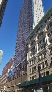
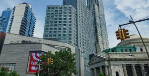
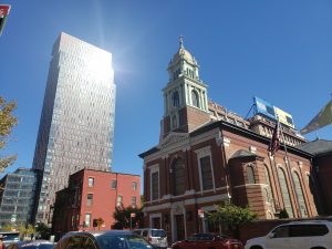
This is a picture of Albee Square, a public plaza located at the intersection of Fulton Street, DeKalb Avenue, and Albee Square West. This is a very convenient location, as the A,C, 2, 3, Q, R, 4, and 5 trains are nearby. I personally took the A train to Hoyt-Schermerhorn Street and turned left at Bond Street. I walked straight until Albee Square was directly in front of me. In this plaza, you will find the Dime Savings Bank (on the far right), and City Point (the other buildings), which is a residential/commercial mixed use, multi-building complex.
The history of the two buildings starts here. The Dime Savings Bank was first opened in 1859. When it first opened, it only occupied a small room on the ground floor of the Post Office at 211 Montague Street. The first person to make a deposit was a man named John Halsey who invested $50. By the end of the bank’s first business day, 90 people opened accounts. By 1884, the bank had about 40,000 customers, for whom the bank was holding nearly 12 million dollars. Known Brooklynites at the time such as George Hall, Brooklyn’s first Mayor, John W. Hunter, the Mayor of Brooklyn from 1875 to 1876, and Alfred Smith Barnes, publisher and director of the Brooklyn Historical Society, had the Dime build its first actual building on the corner of Remsen and Court Streets. The bank was quite successful, but in June 2001, Washington Mutual announced that they would acquire the Dime for $5.2 billion in cash and stock, rebranding all of its locations to Washington Mutual banks. It was acquired in January 2002. Dime had 123 branch offices in the New York City area in the states of New York and New Jersey. The Washington Mutual banks were a failure, and is now being incorporated into a skyscraper as we speak. When completed, the building will be stand the tallest in Brooklyn.
The location of the image, Albee Square, used to be a theater until 1977 when it was replaced by the Albee Square Mall. The mall was later demolished for new development in 2007. This new development is now known as City Point, which was part of the “Downtown Brooklyn Plan”, developed by the City’s office of Economic Department. This plan consisted of a series of zoning changes and public works. The first tower, City Point Tower 1, opened in 2015. The second tower, City Point Tower II, was completed in 2015 and opened in 2016. A third tower—City Point Tower III, is under construction, planned to be 720 feet tall, making it the tallest in Brooklyn in 2020. This is the building that will be connected to the Dime.
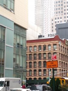
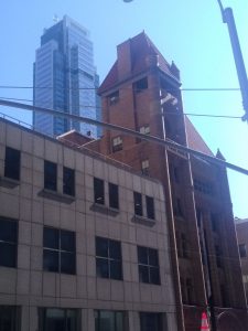
There is a high contrast between the two for multiple reasons. The Bank is a much older building than the City Point development. The Classical Revival architecture clearly sets the Bank apart from the other buildings, having multiple pillars on the front and sides, and the Dome-shaped roof. Above the sign of the Bank, there are sculptures of people and small details running along the edges of the entire Bank. The copper roof looks as if it were a more recent addition to the Bank because of the blue tape next to it. The City Point development on the other hand was built with more modern materials, with the structure being far angular than that of the Bank. The first thing that might catch your eye is the Target logo on the front of the mall part of the development, as it adds a pop of color to the small, grey building. The taller part of the development has cool grey undertones and a darker shade of the same color on the windows.
In the article “The Way We Live Now: 11-11-01; Lost and Found” by Colson Whitehead, the discussion of people seeing things differently is shown in this paragraph: “Go back to your old haunts in your old neighborhoods and what do you find: they remain and have disappeared. The greasy spoon, the deli, the dry cleaner you scouted out when you first arrived and tried to make those new streets yours: they are gone. But look past the windows of the travel agency that replaced your pizza parlor. Beyond the desks and computers and promo posters for tropical adventures, you can still see Neapolitan slices cooling, the pizza cutter lying next to half a pie, the map of Sicily on the wall. It is all still there, I assure you. The man who just paid for a trip to Jamaica sees none of that, sees his romantic getaway, his family vacation, what this little shop on this little street has granted him.” One person may see one thing, which in this case was a pizzeria, but another person will see it differently. Why? Because we all have different experiences in life. We are not the same, therefore we will always look at thing another way no matter what.
Another article that talks about viewing things differently is “How better photos can help you document, and shape, your neighborhood” by Patrick Sisson. When Chuck Wolfe was asked about his style, he said, “My style is based on a tool in the book which I call the urban diary, which I’ve been writing about it for years. It’s a very flexible approach, designed for people who want to document and use the LENS method: look, explore, narrate, and summarize…I tell people to look for overlaps and juxtapositions.. to tell a story. Use the camera as a reflexive tool.” In other words, Wolfe is saying that photography allows you to display your view of anything, whether it is of the city or something that simply peaks your interest. He says that juxtapositions are good for storytelling. There is plenty of history behind the juxtaposition, and how it even became one in the first place.
Everyone sees things from a different perspective. If your favorite store was replaced with a restaurant, you will only remember it as the store. However, someone else may see it as simply a restaurant. Juxtapositions always have some sort of story behind it, and each and every person will have a different story to tell of it.
Works Cited:
Dean, Allison Lirish. “Albee Square: When the Mall’s No Longer Home.” Gotham Gazette, 20 July 2007, https://www.gothamgazette.com/index.php/development/3612-albee-square-when-the-malls-no-longer-home.
“Dime Savings Bank of New York.” Downtown Brooklyn, 10 Oct. 2018, http://downtownbrooklyn.com/listings/dime-savings-bank-of-new-york.
Sisson, Patrick. “How better photos can help you document, and shape, your neighborhood.” Curbed March 14, 2017. Web.
“The True Story behind the City Point Development.” Good Jobs First, www.goodjobsfirst.org/blog/true-story-behind-city-point-development.
Whitehead, Colson. “The Way We Live Now: 11-11-01; Lost and Found.” The New York Times, November 11, 2001. Web.

