Color Interaction Pairings

Deliver

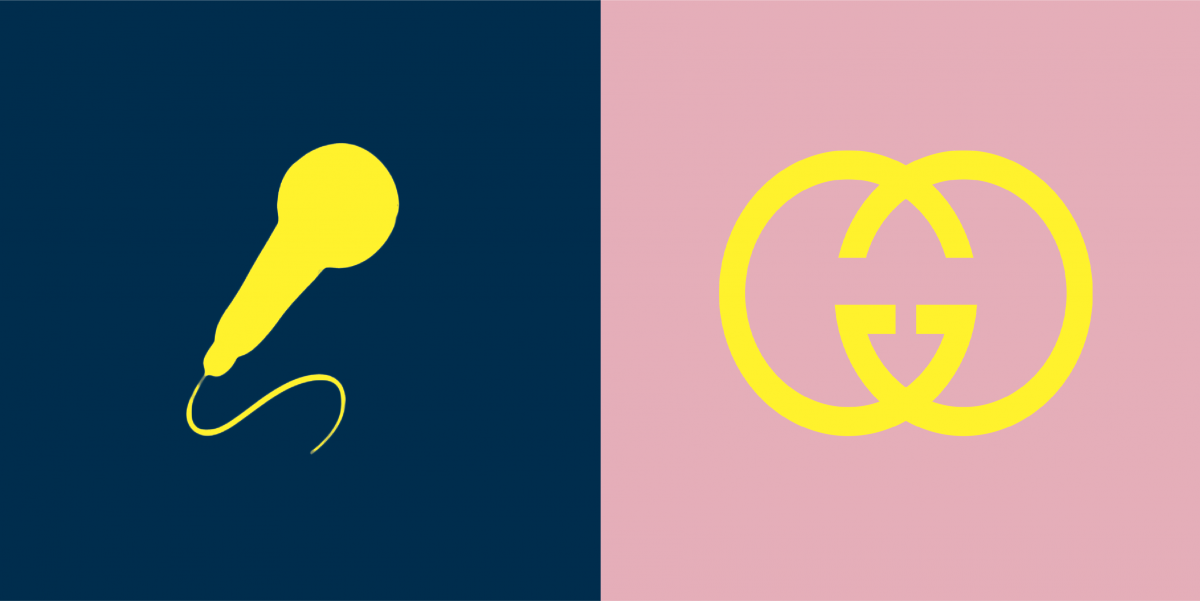
This project was quick and easy to work on. I was nervous at first to be paired with a random classmate but, things ended up working out better than I thought. I chose a microphone as Ken’s icon because his main interest and passion is producing music. I also chose the deep navy blue background to represent his fun, laid-back personality, and, we agreed on yellow as the color for both icons because it compliments each background color well.

Project 5


DEVELOP
Develop

Me and my project buddy Belen struggled  to find what icon fit best for one another. after a couple days we decided on a geometric lion for me because I believe its what best represents me.As for Belen she really loves the Jurassic Park movies and I believe although. it doesn’t fully represents her. I think what we like and what we like to see and do matters. It’s what makes us unique and represents the individual.

project 5

Develop

alt

Me and my partner Kevin had a struggle trying to figure out what icon fit best for one another. But after a a couple days we figured it out. I decided to do a geometric lion for Kevin because I believe Kevin was a very straightforward person , with different personalities. He is the oldest brother and I viewed him as a leader . He’s an example and guides his siblings. I believe Kevin decided to do a dinosaur for me because I love all jurassic park movies.

The process itself was a struggle since i’m still learning all this new vocabulary and getting use to illustrator

Color Interaction Pairings

Define

Develop

Paired Color Identities


Deliver

Experimenting with the paired color interaction studies was fun, seeing how only shifting either the value or hue affected the center color. When choosing our partners for the Paired Color Identities, I had Kami as my partner. We both shared an interest in anime so choosing icons that represented us was rather easy. I choose the anime Naruto for Kami and he chose The Seven Deadly Sins for me. For our colors, Kami decided my color should be purple since it’s my favorite color. I choose a muted red for Kami’s background since the normal saturated red is bold, and Kami is sort of a quiet guy but that doesn’t mean he isn’t bold. I learned a lot about both my project partner and how colors interacted, in my future projects I hope to incorporate what I’ve learned into it.