Alice Garcia's ePortfolio

A Communication Design Portfolio

The Virtual Trip

Description

We are to write about 3 art works from the virtual  trip-NASSAU MUSEUM EXHIBIT “BLUE”


The Huxley guide to Switzerland by Christopher Winter

This first piece caught my eye because I liked the way he used the blue around the person that seems to be split into two personalities. It not a flat The blue is used well that you are able to see the  reflection from the top background to the water. They seem to be looking at their own reflection of themselves in a different view from the other.

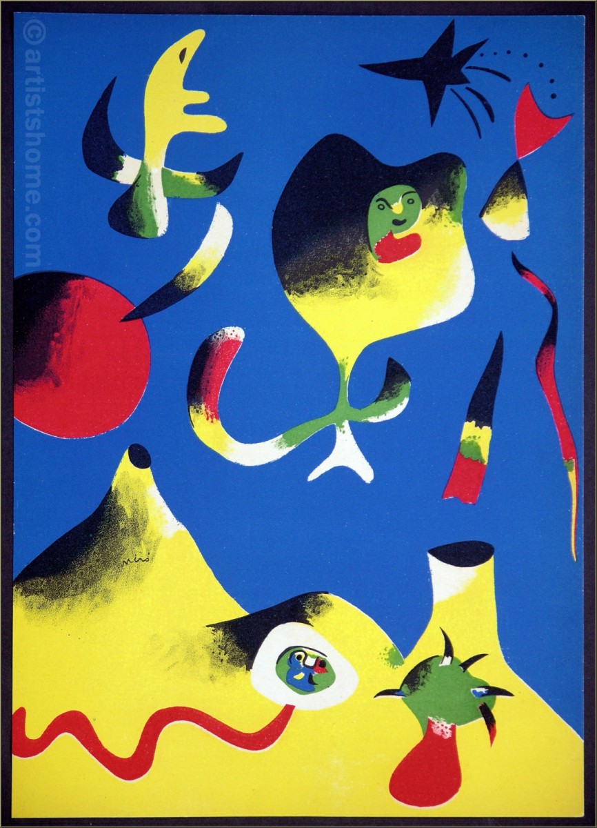
Miro – Verve Edition 

The moment I saw this pieces I really liked the way it was set up. I think that this piece used the right amount of blue because it stands out the background of the work. I thought about it representing the sky because of the brilliant blue and that also that there is a black star on the top right and in the left centered is like a sun. Both the sun and star are of a different color from what you’ll imagine them to have looked like in the art pieces. There seems to be a type of floating feeling on top of a landscape. I find it very unique.


Heart Glass by Clive Smith

The blue in the art piece illuminates the surroundings and makes them stand out more, like the snow pure white and the tree covered in cold snow. The blue helps bring light into the art work and create small shades like the one behind the tree. The repetition in this piece is the square tiles creating the glass look but every tile has its own part and detail to them come as a whole.

The difference between both interviews on Star Wars

The first interview had both the director and the interviewer in the view. You get a glimpse of the person and their name, who is speaking to the director and how is their form of speaking back and forward to each other. Due to it being exclusive we get a bit more of something that hasn’t been said about the director or that they recall something.

In the second interview a female interviewer is behind the camera asking the director about how they feel about their movie for their fans and what they did to make it happen. The director then speaks about how they went with baby steps to start it off. It definitely worked because even though there was always a lot of decisions and moments they got to set it up and little by little they came to a conclude that they was making the movie. He goes on about how its not just the fact that you describe what the movie is about but what matter is “the heart and soul of the characters.”

James Bond and Apple Ad

In the video of Dr. No, I thought that the titles are following the sound wave and the colors changed due to how high or low it goes. The colors make a motion and not only that but that even if it’s not the title it would help place the text in a certain spot.

For the apple video the colors are from the rainbow set when it first starts up as the fill for the apple. The colors then play their own roles to join together and create the objects. The dancing silhouette would look transparent that the color would combine and create a 3 color in between.