For this project we were asked to choose a quote and show how it communicates it’s message that’s being illustrated. The quote I’ll be choosing is ” It was beauty killed the beast “- Carl Denham, from the movie King Kong, 2005
The reason I chose this quote is because I really like the way the quote itself can be seen as misquoted but it’s just right to conclude the ending of the film. The love of a beast for a beauty can just lead to a tragic end.
Visual quote 1 draft 1
For my first concept I wanted it to stand out by the simple “BKTB” which stands for beauty killed the beast in just capital letters. The font I used was arial which made the words stand out rather than having a bolder font. I thought of placing the rose as a symbol of beauty over the capital B and kong next to the last B to present the beast. I thought of putting the background as grey to follow a film look.
Visual quote 1 draft 2
After receiving feedback, I decided to change it up because I realized that my previous concept was too spaced out, leaving it awkward. So I decided to have the words a bit more close together. I use the rose stem to wrap around the first B but also I let the rose have an encounter with the word “was” to make it stand out more. I replace the last B with the beast and let the line go through his chest to show that he is killed. I moved my quote attribute and changed it from it all being capitals to just leaving the initials be capital and the rest lower case. I used the font Futura for the quote attribution to have a different look from the actual concept.
Visual quote 1 draft 3
PDF: Visual quote.pdf
For this last draft, I decided to have it all centered rather than having it look awkwardly to the left. I noticed I felt comfortable with this last one because I was able to make the focus on to the center instead of like the second draft. The second draft still looked off since it wasn’t aligned right and the quote attribute was still too spaced. I took the red color from the rose and change the stroke of the “King Kong” to connect with the grey line but also to make it look like there was an em-dash next to the quote attribute.
Visual quote 2 draft 1
For my second concept, I decided to take my drawing composition and recreated my sketch in indesign. Of course I wanted it to still follow the meaning behind my chosen quote. I chose to not type the “A” in beauty because I thought why not have the top of the empire state represent it a different way. Rockwell and helvetica were both used to make the letters a lot better when I transferred into digital.
Visual quote 2 draft 2
In my this second draft, I looked over and decided to simply have beauty as the main attention, so I removed things such as the beast and plane and just simply put the words in the geometric shape I have created. I changed my font from being two into just it being helvetica. I like the new look to it and it being simple.
Visual quote 2 draft 3
PDF: Visual quote 2.pdf
In this last draft of my 2 concept, I noticed my Empire State building was flying and not touching any bottom of the page size. So, I took the bottom base of the building and enlarged it a bit more to fit at the center. As for the quote attribute I added the em-dash, I thought that the space for here worked out in this draft.
Visual quote 3 draft 1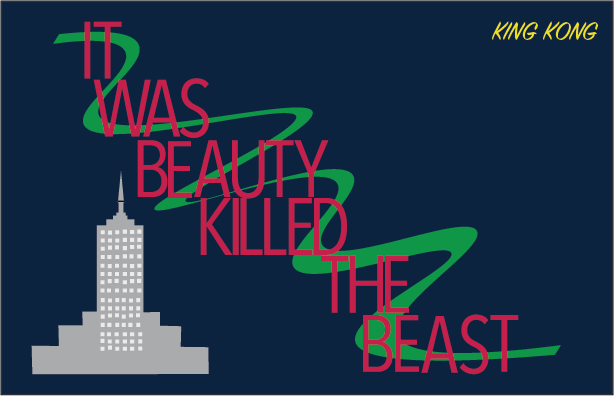
For my third concept I decided to add more color. I really liked this one because I did a mixture of trying to represent a rose with the words in red and swirl on the back in green. I decided to include the empire state building to state where the scene took place. The font used here was SignPainter and arial.
Visual quote 3 draft 2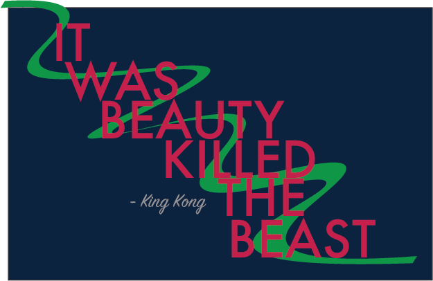
In this last concept, I chose to change my font to Futura. I still keep SignPainter as the font for the quote attributions. I removed the empire state building because it seemed to be not needed since it took the space of what really needed to be looked at the center. I chose to extend the stem on the upper left corner to make it bleed off the page to create more motion for the swirl.
Visual quote 3 draft 3
PDF: Visual quote 3.pdf
In this final draft of my last concept, I feel like this works out more because it’s not taking so much of the spaced like the 2 draft. I still used Futura here but the type was a condensed medium so it took the centers attention. I end up changing the length of stem to not have it curled up outside.

