This panel is using two pages because i wanted to really visualize like people hearing hokum. I wanted to have like ears and dialogue bubbles like as if people hear non sense and ears. And pointing at words in the book because to other people that dont know what the book was before all those words are nonsense or hokum. I used permanent marker, tape, and cut out of dialogue bubbles.
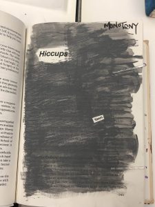
Didactic 1: Monotomy
This panel is the second to last panel and it says the word Monotomy which means the same thing, or boring, same tone. I used the color grey for the background because its known for being a boring color and i kept it at the same tone. I used the word hiccup as like the title because its the same tone over and over again. I used acrylic paint and cut up one word that says “yawn”
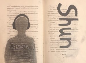
Didactic #3
For this dicactic, the word that I will be using and describing both the definition itself and the drawing is “shun” and it defines to persistently avoid, ignore, or reject through antipathy or caution. (Dictionary.com) On the left page, the first think I thought of being avoidable or ignoring is someone with a pair of big headphones, therefore I decided to use a page with long text that will surround the person in headphones. According to my design, there’s a person wearing dark headphone and that person is shaded with a gray color. Now, I was thinking that maybe I could compare the psychology of the color value and the image itself. First, the headphones are shaded with black and opposes the outside which is white with text. The person is shade with a dark grayish color that represents that the headphones is consuming him/her, avoiding to make any contact to the outside, typically ignoring and inside the person , there used to be texts but since it is shaded with a grayish color, we can’t see what it says or barely see it what it was written. There’s the word “ignorant” inside of that person that it is kind of a light gray and the reason I decided to make it lighter is because first that word is a synonyms for “shun” and second that person is aware of that word and describes who he/she admits that he/ she is a ignorant, then that person goes on listening to there music and ignoring at the same time. This project was uses with pencil for the gray shading of the person and black marker.
Didactic #2
The word I use for this artwrok is Serene and it defines peaceful, calm, untroubled, etc. (Dictionary.com). I decided to use a angel as an example for serene because angels are represent to be an signal of peace. So, I decided to draw an anime character with a halo on top of her head that will represent herself an angel on the left page and design the word serene with a eligent font on the right page. This artwork was design with penicl, black marker and a razor point.
Didactic four
Here, we can see a woman, loosely resembling the Virgin Mary in a contemporary style, weeping, surrounded by a red halo, and next to a heart, with a yellow bored around it, and thin blue, vaguely gothic archways in its corners. This piece is centered around the word ‘Afflatus’ meaning a divine creative impulse or inspiration, and can be seen above. In a way this piece captures the definition, its Devine inspiration is the Devine.
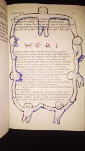
Didactic two
This piece centers around the definition of ‘Weal’ that which is best for someone or something. The illustration depicts ole figures linking hands and forming a circle around the word, and the original text featured in the book. These figures come together in a supportive circle, much like other illustration featuring of people on earth standing together holding hands.
Class Notes: Project #4 drafting
Reminders:
- Project #3 is due on 11/26/18 by the start of class
- We will work on the Glossument in class so be sure to have your book
- We will work on drafting parts of Project #4, so be sure to have more materials developed in your Glossument as the foundation for your work on Project #4
Writing didactics/labels/wall text for our Glossument projects:
- Write about the page/spread
- refer to the artist in 3rd person if at all
- the genre of this writing is not a reflection piece
- about a paragraph or two
- aim for 50 words
- audience: visitors/viewers
- some are knowledgeable
- some are invested
- some want to learn but don’t know much
- jargon vs instructive language? aim to reach a wide audience
- name each piece so it’s easier to refer to it. Could be the word you’re representing, or that word in a phrase, or something else
- write about:
- choices you made
- your method
- what materials and why
- what effect you aimed for
- how you see it represent the word you’re depicting
- How this page/spread represents your theme, or, How this page/spread fits within your overall Glossument book
- some resources:
- https://mgnsw.org.au/sector/resources/online-resources/exhibition/exhibition-labelling/
- http://eric-leyland.blogspot.com/2011/09/guidelines-for-good-interpretive-text.html
- https://www.theguardian.com/culture-professionals-network/2015/aug/04/writing-gallery-texts-panels-common-mistakes-interpretation
- https://evmuseography.wordpress.com/2014/05/28/5-basis-for-museums-didactics/
- https://en.wikipedia.org/wiki/Museum_label
- Add your first didactic panel as a post, including a photograph of the page you’re writing about; Comment on at least one classmate’s post by
WednesdayFriday, 11/30- Use the category ENG 1101 Project #4
- Use any tags you think are appropriate


